
Kendo UI for jQuery
What's New R1 2021
What's New HistoryNew jQuery Component: FloatingActionButton
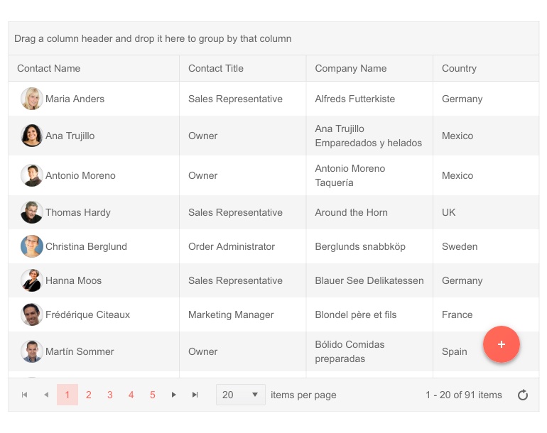
The Kendo UI for jQuery FloatingActionButton component provides a floating button that performs an action contextual to the content on the page. You can also display additional action items when the button is interacted with. Often called a "speed dial", the list of available actions can be customized to fit any scenario. Each action button within the jQuery FloatingActionButton includes configuration options such as style and icon to help you animate the action and adhere to your UI guidelines.
See the jQuery FloatingActionButton demo
New jQuery Component: BottomNavigation
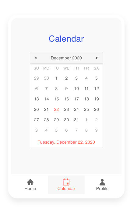
The Kendo UI for jQuery BottomNavigation component is the perfect UI component for any type of navigation that needs to span across desktop and mobile devices. It gives users a quick and intuitive way to interact with an always present and responsive navigation element at the bottom of the page.
The jQuery BottomNavigation component makes it very easy to follow style guides, design systems and other requirements. Developers have full control over the icons and text associated with each button. Integration with a routing setup is possible thanks to the various configuration options and events the component offers.
See the jQuery BottomNavigation demo
New jQuery Component: ExpansionPanel
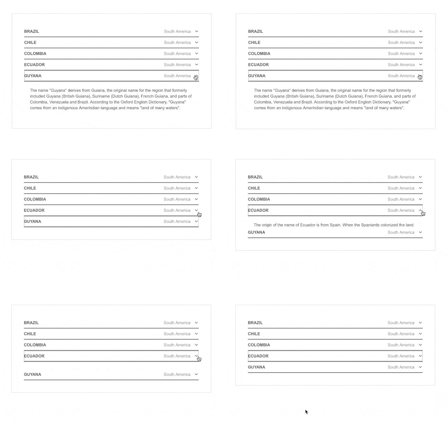
The Kendo UI for jQuery ExpansionPanel layout component is well suited to present content in sections which can be expanded and collapsed. The component is broken down into two parts: the header, which is always displayed, and the content area, which can be shown or hidden. Additionally, the Kendo UI templates help you style and add virtually anything into the content area.
See the jQuery ExpansionPanel demo
New jQuery Component: RadioGroup
The Kendo UI for jQuery RadioGroup component supplements the Kendo UI for jQuery RadioButton component. Whenever the user experience requires two or more radio buttons in an application, use the Kendo UI for jQuery RadioGroup component to manage selected options, validation and layout.
See the jQuery RadioGroup demo

New jQuery Component: CheckboxGroup
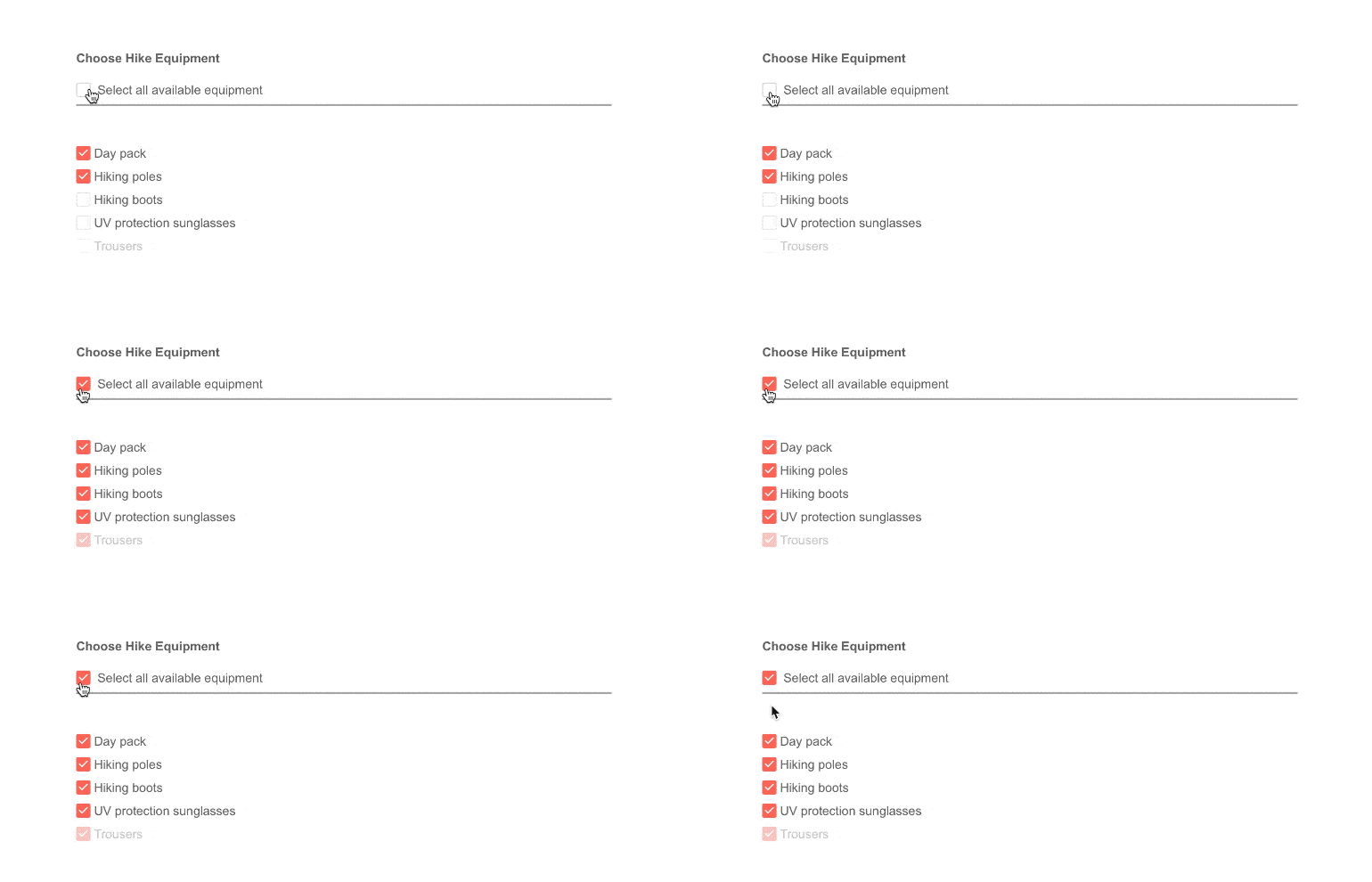
The Kendo UI for jQueryCheckboxGroup component supplements the Kendo UI for jQuery Checkbox component. When you want to display two or more checkboxes in your application, use the Kendo UI for jQuery CheckboxGroup component to manage them.
See the jQuery CheckboxGroup demo
New jQuery Grid Feature: Control Export on a Column Basis
The Kendo UI for jQuery Grid has the ability to export content to various file formats such as Excel and PDF. By default, it will export all table columns. Now, developers can define whether a column should be a part of the exported file. This configuration is available on a per-column level for ultimate flexibility.
See the jQuery Grid demo
New jQuery Grid Feature: Include Images in Excel Export
The Kendo UI for jQuery Grid now includes a ready-to-use sample, showcasing how to export images from the Kendo UI Grid when exporting it as an Excel file.
See the jQuery Excel export demo
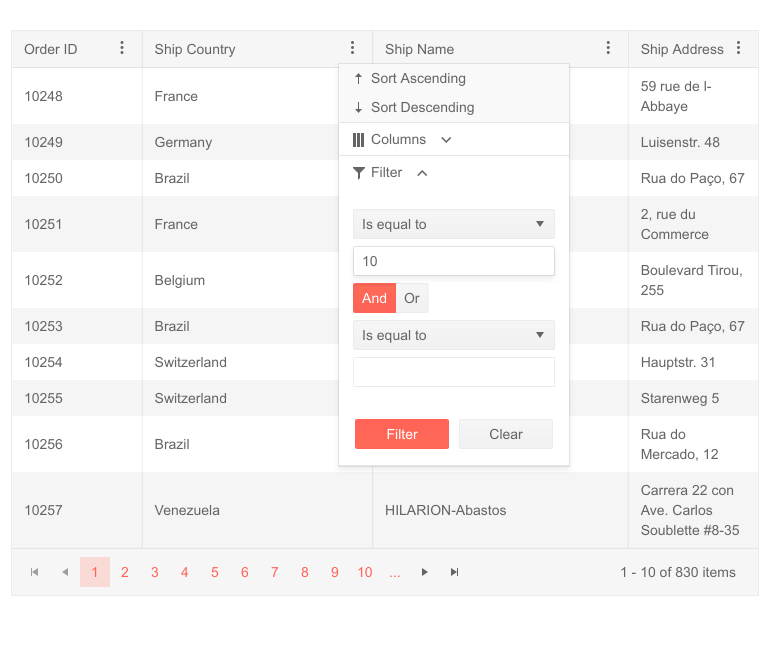
New jQuery Grid Feature: Sort & Group via Column Menu
The Kendo UI for jQuery Grid now includes UI elements to help sort and group columns via the column menu. The feature can be enabled with a couple of configuration options and gives users even more options for interacting with the Kendo UI for jQuery Grid columns through the column menu.
See the jQuery Grid Column Menu demo
New jQuery Grid Feature: Updated Column Menu Design
Kendo UI for jQuery Grid users can now switch to the new and improved column menu design.
See the jQuery Grid Column Menu demo
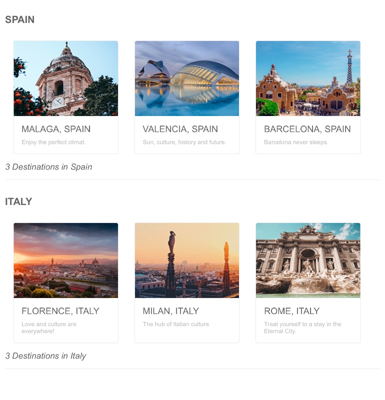
New jQuery ListView Feature: Grouping
The Kendo UI for jQuery now supports grouping. Similarly to other data-bound components like the Data Grid, any data bound to the Kendo UI for jQuery ListView can now be grouped by any defined field.
See the jQuery ListView demo
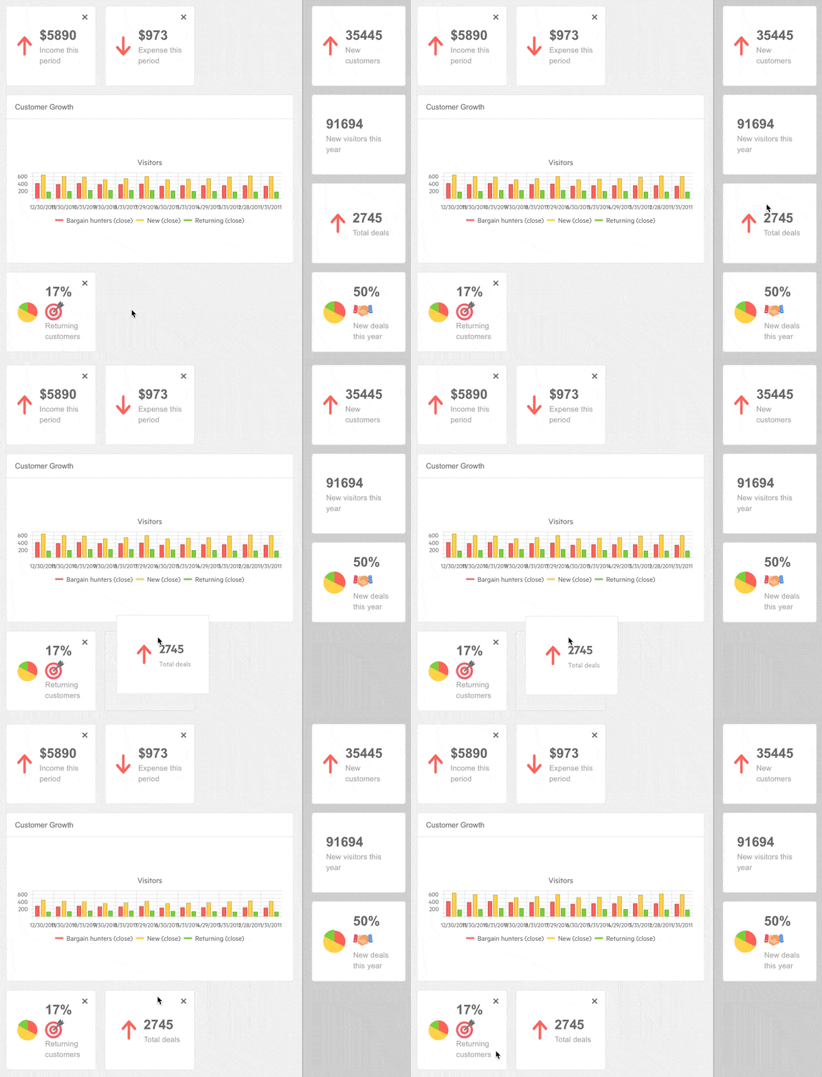
New jQuery TileLayout Feature: Add & Remove Tiles
The Kendo UI for jQuery TileLayout component now includes the ability to add and remove tiles after the initial rendering of the component. Developers can modify the collection of tiles by adding and removing tiles dynamically.
See the jQuery TileLayout demo
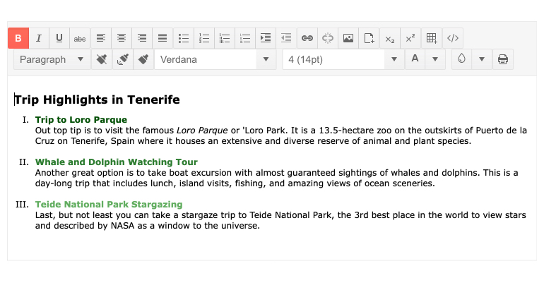
New jQuery Editor Feature: Create Lists with Roman Numerals
The Kendo UI for jQuery component now includes the ability to create lists with Roman numerals.
See the jQuery Editor demo
New jQuery Editor Feature: Table Aligning Tool
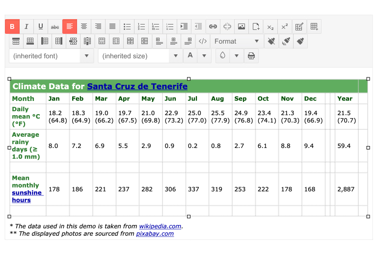
The Kendo UI for jQuery Editor now includes the ability to align HTML tables within the Editor content. This tool will allow users to quickly and easily align any table to the left, center or right of the Editor document.
See the jQuery Editor demo
Various Components: Improved Accessibility
The Kendo UI for jQuery UI ScrollView, Drawer, Timeline and TileLayout components now support keyboard navigation. Various other accessibility enhancements were added to other components.
Kendo UI for jQuery - R1 2021
- New jQuery Component: FloatingActionButton
- New jQuery Component: BottomNavigation
- New jQuery Component: ExpansionPanel
- New jQuery Component: RadioGroup
- New jQuery Component: CheckboxGroup
- New jQuery Grid Feature: Control Export on a Column Basis
- New jQuery Grid Feature: Include Images in Excel Export
- New jQuery Grid Feature: Sort & Group via Column Menu
- New jQuery Grid Feature: Updated Column Menu Design
- New jQuery ListView Feature: Grouping
- New jQuery TileLayout Feature: Add & Remove Tiles
- New jQuery Editor Feature: Create Lists with Roman Numerals
- New jQuery Editor Feature: Table Aligning Tool
- Various Components: Improved Accessibility

