New component: Form
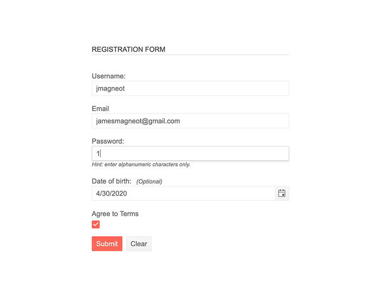
The Telerik UI for JSP Form component is the perfect tool for a registration form, contact form or some other form! It is trivial to setup and does most of the work on its own - like generating input fields depending on your data. It also comes with a great deal of customization - like you being able to provide validation callbacks or change the visuals.

New component: Stepper
The newly added Telerik UI for JSP Stepper control arrived to help you split complex actions in your web app into several simple steps. It is created to guide the user to each of the items that must be completed to achieve the whole. Steps can be required or optional and the user might be forced to do them in sequence or given the freedom to take them in any order they would prefer. Throw in how you can also change any of the visual elements and the Stepper becomes an amazing tool (and a great partner to the Form component we just mentioned).

New component: TileLayout
The TileLayout control for Telerik UI for JSP is a component directed towards your own users, not towards yourself. It is a container, which allows the end user to rearrange and resize all of the contained items inside in order to create a UI screen that serves their needs the best.

New component: TextBox
The TextBox control for Telerik UI for JSP is a exactly what you imagine it to be – a text input widget but enhanced with a ton of features – from basics like events and visual styling to out-of-the-box support for floating labels!

Component Improvement: Remote (server-side) Grid Grouping
This has been one of our most heavily requested features! Grouping items in the Telerik UI for JSP Grid component is now many times faster when working with huge numbers of rows. When you enable our new attribute, whenever users ask the Grid to group some elements together (e.g. all products being sold in a certain shop), the grouping procedure will run on the server. Effectively, this frees up the client to display a loading screen while waiting for the server to process the results but also makes it faster since the server is likely to be much more powerful than the user’s machine.
Component Improvement: Scheduler
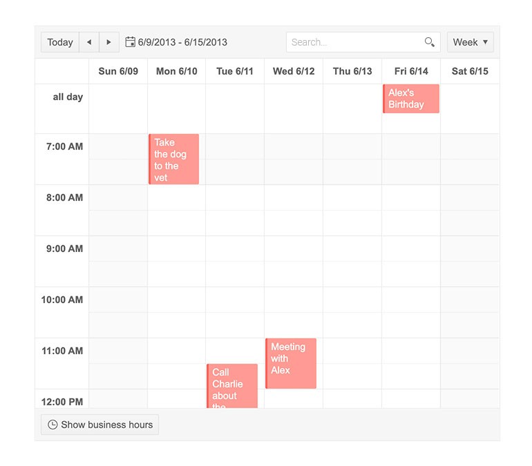
We put a lot of effort on the Telerik UI for JSP Scheduler component these past months to add all of these new features:
- We’ve supported grouping resources together for a while but with this release, Vertical Grouping is now virtual! Interacting with heavily overbooked calendars will no longer slow down your browser.
- The scheduler is now able to export and import data from all popular calendar clients like Outlook, Google Calendar and Apple Calendar. This is because it is now compatible with the iCalendar specification and therefore also compatible with any tool that supports it.
- The Scheduler now has a search bar through which users can easily find what they are looking for
- Working days can now be changed to accommodate non-standard working time

Component Improvement: Floating Labels
Floating labels - labels initially reside in the input elements they are for and later "float" over them are now a staple of Material Design. With this release, Floating labels are now available for our text components – the TextBox, MaskedTextBox and NumericTextBox.

Component improvement: TimePicker, DatePicker, DateTimePicker and Calendar Rendering
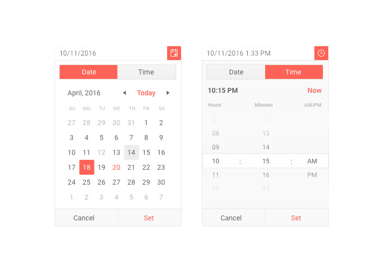
The visual quality of our controls is one of our highest priorities. The Telerik UI for JSP TimePicker, TimePicker, DatePicker, DateTimePicker and Calendar components received some love with this release - we added a new look to all of them. The old rendering style is still the default so you will not get any surprises when you update to the latest version, but you can switch to the new visual anytime you want.

UI for JSP
Telerik UI for JSP - R2 2020
- New component: Form
- New component: Stepper
- New component: TileLayout
- New component: TextBox
- Component Improvement: Remote (server-side) Grid Grouping
- Component Improvement: Scheduler
- Component Improvement: Floating Labels
- Component improvement: TimePicker, DatePicker, DateTimePicker and Calendar Rendering
New features & Roadmap
Have a feature request?
Post your feedback via the JSP UI UserVoice portal or the Public forums
What's new across all Telerik products?
Next Steps
Try Telerik UI for JSP with dedicated technical support.
See the UI for JSP in action and check how much it can do out-of-the-box.
Check out the offers. Purchase an individual suite or treat yourself to one of our bundles.


