Windows11 Theme
With the R2 2022 release of the UI for WPF suite we have introduced the brand new Windows 11 Theme.
Inspired by the refreshed Windows 11 OS, the Windows 11 theme delivers a lot cleaner and smoother look and feel to your WPF apps. The team at Microsoft are well known for their eagerness to deliver the best possible user experience that we encounter every day and with the Windows 11 theme you will be able to easily bring it to your own apps.
Jump to the following topics to learn about the specifics of the theme's palette and features.
- Default Theme Colors
- Default Theme Brushes
- Changing Palette Colors
- Changing Theme Variation
- Acrylic and Mica Effects
- Setting the Material
- Using System Accent Color
- Changing Font Properties
- Using Glyphs
- Using Theme Helper
- Changing Corner Radius
- Changing ScrollBarsMode
- Changing Opacity
Windows 11 Compact Mode
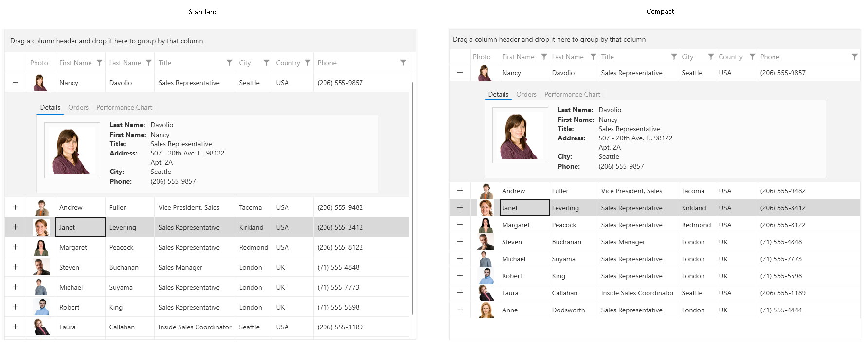
The Windows 11 theme supports a compact mode that reduces the default element sizes. To enable this, set the Windows11ThemeSizeHelper.Helper.IsInCompactMode static property to true.
Enabling Windows 11 Compact Mode
	public partial class App : Application
    {
        protected override void OnStartup(StartupEventArgs e)
        {
            Windows11ThemeSizeHelper.Helper.IsInCompactMode = true;
            base.OnStartup(e);
        }
    }
Windows 11 standard vs. compact mode in RadGridView
Default Theme Colors
The Windows11 Theme is designed to be easily modified via the exposed colors in the theme palette. The default values of the brushes in the theme are listed below.
| Color name | Light | Dark | ||
|---|---|---|---|---|
| AccentColor | #FF005FB8 | #FF60CDFF | ||
| AccentMouseOverColor | #E6005FB8 | #E660CDFF | ||
| AccentPressedColor | #CC005FB8 | #CC60CDFF | ||
| AccentSelectedColor | #FF0078D4 | #FF0078D4 | ||
| AccentControlBorderGradientStop1Color | #14FFFFFF | #14FFFFFF | ||
| AccentControlBorderGradientStop2Color | #66000000 | #23000000 | ||
| AccentControlForegroundColor | #FFFFFFFF | #FFFFFFFF | ||
| AlternativeColor | #FFF3F3F3 | #FF202020 | ||
| ButtonBorderGradientStop1Color | #0E000000 | #17FFFFFF | ||
| ButtonBorderGradientStop2Color | #29000000 | #17FFFFFF | ||
| DisabledBackgroundColor | #4DF9F9F9 | #0BFFFFFF | ||
| DisabledBorderColor | #0F000000 | #12FFFFFF | ||
| DisabledForegroundColor | #FF000000 | #FFFFFFFF | ||
| FocusColor | #E4000000 | #FFFFFFFF | ||
| FocusInnerColor | #B3FFFFFF | #B3000000 | ||
| IconColor | #E4000000 | #FFFFFFFF | ||
| IconSecondaryColor | #9B000000 | #C8FFFFFF | ||
| InputBorderGradientStop1Color | #0F000000 | #14FFFFFF | ||
| InputBorderGradientStop2Color | #72000000 | #8AFFFFFF | ||
| MouseOverBackgroundColor | #B3F9F9F9 | #15FFFFFF | ||
| MouseOverBorderGradientStop1Color | #0F000000 | #14FFFFFF | ||
| MouseOverBorderGradientStop2Color | #71000000 | #8AFFFFFF | ||
| OverlayColor | #FFFBFBFB | #FF2D2D2D | ||
| PressedBackgroundColor | #4DF9F9F9 | #08FFFFFF | ||
| PrimaryBackgroundColor | #B3FFFFFF | #0FFFFFFF | ||
| PrimaryBorderColor | #0F000000 | #12FFFFFF | ||
| PrimaryForegroundColor | #E4000000 | #FFFFFFFF | ||
| PrimarySolidBackgroundColor | #FFFFFFFF | #FF1E1E1E | ||
| PrimarySolidBorderColor | #FFECECEC | #FF2C2C2C | ||
| ReadOnlyBackgroundColor | #E6F6F6F6 | #08FFFFFF | ||
| ReadOnlyBorderColor | #FFEBEBEB | #FF1C1C1C | ||
| SecondaryBackgroundColor | #FFEEEEEE | #FF1C1C1C | ||
| SecondaryBorderColor | #29000000 | #18FFFFFF | ||
| SecondaryForegroundColor | #9B000000 | #C8FFFFFF | ||
| SelectedColor | #0A000000 | #0FFFFFFF | ||
| SelectedMouseOverColor | #06000000 | #0BFFFFFF | ||
| SelectedUnfocusedColor | #FFD9D9D9 | #FF404040 | ||
| StrokeColor | #FFC4C4C4 | #FF313131 | ||
| SubtleColor | #0A000000 | #0FFFFFFF | ||
| SubtleSecondaryColor | #06000000 | #0BFFFFFF | ||
| TertiaryBackgroundColor | #FFF9F9F9 | #FF282828 | ||
| TertiaryBorderColor | #FFEBEBEB | #FF262626 | ||
| TertiaryForegroundColor | #72000000 | #8BFFFFFF | ||
| TertiarySmokeBackgroundColor | #4D000000 | #4D000000 | ||
| ValidationColor | #FFC42B1C | #FFFF99A4 |
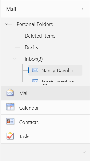
Theme colors represented in RadOutlookBar
Default Theme Brushes
Foreground Brushes
PrimaryForegroundBrush—This is the default foreground of the theme.SecondaryForegroundBrush—Used for the foreground of the buttons in their pressed state. It is also used as a default foreground to input/editor controls like the MS TextBox, WatermarkTextBox, PasswordBox. This is the default foreground of a GridView's header cell, as well as the TabControl's tab item.TertiaryForegroundBrush—Used for the foreground of the buttons' glyph elements in their pressed state. This is the default border color of the MS CheckBox, RadioButton and the ScrollViewer's RepeatButtons and Thumbs. Also used for the ticks color of the data visualization components.DisabledForegroundBrush—Used for the foreground of the elements in their disabled state.AccentControlForegroundBrush—Used for the foreground of the elements over an accent background (e.g.,when their parent is in its selected/checked state).IconBrush—This is the default fill of the theme's glyph icons.IconSecondaryBrush—Used as the default fill of the glyph icons when they are nested in an input/editor element - e.g., the ComboBox's button part, NumericUpDown's increase and decrease buttons, etc.
Background Brushes
PrimaryBackgroundBrush—Used for the background the inputs and other editable elements such as ComboBox, AutoCompleteBox, NumericUpDown, etc. Also used as the default background of the buttons.PrimarySolidBackgroundBrush—A completely solid variation of the PrimaryBackgroundBrush used for elements which require a non-transparent background for optimum readability.SecondaryBackgroundBrush—Used for the background of non-editable, secondary elements - e.g. the Ribbon's gallery buttons, Chat's cards, GridView pinned rows, etc. Also used for the default background of the RichTextBox component.TertiaryBackgroundBrush—Used for the background of the popup/overlay elements like ToolTip.TertiarySmokeBackgroundBrush—Used for the background of the ChatOverlay's header and footer and the RichTextBox's ruler tab stop elements.SubtleBrush—Used for the background of nested/secondary buttons and list items in their mouse over state.SubtleSecondaryBrush—Used for the background of nested/secondary buttons in their pressed state.AlternativeBrush—Used for the background of the toolbar-like components - e.g., StatusBar, DataPager, Grid's FilteringControl and panels - group, search, footer, etc. This is the default background of some controls like the ToolBar, Panelbar, Chat. Also used as a header background.OverlayBrush—Used for the background of the Window-based controls (e.g. RadWindow, RadTabbedWindow, FileDialogs, etc.).
Border Brushes
PrimaryBorderBrush—This is the default border color of the majority of controls.PrimarySolidBorderBrush—A completely solid variation of the PrimaryBorderBrush used for elements which require a non-transparent border color for optimum readability or in case of overlapping borders.SecondaryBorderBrush—Used for the border color of the divider/separator-like elements.TertiaryBorderBrush—This is the default border color of the Slider's thumbs.ButtonBorderBrush—A gradient brush, used as the default border color of buttons.InputBorderBrush—A gradient brush, used as the default border color of inputs.AccentControlBorderBrush—A gradient brush, used as the border color of accent buttons in their mouse over, pressed, checked states.StrokeBrush—This is the default border color of the TimeBar and Timeline controls. It is also used as the color of the TreeListView's lines and Diagram's selection, resizing rectangles and manipulation adorners. Used as a background for the GridViewMergedCells.
Special State Brushes
FocusBrush—Used for the border color of the elements in their focused state.FocusInnerBrush—Used as the fill color of the gap between an element and its focus border.MouseOverBackgroundBrush—Used for the background of the non-accent elements in their mouse over state - e.g. buttons.MouseOverBorderBrush—A gradient brush, used as the border color of non-accent buttons in their mouse over state.PressedBackgroundBrush—Used for the background of the non-accent elements in their pressed state - e.g. buttons.SelectedBrush—Used for the background of the elements in their selected state (e.g., the ListBoxItem, ComboBoxItem, PanelBarItem, etc.). Also used as the default value of the GridView's row and cell SelectedBackground properties.SelectedMouseOverBrush—Used for the background of the elements in their selected and mouse over state (e.g., the ListBoxItem, ComboBoxItem, PanelBarItem, etc.).SelectedUnfocusedBrush—Used for the background of the elements in their selected and not focused state (e.g., the GridViewRow, TreeListViewRow and the TreeViewItem).ReadOnlyBackgroundBrush—Used for the background of the controls in a read-only state.ReadOnlyBorderBrush—Used for the border color of the controls in a read-only state.DisabledBackgroundBrush—Used for the background of the controls in a disabled state.DisabledBorderBrush—Used for the border color of the controls in a disabled state.ValidationBrush—Used for the background/border color of the controls to indicate the validation errors - for the foreground of the invalid control, or as a border for the error tooltip, border for invalid rows and cells.
Accent Brushes
AccentBrush—Used for the background/border color of the elements that should have accent - e.g., the background of the toggle button in its checked state.AccentMouseOverBrush—Used for the background of the accent elements in their mouse over state (e.g., all buttons).AccentPressedBrush—Used for the background of the accent elements in their pressed state (e.g., all buttons).AccentSelectedBrush—This is the default background and border color of the drag-drop visuals and the fill of the pill displayed in some items as an addition to its selection background. Also used as the default background of the ScheduleView's AppointmentItem and the foreground of some headers.
Changing Palette Colors
The Windows11 theme provides dynamic change of the palette colors responsible for the brushes used in our controls. Their defaults are stated above. This mechanism is used to modify the color variation of the theme.
The general naming convention is: Windows11Palette.Palette.[name]Color is responsible for [name]Brush – e.g. Windows11Palette.Palette.AccentColor sets the color for telerik:Windows11Resource ResourceKey=AccentBrush
The colors containing GradientStop in their names set the respective gradient stop color of a LinearGradientBrush.
Changing the colors can be achieved in code behind.
Setting palette colors
Windows11Palette.Palette.AccentColor = Color.FromRgb(255, 0, 0);Changing Theme Variation
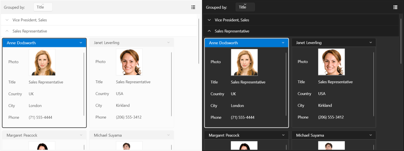
The Windows11 theme offers three color variations. The System variation corresponds to the default theme (Light or Dark) of the operation system the application is running on. You can also explicitly choose either the Light or Dark variation. The Light variation is used by default.
The following example demonstrates the ability to switch between the supported variations by calling the LoadPreset method as shown below:
Changing the color variation of the theme
	//System's color variation
	Windows11Palette.LoadPreset(Windows11Palette.ColorVariation.System);

	//Light color variation
	Windows11Palette.LoadPreset(Windows11Palette.ColorVariation.Light);

	//Dark color variation
	Windows11Palette.LoadPreset(Windows11Palette.ColorVariation.Dark);
Windows11 theme color variations
The
Darkvariation of the theme is designed with a dark background in mind and it is recommended to use such a background in your application when working with it.
Acrylic and Mica Effects
Windows 11 uses two types of occluding materials - acrylic and mica - as base layers beneath interactive UI controls. These materials are visual effects applied to UX surfaces that resemble real life artifacts.
Acrylic
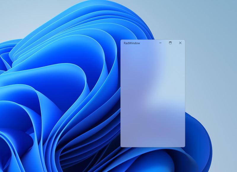
Acrylic is a semi-transparent material that replicates the effect of frosted glass. In Windows 11, acrylic has been updated to be brighter and more translucent, allowing for a stronger contextual relationship with the visuals behind it. Acrylic is used only for transient, light-dismiss surfaces such as flyouts and context menus.
Acrylic is mode aware; it supports both light and dark mode.
RadWindow with Acrylic Effect
Mica
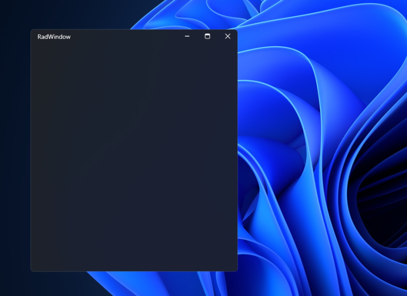
Mica is a new opaque material introduced in Windows 11. Mica surfaces are subtly tinted with the user's desktop background color.
Mica is mode aware; it supports both light and dark modes. Mica also indicates window focus with active and inactive states as a built in feature.
RadWindow with Mica Effect
Setting the Material
To change the occluding material, you can set the attached BackdropMaterial property of the WindowEffectsHelper class, located in the Telerik.Windows.Controls.Theming.Helpers;assembly=Telerik.Windows.Controls namespace.
Set Material
	<telerik:RadWindow x:Class="Example.MainWindow"
					xmlns="http://schemas.microsoft.com/winfx/2006/xaml/presentation"
					xmlns:x="http://schemas.microsoft.com/winfx/2006/xaml"
					xmlns:telerik="http://schemas.telerik.com/2008/xaml/presentation"
					xmlns:helpers="clr-namespace:Telerik.Windows.Controls.Theming.Helpers;assembly=Telerik.Windows.Controls"
					helpers:WindowEffectsHelper.BackdropMaterial="Mica"
					Header="RadWindow">
Using System Accent Color
The Windows 11 theme provides you with the ability to apply dynamic accent colors based on the OS accent color. This feature is supported only on Windows 10 and above.
This is controlled via the UseSystemAccentColor property. Its default value is false which means that the default values of the AccentColor, AccentMouseOverColor, AccentPressedColor and AccentSelectedColor from the colors table above will be used.
When set to true, the AccentColor of the theme will be the selected one in the System Color Settings of the OS, the AccentMouseOverColor will apply 90% opacity to it and the AccentPressedColor - 80% opacity. The AccentSelectedColor will also be changed with respect to the AccentColor.
Changing the color variation of the theme
Windows11Palette.Palette.UseSystemAccentColor = true;Changing Font Properties
When using the Windows11 theme you can dynamically change the FontSize and FontFamily properties of all components in the application the same way as you do in all other Available Themes which support ThemePalette.
The FontSize and FontFamily properties are public so you can easily modify the theme resources at a single point. The most commonly used font size in the theme is with value 14 and can be modified through the Windows11Palette.Palette.FontSize property in the same manner as in the other themes that support a theme palette.
The default font used in the theme is Segoe UI.
For complex scenarios we strongly recommend setting the
FontSizeproperties only before the application is initialized.
The following shows the default font sizes and families.
Default FontSizes
	Windows11Palette.Palette.FontSizeS = 12;
	Windows11Palette.Palette.FontSize = 14;
	Windows11Palette.Palette.FontSizeM = 18;
	Windows11Palette.Palette.FontSizeL = 20;
	Windows11Palette.Palette.FontSizeXL = 28;
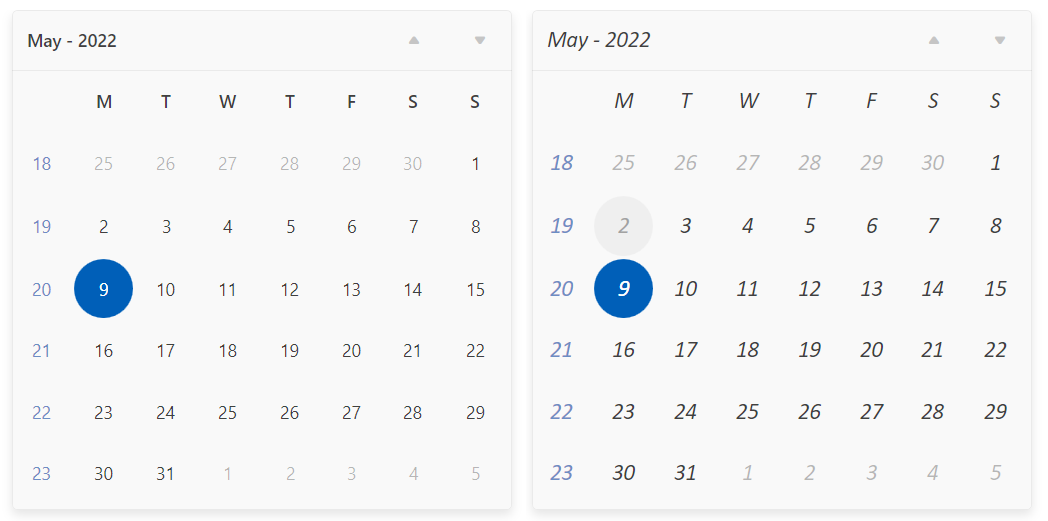
This example shows how to change the default FontFamily from "Segoe UI" to "Calibri Italic" and the FontSize from 14 to 18.
Changing the theme's FontSize and FontFamily
	private void OnButtonChangeFontSizeClick(object sender, RoutedEventArgs e)
	{
		Windows11Palette.Palette.FontSize = 18;
		Windows11Palette.Palette.FontFamily = new FontFamily("Calibri Italic");
	}
Setting FontSize and FontFamily
Using Glyphs
The Windows11 Theme also uses the font glyphs by default. The RadGlyph provides a lightweight, flexible and design-time-friendly implementation of our glyph font.
You can read more about the RadGlyph in the RadGlyph Overview article and about the range of the font glyphs in the Font Glyphs Overview article.
Using Theme Helper
The ThemeHelper class is used in the Windows11 theme. It exposes a set of attached properties and can be used to directly modify the appearance of a specific basic control without the need to alter its control template.
This example shows a RadToggleButton control with modified brushes for its different states through the ThemeHelper class:
Set RadToggleButton's visual appearance through the ThemeHelper class
	<telerik:RadToggleButton Content="RadButton"
						Margin="10"
						xmlns:helpers="clr-namespace:Telerik.Windows.Controls.Theming.Helpers;assembly=Telerik.Windows.Controls"
						helpers:ThemeHelper.MouseOverBackgroundBrush="{telerik:Windows11Resource ResourceKey=ValidationBrush}" />
Appearance of the RadToggleButton in the different states

Changing Corner Radius
The Windows 11 theme exposes an easy way to modify the corner radius of many elements in your application. It uses three levels of rounding depending on what UI component is being rounded and how that component is arranged relative to neighboring elements:
- Top-level containers such as app windows, popups and dialogs are rounded using an
8pxcorner radius. - In-page elements such as buttons and list backplates are rounded using a
4pxcorner radius. - Straight edges that intersect with other straight edges are
notrounded.
The Windows11Palette features two corner radius properties based on the first two points from the above list.
The CornerRadius property of the palette is the default one and defaults to 4.
The OverlayCornerRadius property corresponds to the first point of the list and defaults to 8.
Changing the default corner radius
Windows11Palette.Palette.CornerRadius = new CornerRadius(0);Appearance of a RadButton control after changing the default corner radius

Changing ScrollBarsMode
By default, the scrollbars in the Windows 11 theme change their size depending on whether the mouse is currently over them. You have the option of setting the ScrollBarsMode property of the Windows 11 palette in order to control this behavior. It is of type ScrollViewerScrollBarsMode and can be set to one of the following values:
ScrollViewerScrollBarsMode.Auto—The ScrollBars appear as a narrow sliver and expand to normal size on MouseOver. This is the default value.ScrollViewerScrollBarsMode.Compact—The ScrollBars appear always as a narrow sliver.ScrollViewerScrollBarsMode.Normal—The ScrollBars appear always with their normal size.
Setting the ScrollBarsMode property of the palette to Normal
FluentPalette.Palette.ScrollBarsMode = Telerik.Windows.Controls.Theming.ScrollViewerScrollBarsMode.Normal;Changing Opacity
If you need to change the opacity of the disabled and read-only elements, you can easily do so by using the DisabledOpacity and ReadOnlyOpacity properties of the Windows11Palette. The default values are 0.36 and 1.0 respectively.
Changing the opacity
	Windows11Palette.Palette.DisabledOpacity = 0.5;
	Windows11Palette.Palette.ReadOnlyOpacity = 0.5;
Merging Modified Palette Resources With StyleManager Theming Approach
When modifying fonts, colors, or other resources from the Windows11Palette and StyleManager is used as theming mechanism, the theme's ResourceDictionary needs to be merged in App.xaml file to apply the changes.
Merging the theme's ResourceDictionary in App.xaml
	<Application.Resources>
	    <ResourceDictionary>
	        <ResourceDictionary.MergedDictionaries>
	            <telerik:Windows11ResourceDictionary/>
	        </ResourceDictionary.MergedDictionaries>
	    </ResourceDictionary>
	</Application.Resources>