WPF Themes Suite
The UI for WPF suite comes with a variety of predefined themes which you can apply to your application. Some of the themes have ThemePalette, allowing for different color variations to expand this variety even more. Below you can find a list of the available themes, a glimpse of their appearance, the support of a ThemePalette, and the built-in color variations (if such are present).
You can check the appearance of a specific control in a certain theme by viewing its "Theming" demo in our WPF Controls Examples application.
The table is ordered chronologically, where the first theme in the list is the latest released.
| Theme name | Appearance | Theme Palette | Variations |
|---|---|---|---|
| Windows 11 |  | Yes | System, Light, Dark |
| Office 2019 |  | Yes | Light, Gray, Dark |
| Visual Studio 2019 |  | Yes | Blue, Dark |
| Crystal |  | Yes | Light, Dark |
| Fluent |  | Yes | Light, Dark |
| Material |  | Yes | Light, Dark |
| Office 2016 Touch |  | Yes | - |
| Office 2016 |  | Yes | - |
| Green |  | Yes | Light, Dark |
| Visual Studio 2013 |  | Yes | Light, Blue, Dark |
| Office 2013 |  | Yes | White, LightGray, DarkGray |
| Windows 8 Touch |  | Yes | - |
| Windows 8 |  | Yes | - |
| Expression Dark |  | No | - |
| Windows 7 |  | No | - |
| Transparent |  | No | - |
| Vista |  | No | - |
| Summer |  | No | - |
| Office Silver | 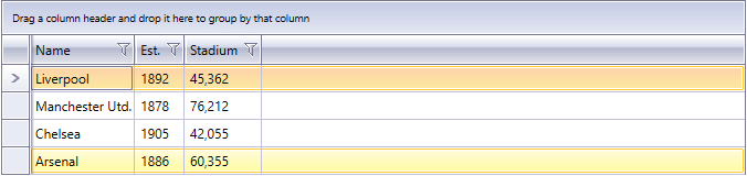 | No | - |
| Office Blue | 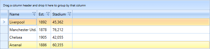 | No | - |
| Office Black | 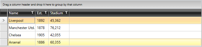 | No | - |
The names of the color variations from this list correspond to the different presets that can be loaded - e.g. VisualStudio2013Palette.LoadPreset(VisualStudio2013Palette.ColorVariation.Dark); will load the dark variation of the Visual Studio 2013 theme. All themes which support ThemePalettes are present in the Color Theme Generator, which allows for creating custom color variations even for themes that do not have ColorVariations.