New to Telerik UI for WPF? Start a free 30-day trial
Header Template
Updated on Sep 15, 2025
In RadTimePicker it is possible to customize the built-in text and template of the Header and HeaderTemplate.
The next example will demonstrate the necessary steps in order to customize the Header and HeaderTemplate of the RadTimePicker control.
Please note that if you are using NoXaml dlls, you need to base your style on the default one for the theme. You can read more about that in the Styling the Controls article.
Example 1: Define Style targeting RadClock
XAML
	<Style x:Key="RadClockStyle" TargetType="telerik:RadClock" >

	</Style>
Example 2: Set Header property
XAML
	<Style x:Key="RadClockStyle1" TargetType="telerik:RadClock" >
		<Setter Property="Header" Value="Custom Header and HeaderTemplate"/>
	</Style>
Example 3: Set HeaderTemplate property
XAML
<Style x:Key="RadClockStyle2" TargetType="telerik:RadClock" >
<Setter Property="Header" Value="Custom Header and HeaderTemplate"/>
<Setter Property="HeaderTemplate">
<Setter.Value>
<DataTemplate>
<Border BorderBrush="White" BorderThickness="1" Margin="3">
<TextBlock Text="{Binding}" Margin="5"/>
</Border>
</DataTemplate>
</Setter.Value>
</Setter>
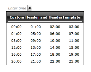
</Style>Example 4: Set RadTimePicker's ClockStyle property
XAML
<telerik:RadTimePicker ClockStyle="{StaticResource RadClockStyle2}"/>Figure 1: RadTimePicker with styled header