New to Telerik UI for WPF? Start a free 30-day trial
LayoutControlGroup
Updated on Sep 15, 2025
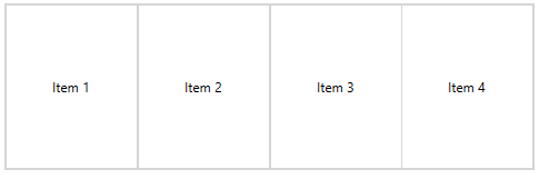
LayoutControlGroup is one of the few layout groups supported by the RadLayoutControl. When it comes to visual appearance LayoutControlGroup is the most simple of the groups. It displays only a border around its items.
You can read the Layout Panel article to get better understanding on how the layout groups are arranging their children.
Figure 1 shows how a LayoutControlGroup with few children looks. And Example 1 demonstrates how to set up a group.
Example 1: Setting up LayoutControlGroup
XAML
	<telerik:RadLayoutControl>
		<telerik:LayoutControlGroup >
			<Button Content="Item 1" />
			<Button Content="Item 2" />
			<Button Content="Item 3" />
			<Button Content="Item 4" />
		</telerik:LayoutControlGroup>
	</telerik:RadLayoutControl>
Figure 1: LayoutControlGroup
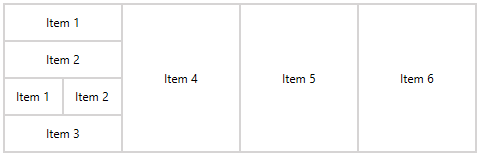
You can add LayoutControlGroup into another layout group (see Example 2).
Example 2: Nesting LayoutControlGroups
XAML
	<telerik:RadLayoutControl>
		<telerik:LayoutControlGroup>
			<telerik:LayoutControlGroup Orientation="Vertical">
				<Button Content="Item 1" />
				<Button Content="Item 2" />
				<telerik:LayoutControlGroup>
					<Button Content="Item 1" />
					<Button Content="Item 2" />
				</telerik:LayoutControlGroup>
				<Button Content="Item 3" />
			</telerik:LayoutControlGroup>
			<Button Content="Item 4" />
			<Button Content="Item 5" />
			<Button Content="Item 6" />
		</telerik:LayoutControlGroup>
	</telerik:RadLayoutControl>
Figure 2: Nested LayoutControlGroups