Styling Column Groups
In order to style Columng Groups you will need to create two styles targeting the CommonHeaderPresenter and CommonColumnHeader elements. The CommonHeaderPresenter hosts all common column headers and the CommonColumnHeader is responsible for a single common column header.
Example 1: Styling the CommonHeaderPresenter and CommonColumnHeader
<UserControl.Resources>
<!-- If you use NoXaml dlls and the implicit styles theming you will need to set also the BasedOn property to the Style object-->
<!-- BasedOn="{StaticResource CommonHeaderPresenterStyle}" -->
<Style TargetType="telerik:CommonHeaderPresenter">
<Setter Property="Background" Value="Red"/>
</Style>
<!-- BasedOn="{StaticResource CommonColumnHeaderStyle}" -->
<Style TargetType="telerik:CommonColumnHeader">
<Setter Property="Background" Value="Red"/>
</Style>
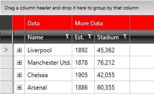
</UserControl.Resources>This will result in a red background for the merged header cells.
Figure 1: The styled Column Groups
As of version Q2 2015, the GridViewColumnGroupRow visual element was introduced. You need to also merge its XAML if using a Custom Theme.
If you want to have your Row Indicator visible, you will also need to modify the CommonHeaderIndent element of the GridViewHeaderRow. You can look at the Styling Header Row article for more information on how to achieve that.