Styling Column Headers
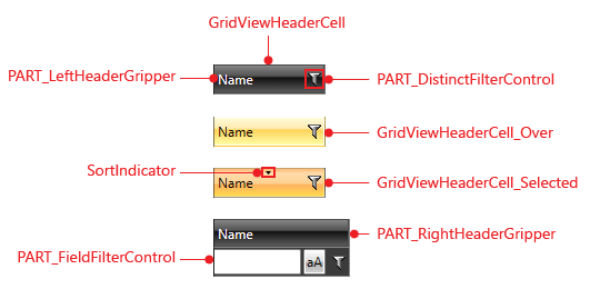
Figure 1: GridViewHeaderCell template structure
Targeting the GridViewHeaderCell element
In order to style all header cells in your application, you should create an appropriate style targeting the GridViewHeaderCell element.
You have two options:
-
To create an empty style and set it up on your own.
-
To copy the default style of the control and modify it.
To learn how to modify the default GridViewHeaderCell style, please refer to the Modifying Default Styles article.
The style in Example 1 will style all the column headers in your application.
Example 1: Styling all header cells of an application
<Application.Resources>
	<Style TargetType="telerik:GridViewHeaderCell">
		<Setter Property="Foreground" Value="Red"/>
		<Setter Property="HorizontalContentAlignment" Value="Center"/>
	</Style>
</Application.Resources>
If you're using Implicit Styles, you need to base your style on the GridViewHeaderCellStyle.
Setting a Column's HeaderCellStyle
RadGridView header cells can also be styled by creating an appropriate Style for the GridViewHeaderCell element and setting it as the HeaderCellStyle property of the respective GridView Column.
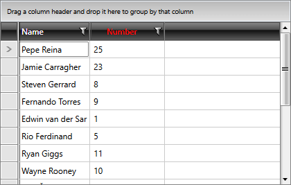
The style from Example 2 will only be applied to the Number column as we've set its HeaderCellStyle property.
Example 2: Setting a column's HeaderCellStyle
<Grid>
    <Grid.Resources>
        <Style x:Key="CustomGridViewHeaderCellStyle" TargetType="telerik:GridViewHeaderCell" BasedOn="{StaticResource GridViewHeaderCellStyle}">
            <Setter Property="Foreground" Value="Red"/>
            <Setter Property="HorizontalContentAlignment" Value="Center"/>
        </Style>
    </Grid.Resources>
    <telerik:RadGridView ItemsSource="{Binding Players}" AutoGenerateColumns="False">
        <telerik:RadGridView.Columns>
            <telerik:GridViewDataColumn DataMemberBinding="{Binding Name}" />
            <telerik:GridViewDataColumn DataMemberBinding="{Binding Number}" HeaderCellStyle="{StaticResource CustomGridViewHeaderCellStyle}" />
        </telerik:RadGridView.Columns>
    </telerik:RadGridView>
</Grid>
Figure 2: RadGridView with styled header cell