MultiColumnComboBox Column
GridViewMultiColumnComboBoxColumn derives from GridViewBoundColumnBase. In view mode it is represented by a standard TextBlock, whereas in edit mode the RadMultiColumnComboBox component is used. Here is a list of its most important properties:
-
DataMemberBinding: Allows you to specify the binding to the property, whose value you want to display in the column.
-
ItemsSource: Specifies the data source for the RadMultiColumnComboBox editor.
-
ItemsSourceBinding: Allows binding editor's ItemsSource to a member of the bound data item.
-
DisplayMemberPath: Member path to display. It points to a field in the assigned ItemsSource.
-
SelectedValuePath: Used in conjunction with DisplayMemberPath in the process of translation of a value to display as content. It also tells the RadMultiColumnComboBox editor which property to use as a Value when the user makes selection.
-
NullText: Allows you to set a string which will be displayed in both view mode and edit mode when the RadMultiColumnComboBox editor does not have a selected item.
-
HighlightMatches: Gets or sets a value that indicates whether matched items will be highlighted.
-
AutoCompleteMode: Gets or sets the AutoCompleteMode of the RadMultiColumnComboBox editor.
-
MatchCase: Gets or sets value that indicates whether text matching is case sensitive.
-
KeepDropDownOpen: Gets or sets the KeepDropDownOpen of the RadMultiColumnComboBox editor.
-
OpenDropDownOnInput: Gets or sets the OpenDropDownOnInput of the RadMultiColumnComboBox editor.
-
DropDownHeight: Gets or sets the DropDownHeight of the RadMultiColumnComboBox editor.
-
DropDownWidth: Gets or sets the DropDownWidth of the RadMultiColumnComboBox editor.
-
DropDownMinHeight: Gets or sets the DropDownMinHeight of the RadMultiColumnComboBox editor.
-
DropDownMinWidth: Gets or sets the DropDownMinWidth of the RadMultiColumnComboBox editor.
-
DropDownMaxHeight: Gets or sets the DropDownMaxHeight of the RadMultiColumnComboBox editor.
-
DropDownMaxWidth: Gets or sets the DropDownMaxWidth of the RadMultiColumnComboBox editor.
-
DropDownPlacement: Gets or sets the DropDownPlacement of the RadMultiColumnComboBox editor.
-
CloseDropDownAfterSelectionInput: Get or sets the CloseDropDownAfterSelectionInput of the RadMultiColumnComboBox editor.
-
AutoGenerateColumns: Gets or sets a value indicating whether columns in the editor's popup are created automatically when the ItemsSource property is set. The default value is true. This property was introduced with R1 2020 SP1.
-
Columns: Gets the collection of GridViewColumns for the grid view in the editor's popup. This property was introduced with R1 2020 SP1.
-
CanUserSearchInHiddenColumns: Gets or sets value that indicates whether the search engine should search in hidden columns. This property was introduced with R3 2020.
Setting up GridViewMultiColumnComboBoxColumn
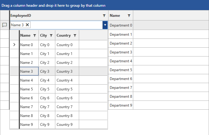
Examples 1 and 2 demonstrate how you can define some dummy data and set up a GridViewMultiColumnComboBoxColumn. The RadGridView is populated with a collection of Departments, each of which holds a collection of Employees. The Employees collection is set as the ItemsSource of the GridViewMultiColumnComboBoxColumn.
Example 1: Defining the models and viewmodel
    public class Employee
    {
        public int ID { get; set; }
        public string Name { get; set; }
        public string Title { get; set; }
        public string City { get; set; }
        public string Country { get; set; }
    }

    public class Department
    {
        public int ID { get; set; }
        public int EmployeeID { get; set; }
        public string Name { get; set; }

        public ObservableCollection<Employee> Employees
        {
            get
            {
                var countries = new ObservableCollection<Employee>();
                for (int i = 0; i < 10; i++)
                {
                    Employee employee = new Employee();
                    employee.ID = i;
                    employee.Name = "Name " + i;
                    employee.Title = "Title "+ i;
                    employee.City = "City " + i;
                    employee.Country = "Country " + i;

                    countries.Add(employee);
                }

                return countries;
            }
        }
    }

    public class MyViewModel : ViewModelBase
    {
        public ObservableCollection<Department> Departments
        {
            get
            {
                var locations = new ObservableCollection<Department>();
                for (int i = 0; i < 10; i++)
                {
                    Department department = new Department();
                    department.ID = i;
                    department.EmployeeID = i;
                    department.Name = "Department " + i;
                    locations.Add(department);
                }

                return locations;
            }
        }
}Example 2: Defining the xaml
	<Window.DataContext>
		<my:MyViewModel />
	</Window.DataContext>
    <Grid>
        <telerik:RadGridView Name="DepartmentsGrid"
                         ItemsSource="{Binding Departments}"
                         AutoGenerateColumns="False"
                         GroupRenderMode="Flat">
            <telerik:RadGridView.Columns>
                <telerik:GridViewMultiColumnComboBoxColumn AutoGenerateColumns="False" DataMemberBinding="{Binding EmployeeID}" ItemsSourceBinding="{Binding Employees}" DisplayMemberPath="Name" SelectedValuePath="ID" Width="325">
                    <telerik:GridViewMultiColumnComboBoxColumn.Columns>
                        <telerik:GridViewDataColumn DataMemberBinding="{Binding Name}" />
                        <telerik:GridViewDataColumn DataMemberBinding="{Binding City}" />
                        <telerik:GridViewDataColumn DataMemberBinding="{Binding Country}" />
                    </telerik:GridViewMultiColumnComboBoxColumn.Columns>
                </telerik:GridViewMultiColumnComboBoxColumn>
                <telerik:GridViewDataColumn DataMemberBinding="{Binding Name}" />
            </telerik:RadGridView.Columns>
        </telerik:RadGridView>
    </Grid>
Figure 1: Result from Example 2 in the Office2016 theme