Toggle RowDetails Column
GridViewToggleRowDetailsColumn derives from GridViewColumn class, which means that it isn't used to display data. The column is represented by an GridViewToggleButton control. Clicking on it will show RowDetails if they are available. This column will automatically link the created toggle buttons to the DetailsVisibilityProperty of each GridViewRow.
Defining GridViewToggleRowDetailsColumn in XAML
	<telerik:RadGridView x:Name="radGridView"
	                     AutoGenerateColumns="False">
	    <telerik:RadGridView.Columns>
	        <telerik:GridViewToggleRowDetailsColumn />
	    </telerik:RadGridView.Columns>
	</telerik:RadGridView>
GridViewToggleRowDetailsColumn
You should either configure the
RowDetailsVisibilityModeproperty ofRadGridViewto control the state of all grid rows or use a GridViewToggleRowDetailsColumn to control the state of each individual row. Since GridViewToggleRowDetailsColumn operates on the respective DetailsVisibilityProperty of the GridViewRow, having the RowDetailsVisibilityMode property of RadGridView different fromCollapsedmight lead to unexpected results.
Setting the Expand Mode
The GridViewToggleRowDetailsColumn exposes the ExpandMode property that will allow you to specify whether or not only one row details can be visible on a time. The possible values are as follows:
Single—Only a single row details will be visible at a time.Multiple—Multple row details can be visible at a time. This is the default value of the ExpandMode property.
If ExpandMode property is set to
Single, expanding a new row with the toggle button will collapse the previous one.
Stying the Toggle Button
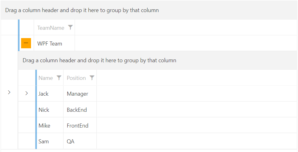
The GridViewToggleRowDetailsColumn allows you to set a Style for the expand/collapse button. This is done via the ToggleButtonStyle property.
Setting a Style for the ToggleButtonStyle
	<telerik:RadGridView x:Name="radGridView"
	                     AutoGenerateColumns="False">
	    <telerik:RadGridView.Columns>
			<telerik:GridViewToggleRowDetailsColumn ExpandMode="Single">
			    <telerik:GridViewToggleRowDetailsColumn.ToggleButtonStyle>
			        <Style TargetType="ToggleButton">
			            <Setter Property="Height" Value="26"/>
			            <Setter Property="Width" Value="26"/>
			            <Setter Property="Background" Value="Orange"/>
			        </Style>
			    </telerik:GridViewToggleRowDetailsColumn.ToggleButtonStyle>
			</telerik:GridViewToggleRowDetailsColumn>
	    </telerik:RadGridView.Columns>
	</telerik:RadGridView>
GridViewToggleRowDetailsColumn with custom Style for the ToggleButtonStyle property