Overview
This topic will present you with the simple way of creating a theme. It's suitable for themes which contain less XAML. The advanced approach is more performant, especially when creating themes for the larger controls.
The RadDocking uses controls such as PaneHeader, RadPaneGroup, ToolWindow, RadSplitContainer that are usually created dynamically depending on the user's actions. Such controls cannot be styled declaratively in XAML. In order to style them you have to apply a theme to your RadDocking control that contains the styles for them.
By applying a theme, the style for a particular control will be set to all of the controls of this type.
Creating the Theme
Before theming the controls involved with the RadDocking control, you have to create a Class Library project that will represent your theme. For example create a project with the following name.
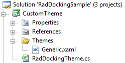
In the Generic.xaml you should place the styles and the resources for your theme.
The RadDockingTheme class should inherit from the Telerik.Windows.Controls.Theme class.
Applying a Theme
The theme can be easily set to your RadDocking control in the following way.
	public StylingPaneHeader()
	{
	    InitializeComponent();
	    StyleManager.SetTheme( this.radDocking, new Theme());
} <UserControl.Resources>
<local:CustomTheme x:Key="MyTheme" />
</UserControl.Resources>
<Grid>
<telerik:RadDocking x:Name="radDocking"
telerik:StyleManager.Theme="{StaticResource MyTheme}">
</telerik:RadDocking>
</Grid> public StylingPaneHeader1()
{
InitializeComponent();
StyleManager.SetTheme(this.radDocking, new RadDockingTheme());
}To learn more about theming controls read the common theming topics on this matter. If you are new to the controls they will give you a basic knowledge about it.