Toggle Switch Button
RadToggleSwitchButton is a control designed to display two exclusive choices. The control is represented by a track in which the thumb is smoothly sliding left and right. The two states content can be customized along with their position. The button derives from our RadToggleButton control. Because of the inheritance, it has all of the features of the RadToggleButton control.
You can see how to use ICommand with a button in the Commands topic.
Toggle Switch Button
Defining RadToggleSwitchButton
You can instantiate RadToggleSwitchButton in both XAML and code as shown in Examples 1 and 2.
Defining a toggle switch button in XAML
<telerik:RadToggleSwitchButton ContentPosition="Both" CheckedContent="ON" UncheckedContent="OFF" />Defining a toggle switch button in code
RadToggleSwitchButton radToggleSwitchButton = new RadToggleSwitchButton() { CheckedContent = "ON", UncheckedContent = "OFF" };Setting Content Position
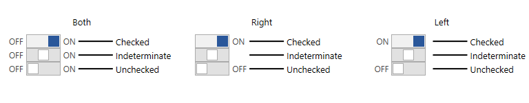
The RadToggleSwitchButton allows you to control the position of its CheckedContent and UncheckedContent. You can do that using its ContentPosition property. This property is an enumeration of type SwitchButtonContentPosition and exposes the following values.
- Both
- Right (default)
- Left
ContentPosition property
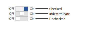
Enabling Three-State Mode
To make RadToggleSwitchButton to go into a three-state mode you can just set its IsThreeState property to True.
Enabling the three-state mode
<telerik:RadToggleSwitchButton IsThreeState="True" ContentPosition="Both" CheckedContent="ON" UncheckedContent="OFF" />Setting Checked and Unchecked Content
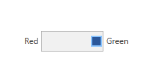
Nevertheless, the RadToggleSwitchButton derives from RadToggleButton, the Content property here is not respected. Two new properties are created. These properties set the check and uncheck content state of the ToggleSwitchButton. Their position depends on the ContentPosition property.
Setting Check/UncheckContent property
<telerik:RadToggleSwitchButton CheckedContent="Red" UncheckedContent="Green" />Setting Track Size
To customize the size of the ToggleSwitchButton's track use its TrackWidth and TrackHeight properties.
Setting track size properties
<telerik:RadToggleSwitchButton UncheckedContent="Red" CheckedContent="Green" ContentPosition="Both" TrackHeight="30" TrackWidth="90" />Change Track Height/Width
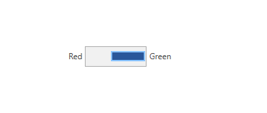
Setting Thumb Size
To customize the size of the ToggleSwitchButton's thumb use its ThumbWidth and ThumbHeight properties.
Setting thumb size properties
<telerik:RadToggleSwitchButton UncheckedContent="Red" CheckedContent="Green" ContentPosition="Both" TrackHeight="30" TrackWidth="90" ThumbHeight="15" ThumbWidth="50"/>Change Thumb Height/Width
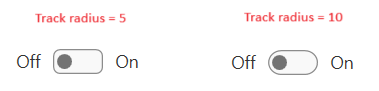
Setting Track Corner Radius
To set the corner radius of the track, set the CheckedTrackRadius and UncheckedTrackRadius properties of the button.
Setting track corner radius properties
	<telerik:RadToggleSwitchButton ContentPosition="Both"
				       CheckedContent="On"
				       UncheckedContent="Off"
				       CheckedTrackRadius="10"
				       UncheckedTrackRadius="10"/>
Tracks with radiuses of 5 and 10 pixels