New to Telerik UI for WPF? Start a free 30-day trial
AIPrompt Button
Updated on Sep 15, 2025
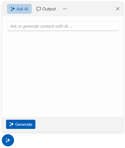
The AIPrompt component can also be displayed as a button that will show a RadAIPrompt when interacted with it. To display the component as a button, create a new RadAIPromptButton instance.
The RadAIPromptButton provides the following properties:
AIPrompt—Allows you to set an RadAIPrompt instance that will be displayed when the RadAIPromptButton is open.PopupWidth—Provides the ability to specify the width of the popup of RadAIPromptButton.PopupHeight—Provides the ability to specify the height of the popup of RadAIPromptButton.IsPopupOpen—Allows you to open/close the popup holding the RadAIPrompt.
Creating a RadAIPromptButton
XAML
    <telerik:RadAIPromptButton x:Name="aiPromptButton">
    	<telerik:RadAIPromptButton.AIPrompt>
    		<telerik:RadAIPrompt x:Name="aiPrompt"
                                 Commands="{Binding MyCommands}"
                                 Suggestions="{Binding MySuggestions}">
    			<telerik:RadAIPromptInputItem />
    			<telerik:RadAIPromptOutputItem />
    			<telerik:RadAIPromptCommandsItem />
    		</telerik:RadAIPrompt>
    	</telerik:RadAIPromptButton.AIPrompt>
    </telerik:RadAIPromptButton>
RadAIPromptButton