Accessing and Customizing Elements
Accessing and customizing elements can be performed either at design time, or at run time. Before proceeding with this topic, it is recommended to get familiar with the visual structure of RadWaitingBar.
Design Time
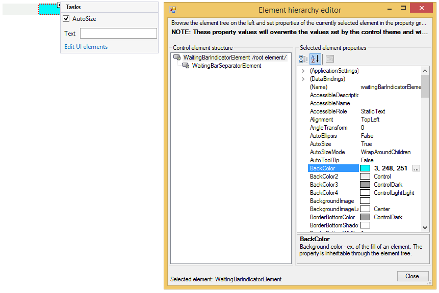
You can access and modify the style for different elements in RadWaitingBar by using the Element hierarchy editor.
Fig.1 Element hierarchy editor
Programmatically
You can customize the nested elements at run time as well:
Fig.2 Customize elements
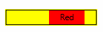
Customize elements
this.radWaitingBar1.WaitingIndicators[0].BackColor = Color.Aqua;
this.radWaitingBar1.WaitingIndicators[0].Text = "Aqua";
this.radWaitingBar1.WaitingIndicators[1].BackColor = Color.Red;
this.radWaitingBar1.WaitingIndicators[1].Text = "Red";
this.radWaitingBar1.WaitingBarElement.ContentElement.BorderColor = Color.Black;
this.radWaitingBar1.WaitingBarElement.ContentElement.BorderGradientStyle = Telerik.WinControls.GradientStyles.Solid;
this.radWaitingBar1.WaitingBarElement.ContentElement.DrawBorder = true;
this.radWaitingBar1.BackColor = Color.Yellow;Customizing RadWaitingBar
RadWaitingBar introduces a rich API which allows you to easily customize the visual appearance of RadWaitingBar programmatically. Below you will find scenarios that will increase your knowledge about RadWaitingBar's API, hence you will be able to customize it according to your requirements.
How to customize the text of RadWaitingBar
The text of RadWaitingBar is not displayed by default. To show the text, set the ShowText property of RadWaitingBar to true. To change the text content, use the Text property of RadWaitingBar. To customize the text orientation, set the AngleTransform property of the RadWaitingBarElement.TextElement. To modify the text position, change the TextAlignment property of RadWaitingBarElement.TextElement. Here is a sample snippet:
Customize the text of RadWaitingBar
this.radWaitingBar1.ShowText = true;
this.radWaitingBar1.Text = "Waiting...";
this.radWaitingBar1.WaitingBarElement.TextElement.AngleTransform = 180;
this.radWaitingBar1.WaitingBarElement.TextElement.TextAlignment = ContentAlignment.MiddleLeft;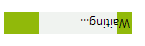
How to customize RadWaitingBar’s Dash style
To set the RadWaitingBar in dash style, set the WaitingStyle property to Dash. To customize the appearance of the stripes-pattern, you need to access the RadWaitingBarElement.SeparatorElement. Here is a sample scenario:
Customize RadWaitingBar’s Dash style
this.radWaitingBar1.WaitingStyle = Telerik.WinControls.Enumerations.WaitingBarStyles.Dash;
WaitingBarSeparatorElement dash = this.radWaitingBar1.WaitingBarElement.SeparatorElement;
dash.NumberOfColors = 2;
dash.BackColor = Color.Orange;
dash.BackColor2 = Color.Yellow;
dash.SweepAngle = 45;
dash.StepWidth = 15;
dash.SeparatorWidth = 10;
dash.GradientPercentage = 0.25f;
How to set Dash style only for the waiting indicators
The waiting indicators also support dash style. To customize the appearance of the indicators’ stripes-pattern, you need to access the SeparatorElements of all indicators. By default, the WaitingIndicators collection contains two indicators. Here is a sample scenario:
Waiting indicators' Dash style
this.radWaitingBar1.WaitingBarElement.WaitingIndicators[0].BackColor = Color.LightGreen;
this.radWaitingBar1.WaitingBarElement.WaitingIndicators[0].NumberOfColors = 1;
this.radWaitingBar1.WaitingBarElement.WaitingIndicators[1].BackColor = Color.LightGreen;
this.radWaitingBar1.WaitingBarElement.WaitingIndicators[1].NumberOfColors = 1;
WaitingBarSeparatorElement separator = ((WaitingBarIndicatorElement)this.radWaitingBar1.WaitingBarElement.WaitingIndicators[0]).SeparatorElement;
WaitingBarSeparatorElement helpSeparator = ((WaitingBarIndicatorElement)this.radWaitingBar1.WaitingBarElement.WaitingIndicators[1]).SeparatorElement;

separator.Dash = true;
helpSeparator.Dash = true;

separator.NumberOfColors = 2;
separator.BackColor = Color.Orange;
separator.BackColor2 = Color.Yellow;
separator.SweepAngle = 45;
separator.StepWidth = 15;
separator.SeparatorWidth = 10;
separator.GradientPercentage = 0.25f;

helpSeparator.NumberOfColors = 2;
helpSeparator.BackColor = Color.Orange;
helpSeparator.BackColor2 = Color.Yellow;
helpSeparator.SweepAngle = 45;
helpSeparator.StepWidth = 15;
helpSeparator.SeparatorWidth = 10;
helpSeparator.GradientPercentage = 0.25f;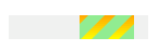
How to customize the shape of RadWatingBar
Different shapes can be applied to both the WaitingBarElement and the waiting indicator. In the following example the WaitingBarElement and the waiting indicator have elliptical shape:
Customize the shape of RadWatingBar
Telerik.WinControls.EllipseShape shape = new Telerik.WinControls.EllipseShape();
this.radWaitingBar1.WaitingBarElement.Shape = shape;
this.radWaitingBar1.WaitingBarElement.ContentElement.Shape = shape;
this.radWaitingBar1.WaitingBarElement.WaitingIndicators[0].Shape = shape;
this.radWaitingBar1.WaitingBarElement.WaitingIndicators[1].Shape = shape;