Working with RadCollapsiblePanel
This article demonstrates how RadCollapsiblePanel can be manipulated via its API.
Important Properties
ExpandDirection - Indicates the direction of the expand animation. The collapse animation is in the opposite direction.
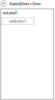
RadDirection.Down
this.radCollapsiblePanel1.ExpandDirection = RadDirection.Down;
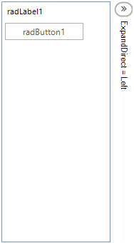
RadDirection.Left
this.radCollapsiblePanel1.ExpandDirection = RadDirection.Left;
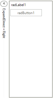
RadDirection.Right
this.radCollapsiblePanel1.ExpandDirection = RadDirection.Right;
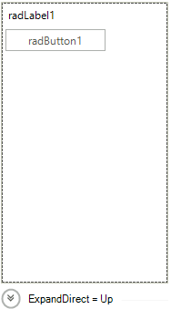
RadDirection.Up
this.radCollapsiblePanel1.ExpandDirection = RadDirection.Up;
EnableAnimation - Indicates whether to use animation to expand or collapse the control.
this.radCollapsiblePanel1.EnableAnimation = false;
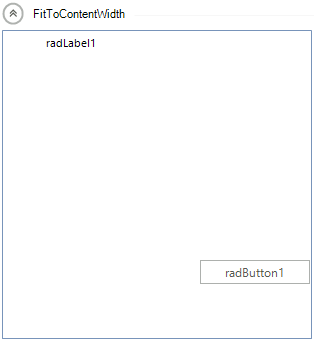
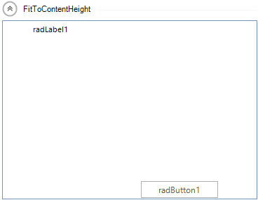
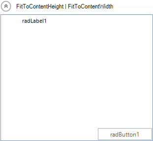
ContentSizingMode - Indicates whether the controls container will resize to fit the width or the height of its content.
this.radCollapsiblePanel1.ContentSizingMode = CollapsiblePanelContentSizingMode.FitToContentWidth;
this.radCollapsiblePanel1.ContentSizingMode = CollapsiblePanelContentSizingMode.FitToContentHeight;
this.radCollapsiblePanel1.ContentSizingMode = CollapsiblePanelContentSizingMode.FitToContentWidth | CollapsiblePanelContentSizingMode.FitToContentHeight;
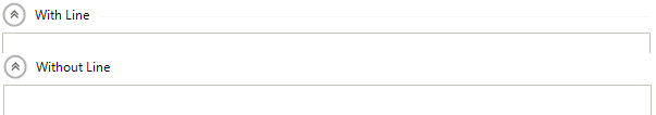
ShowHeaderLine - If true, a line will be displayed in the header which will fill the available space, otherwise it will not be displayed.
HorizontalHeaderAlignment -Determines how the elements in the header to be aligned when it is in a horizontal position:
-
Center
-
Right
-
Left
-
Stretch
VerticalHeaderAlignment - Determines how the elements in the header to be aligned when it is in a vertical position:
-
Center
-
Bottom
-
Top
-
Stretch
AnimationType - Determines the type of the animation when expanding or collapsing the control:
-
Reveal

-
Slide