Themes
This help article will demonstrate a step by step tutorial how to customize the ControlDefault theme for RadTextBoxControl.
-
Open Visual Style Builder
-
Export the built-in themes in a specific folder by selecting
File>>Export Built-in Themes. -
Load a desired theme from the just exported files by selecting
File>>Open Package. -
Expand RadTextBoxControl and select
RadTextBoxControlElementand the select the Disabled state in theElement Stateswindow.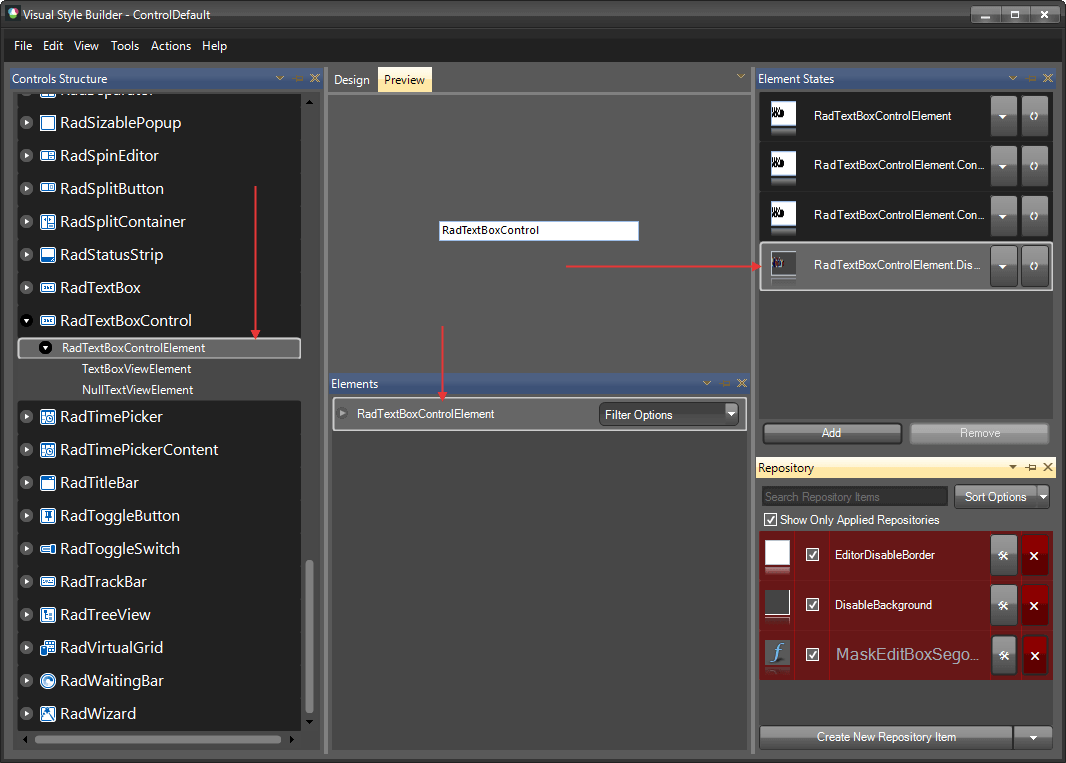
-
Open the
Edit Repository Itemdialog and change theBackColorand theGradientStyle: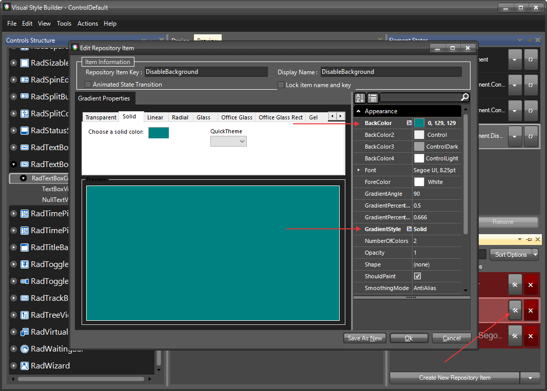
-
Select
RadTextBoxControland change the UseDefaultDisabledPaint property to false.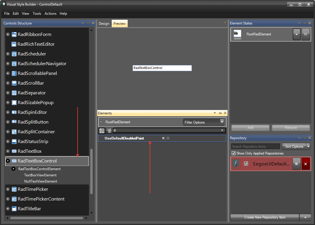
-
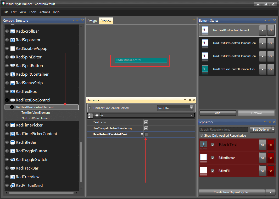
Go back to RadTextBoxControlElement and change the UseDefaultDisabledPaint for it as well.
The following article shows how you can use the new theme: Using Custom Themes.