New to Telerik UI for WinForms? Start a free 30-day trial
Properties
Updated over 1 year ago
| Property | Description | Result |
|---|---|---|
| RadioCheckAlignment | Gets or sets a value indicating the alignment of the radio button. | 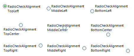 |
| Image | Gets or sets the image that is displayed on the radio button control. To add an image to RadRadioButton at design time, click on the Image property (the ellipsis button) to launch the Select Resource dialog. Use the Import button to load image files as a Local Resource, i.e. for that radio button only, or as a Project resource file where other components can share the same images. | 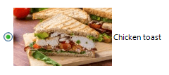 |
| TextImageRelation | Gets or sets the position of text and image relative to each other. Note that the value of this property is independent of the value of RadioCheckAlignment. Setting the RadioCheckAlignment property to MiddleRight and setting TextImageRelation to TextBeforeImage will result in the image being placed between the text and the check box. | 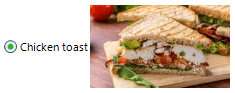 |
| Text | Gets or sets the text associated with the drop down button control. |  |
| DisplayStyle | Defines the display image and text style of an item. None: Specifies that neither image nor text is rendered. Text: Specifies that only text is rendered. Image: Specifies that only an image is rendered. ImageAndText: Specifies that both an image and text are to be rendered. | 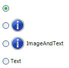 |
| ButtonElement | Gets the instance of RadRadioButtonElement wrapped by this control. RadRadioButtonElement is the main element in the hierarchy tree and encapsulates the actual functionality of RadRadioButton. | |
| ToggleState | Gets or sets the toggle state. Toggle state enumeration defines the following values: Off, Indeterminate, and On. | |
| CheckState * | Gets or sets the check state. Check state enumeration defines the following values: Uncheck, Indeterminate, and Check. | |
| AutoCheck | Gets or sets a value indicating whether the IsChecked value and the appearance of the control automatically change when the control is clicked. |
AutoCheck property is available as of R3 2023. When the RadRadioButton is part of a group and the AutoCheck property is set to true, this ensures that only one radio button is checked at a given time. If the AutoCheck property is set to false, the group of buttons will not act as a mutually exclusive group and the IsChecked property should be updated in code.
Methods
| Method | Description |
|---|---|
| PerformClick | Generates a Click event for a radio button. |
Events
| Event | Description |
|---|---|
| ToggleStateChanging | Occurs before the item's toggle state changes. |
| ToggleStateChanged | Occurs when the elements's state changes. |
| CheckStateChanging | Occurs before the elements's check state changes. |
| CheckStateChanged | Occurs when the elements's check state changes. |
Due to the specifics of the simple data binding we have introduced the CheckStateChanging and CheckStateChanged events together with the CheckState property. These events and property provide the same functionality as the ToggleStateChanged, ToggleStateChanging and the ToggleState property, but give you the ability to simple data bind the control.