New to Telerik UI for .NET MAUI? Start a free 30-day trial
.NET MAUI Scheduler Header Styling
Updated over 1 year ago
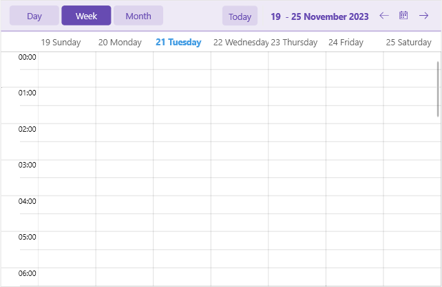
The .NET MAUI Scheduler component comes with built-in styling options that allow you to customize the appearance of its header.
You can style separately the header border, header labels, navigation buttons and more. Here is a list of the available header style properties of the Scheduler:
HeaderBorderStyle—Applies styles such as border thickness and color to the header.HeaderLabelStyle—Applies styles such as TextColor, FontSize, etc to the label displaying the visible range in the header.IncreaseVisibleRangeButtonStyleandDecreaseVisibleRangeButtonStyle—Apply styles to the buttons used for navigating the view (only desktop).TodayButtonStyle—Defines style for the Today button.HeaderIndicatorLabelStyle—Sets style to the label used for showing the popup for date selection (mobile only).ViewDefinitionHeaderItemStyleandActiveViewDefinitionHeaderItemStyle—Apply styles to the available views and active view headers.
The following example demonstrates how to apply custom header styles to the Scheduler:
1. Define the Scheduler:
XAML
<telerik:RadScheduler x:Name="scheduler"
                      HeaderBorderStyle="{StaticResource HeaderBorderStyle}"
                      HeaderLabelStyle="{StaticResource HeaderLabelStyle}"
                      IncreaseVisibleRangeButtonStyle="{StaticResource IncreaseVisibleRangeButtonStyle}"
                      DecreaseVisibleRangeButtonStyle="{StaticResource DecreaseVisibleRangeButtonStyle}"
                      TodayButtonStyle="{StaticResource TodayButtonStyle}"
                      HeaderIndicatorLabelStyle="{StaticResource HeaderIndicatorLabelStyle}"
                      ViewDefinitionHeaderItemStyle="{StaticResource ViewDefinitionHeaderItemStyle}"
                      ActiveViewDefinitionHeaderItemStyle="{StaticResource ActiveViewDefinitionHeaderItemStyle}"
                      ActiveViewDefinitionIndex="1">
    <telerik:RadScheduler.ViewDefinitions>
        <telerik:DayViewDefinition />
        <telerik:WeekViewDefinition />
        <telerik:MonthViewDefinition />
    </telerik:RadScheduler.ViewDefinitions>
</telerik:RadScheduler>
2. Add the custom styles to the page's resources:
XAML
<Style TargetType="telerik:RadBorder" x:Key="HeaderBorderStyle">
    <Setter Property="BackgroundColor" Value="#EEEAF6" />
    <Setter Property="BorderBrush" Value="#C3B4DF" />
    <Setter Property="BorderThickness" Value="0, 0, 0, 2" />
</Style>
<Style TargetType="Label" x:Key="HeaderLabelStyle">
    <Setter Property="TextColor" Value="#674BB2" />
    <Setter Property="FontAttributes" Value="Bold" />
</Style>
<Style TargetType="Button" x:Key="IncreaseVisibleRangeButtonStyle">
    <Setter Property="Text" Value="{x:Static telerik:TelerikFont.IconForward}" />
    <Setter Property="TextColor" Value="#674BB2" />
</Style>
<Style TargetType="Button" x:Key="DecreaseVisibleRangeButtonStyle">
    <Setter Property="Text" Value="{x:Static telerik:TelerikFont.IconBack}" />
    <Setter Property="TextColor" Value="#674BB2" />
</Style>
<Style TargetType="Button" x:Key="TodayButtonStyle">
    <Setter Property="TextColor" Value="#674BB2" />
    <Setter Property="BackgroundColor" Value="{OnPlatform Default=#66C3B4DF, Android=Transparent, iOS=Transparent}" />
    <Setter Property="BorderWidth" Value="0" />
</Style>
<Style TargetType="Label" x:Key="HeaderIndicatorLabelStyle">
    <Setter Property="TextColor" Value="#674BB2" />
    <Setter Property="BackgroundColor" Value="#66C3B4DF" />
    <Setter Property="Clip">
        <EllipseGeometry RadiusX="12"
                         RadiusY="12"
                         Center="{OnPlatform Default='20, 20', iOS='22, 22'}" />
    </Setter>
</Style>
<Style TargetType="telerik:SchedulerDatePicker">
    <Setter Property="ButtonStyle">
        <Setter.Value>
            <Style TargetType="Button">
                <Setter Property="TextColor" Value="#674BB2" />
            </Style>
        </Setter.Value>
    </Setter>
</Style>
<Style TargetType="telerik:SchedulerDropDownButton">
    <Setter Property="ButtonStyle">
        <Setter.Value>
            <Style TargetType="Button">
                <Setter Property="TextColor" Value="#674BB2" />
                <Setter Property="FontAttributes" Value="Bold" />
            </Style>
        </Setter.Value>
    </Setter>
</Style>
<Style TargetType="telerik:NonVirtualizedItemsControlItemContainer" x:Key="ViewDefinitionHeaderItemStyle">
    <Setter Property="TextColor" Value="#674BB2" />
    <Setter Property="BackgroundColor" Value="{OnPlatform Default=#66C3B4DF, Android=Transparent, iOS=Transparent}" />
    <Setter Property="BorderThickness" Value="0" />
    <Setter Property="VisualStateManager.VisualStateGroups">
        <VisualStateGroupList>
            <VisualStateGroup Name="CommonStates">
                <VisualState Name="Normal" />
                <VisualState Name="Focused" />
                <VisualState Name="PointerOver" />
                <VisualState Name="Disabled">
                    <VisualState.Setters>
                        <Setter Property="telerik:NonVirtualizedItemsControlItemContainer.BackgroundColor" Value="Transparent" />
                        <Setter Property="telerik:NonVirtualizedItemsControlItemContainer.TextColor" Value="#61674BB2" />
                    </VisualState.Setters>
                </VisualState>
            </VisualStateGroup>
        </VisualStateGroupList>
    </Setter>
</Style>
<Style TargetType="telerik:NonVirtualizedItemsControlItemContainer" x:Key="ActiveViewDefinitionHeaderItemStyle">
    <Setter Property="TextColor" Value="{OnPlatform Default=White, Android=#674BB2}" />
    <Setter Property="BackgroundColor" Value="{OnPlatform Default=#674BB2, Android=#F8F8F8}" />
    <Setter Property="BorderThickness" Value="0" />
    <Setter Property="VisualStateManager.VisualStateGroups">
        <VisualStateGroupList>
            <VisualStateGroup Name="CommonStates">
                <VisualState Name="Normal" />
                <VisualState Name="Focused" />
                <VisualState Name="PointerOver">
                    <VisualState.Setters>
                        <Setter Property="telerik:NonVirtualizedItemsControlItemContainer.BackgroundColor" Value="#765CBA" />
                    </VisualState.Setters>
                </VisualState>
                <VisualState Name="Disabled">
                    <VisualState.Setters>
                        <Setter Property="telerik:NonVirtualizedItemsControlItemContainer.TextColor" Value="{OnPlatform Default=#61FFFFFF, Android=#61674BB2}" />
                    </VisualState.Setters>
                </VisualState>
            </VisualStateGroup>
        </VisualStateGroupList>
    </Setter>
</Style>