New to Telerik UI for .NET MAUI? Start a free 30-day trial
Tooltips
Updated on Jun 25, 2026
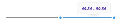
RangeSlider for .NET MAUI can display a tooltip to indicate the currently selected range to the end-user. The tooltip is shown as soon as the user starts dragging the start thumb, the range track or the end thumb.
Check below the customization options for the RangeSlider tooltip:
TooltipStringFormat(string)—Defines a custom string format that is used for displaying the content of the tooltip.TooltipContentTemplate(DataTemplate)—Sets a template or template selector that defines the content of the tooltip.TooltipControlTemplate(ControlTemplate)—Sets the control template of the tooltip that defines its overall appearance.
Check below a quick example with setting TooltipStringFormat and TooltipContentTemplate properties:
1. Add the custom DataTemplate to your page resources:
XAML
<DataTemplate x:Key="CustomTooltipTemplate">
    <Label Text="{Binding FormattedValue}"
           TextColor="{OnPlatform Default='#674BB2', Android='#EDEAF6', iOS='#EDEAF6'}"
           FontAttributes="Bold, Italic"
           Margin="5" />
</DataTemplate>
2. Define the RangeSlider:
XAML
<telerik:RadRangeSlider Minimum="0"
                        Maximum="100"
                        RangeStart="25"
                        RangeEnd="75"
                        TooltipStringFormat="{}{0:N2}"
                        TooltipContentTemplate="{StaticResource CustomTooltipTemplate}" />
Check the RangeSlider modified tooltip below: