New to Telerik UI for .NET MAUI? Start a free 30-day trial
.NET MAUI ListPicker DropDown Styling
Updated on Aug 29, 2025
By using the DropDownSettings property (of type Telerik.Maui.controls.PickerDropDownSettings) of the ListPicker, you can modify the appearance of the dropdown. The PickerDropDownSettings class exposes the following Style properties:
DropDownViewStyle(of typeStylewith target typetelerik:PickerDropDownContentView)—Defines the dropdown view style.FooterStyle(of typeStylewith target typetelerik:PickerPopupFooterView)—Defines the dropdown footer style.AcceptButtonStyle(of typeStylewith target typeButton)—Defines the Accept button style.CancelButtonStyle(of typeStylewith target typeButton)—Defines the Cancel button style.
The DropDownSettings also provides the following properties for dropdown customization:
Placement(of typePlacementMode)—Specifies the position of the dropdown, can be set to Bottom, Right, Left, Top, Center or Relative.HorizontalOffset\VerticalOffset—Specifies the horizontal\vertical distance between the dropdown and the ListPicker.IsFooterVisible(bool)—Specifies whether the DropDown footer is currently visible. By default, the value isTrue.AcceptButtonText(string)—Defines the text visualized for the Accept button. By default, the text isOK.CancelButtonText(string)—Defines the text visualized for the Cancel button. By default, the text isCancel.
Styling Examples
The following examples demonstrate how to define use the styling properties of the ListPicker.
Define the RadListPicker
XAML
<telerik:RadListPicker PickerMode="DropDown"
                       Placeholder="Pick a City Name!"
                       ItemsSource="{Binding Items}"
                       DisplayMemberPath="Name"
                       IsLooping="True"
                       DisplayStringFormat="You have picked: {0}"
                       AutomationId="listPicker">
    <telerik:RadListPicker.BindingContext>
        <local:CitiesViewModel/>
    </telerik:RadListPicker.BindingContext>
    <telerik:RadListPicker.DropDownSettings>
        <telerik:PickerDropDownSettings DropDownViewStyle="{StaticResource dropDownViewStyle}"
                                        FooterStyle="{StaticResource footerStyle}"
                                        AcceptButtonStyle="{StaticResource acceptButtonStyle}"
                                        CancelButtonStyle="{StaticResource cancelButtonStyle}"
                                        AcceptButtonText="{StaticResource acceptButtonText}"
                                        CancelButtonText="{StaticResource cancelButtonText}"/>
    </telerik:RadListPicker.DropDownSettings>
</telerik:RadListPicker>
Define the DropDownViewStyle
XAML
<Style TargetType="telerik:PickerDropDownContentView" x:Key="dropDownViewStyle">
    <Setter Property="BackgroundColor" Value="#E4FCFF"/>
</Style>
Define the FooterStyle
XAML
<Style TargetType="telerik:PickerPopupFooterView" x:Key="footerStyle">
    <Setter Property="BackgroundColor" Value="Transparent"/>
    <Setter Property="HeightRequest" Value="60"/>
</Style>
Define the AcceptButtonStyle
XAML
<Style TargetType="Button" x:Key="acceptButtonStyle">
    <Setter Property="BackgroundColor" Value="Transparent"/>
    <Setter Property="TextColor" Value="#1188FF"/>
</Style>
Define the CancelButtonStyle
XAML
<Style TargetType="Button" x:Key="cancelButtonStyle">
    <Setter Property="BackgroundColor" Value="Transparent"/>
    <Setter Property="TextColor" Value="#1188FF"/>
</Style>
In addition, add the following namespace:
XAML
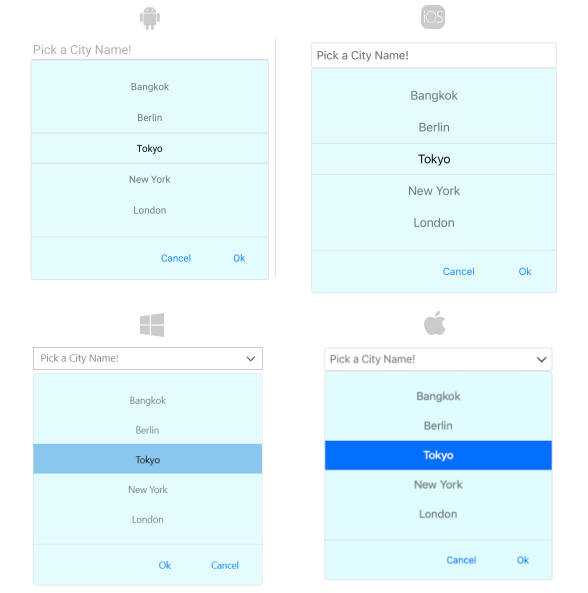
xmlns:telerik="http://schemas.telerik.com/2022/xaml/maui" The following image shows what the ListPicker control looks like when the styles described above are applied: