New to Telerik UI for .NET MAUI? Start a free 30-day trial
.NET MAUI DataForm Visual Structure
Updated on Jan 12, 2026
The visual structure of the .NET MAUI DataForm represents the anatomy of the UI component. Being familiar with the visual elements of the DataForm allows you to quickly find the information required to configure them.
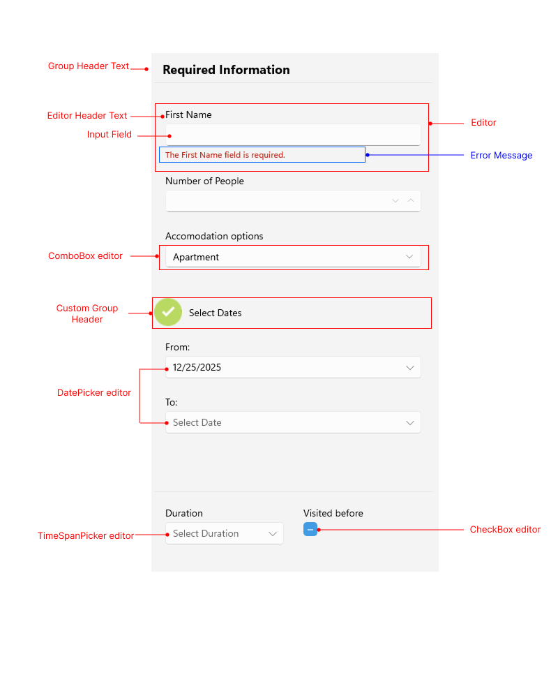
The following image shows the anatomy of the DataForm.

Displayed Elements
- Group Header Text—The text displayed above a group of editors.
- Editor Header Text—The text displayed above the editor input area.
- Input Field—The area where the user enters or selects a value for the editor.
- Editor—The editor in the DataForm control. The editor contains editor header text, the input area, and an optional error validation message.
- Custom Group Header—The header displayed above a group that is customized.
- Error Message—An error message displayed when the input does not match the required data.
- Different types of Editors—The DataForm supports various types of editors, such as
DatePicker,ComboBox,TimeSpanPicker,CheckBox, and more.