.NET MAUI CollectionView Item Swipe
Use the .NET MAUI CollectionView item swipe feature to reveal custom content when the user swipes an item. You can show action buttons, icons, or other views and use them for common scenarios such as update, archive, or delete operations.
This article explains how item swipe works, which properties control the behavior, and how to build a complete example with start and end swipe templates.
The following image shows swipe actions revealed on both sides of a CollectionView item:
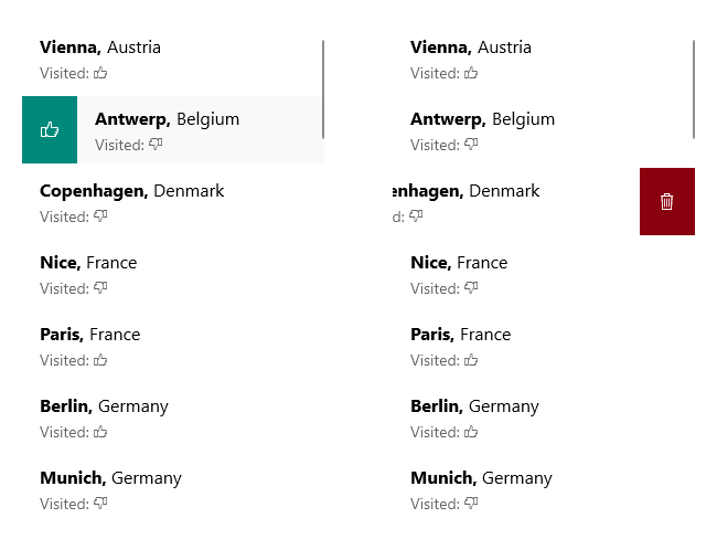
How Does CollectionView Item Swipe Work
When item swipe is enabled, the user swipes a CollectionView item to expose a template that contains custom content. The swipe direction depends on the CollectionView orientation:
- In a vertically oriented CollectionView,
StartSwipeTemplateappears on swipe right andEndSwipeTemplateappears on swipe left. - In a horizontally oriented CollectionView,
StartSwipeTemplateappears on swipe down andEndSwipeTemplateappears on swipe up.
Use this feature when you want quick item-level actions without opening a separate details screen or context menu.
Properties
Use the following RadCollectionView properties to configure item swipe:
IsItemSwipeEnabled(bool)—Indicates whether the items of the CollectionView can be swiped. The default value isFalse.SwipeThreshold(double)—Defines the length (in pixels) of the swipe gesture that is required to trigger the feature.StartSwipeLength(double)—Defines how far the item moves and remains open when the start swipe template is revealed.EndSwipeLength(double)—Defines how far the item moves and remains open when the end swipe template is revealed.StartSwipeTemplate(DataTemplate)—Defines the content shown for a swipe right in vertical orientation or a swipe down in horizontal orientation.EndSwipeTemplate(DataTemplate)—Defines the content shown for a swipe left in vertical orientation or a swipe up in horizontal orientation.
If you want different actions on each side, define both swipe templates and set lengths that match the size of the content inside each template.
Methods
Use the following RadCollectionView method when you want to return the swiped item to its default position after the user taps an action:
- void
EndItemSwipe(boolisAnimated)—Moves the swiped item to its default position.
Call EndItemSwipe after the action completes when you want to close the swipe programmatically.
How Do You Create a CollectionView with Swipe Actions
The following example defines both StartSwipeTemplate and EndSwipeTemplate. In this sample, the start swipe template updates a property of the data item, while the end swipe template deletes the item.
- Add
StartSwipeTemplateandEndSwipeTemplatedata templates to the page resources:
<telerik:BoolToValueConverter x:Key="VisitedToIconConverter"
                              TrueValue="{x:Static telerik:TelerikFont.IconThumbsUp}"
                              FalseValue="{x:Static telerik:TelerikFont.IconThumbsDown}" />
<telerik:BoolToValueConverter x:Key="InvertedVisitedToIconConverter"
                              TrueValue="{x:Static telerik:TelerikFont.IconThumbsDown}"
                              FalseValue="{x:Static telerik:TelerikFont.IconThumbsUp}" />
<DataTemplate x:Key="StartSwipeItemTemplate">
    <Grid BackgroundColor="#00897B"
          HorizontalOptions="Fill"
          VerticalOptions="Fill">
        <Label FontFamily="{x:Static telerik:TelerikFont.Name}"
               FontSize="16"
               Text="{Binding Visited, Converter={StaticResource InvertedVisitedToIconConverter}}"
               TextColor="White"
               HorizontalTextAlignment="Center"
               VerticalTextAlignment="Center"
               Padding="10, 0" />
        <Grid.GestureRecognizers>
            <TapGestureRecognizer Tapped="VisitItemTapped" />
        </Grid.GestureRecognizers>
    </Grid>
</DataTemplate>
<DataTemplate x:Key="EndSwipeItemTemplate">
    <Grid BackgroundColor="#89000E"
          HorizontalOptions="Fill"
          VerticalOptions="Fill">
        <Label FontFamily="{x:Static telerik:TelerikFont.Name}"
               FontSize="16"
               Text="{x:Static telerik:TelerikFont.IconDelete}"
               TextColor="White"
               HorizontalTextAlignment="Center"
               VerticalTextAlignment="Center"
               Padding="10, 0" />
        <Grid.GestureRecognizers>
            <TapGestureRecognizer Tapped="DeleteItemTapped" />
        </Grid.GestureRecognizers>
    </Grid>
</DataTemplate>- Add the
CollectionViewdefinition and setIsItemSwipeEnabled:
<telerik:RadCollectionView x:Name="collectionView"
                           ItemsSource="{Binding Locations}"
                           IsItemSwipeEnabled="True"
                           StartSwipeTemplate="{StaticResource StartSwipeItemTemplate}"
                           EndSwipeTemplate="{StaticResource EndSwipeItemTemplate}"
                           StartSwipeLength="50"
                           EndSwipeLength="50"
                           SwipeThreshold="25">
    <telerik:RadCollectionView.ItemTemplate>
        <DataTemplate>
            <Grid RowDefinitions="Auto, Auto"
                  RowSpacing="4"
                  Padding="16, 8">
                <HorizontalStackLayout Spacing="4">
                    <Label Text="{Binding City, StringFormat='{0},'}"
                           FontSize="16"
                           FontAttributes="Bold" />
                    <Label Text="{Binding Country}"
                           FontSize="16" />
                </HorizontalStackLayout>
                <HorizontalStackLayout Grid.Row="1"
                                       Spacing="4">
                    <Label Text="Visited:"
                           TextColor="#99000000" />
                    <Label FontFamily="{x:Static telerik:TelerikFont.Name}"
                           Text="{Binding Visited, Converter={StaticResource VisitedToIconConverter}}"
                           TextColor="#99000000"
                           FontSize="12"
                           VerticalTextAlignment="Center" />
                </HorizontalStackLayout>
            </Grid>
        </DataTemplate>
    </telerik:RadCollectionView.ItemTemplate>
    <telerik:RadCollectionView.BindingContext>
        <local:ViewModel />
    </telerik:RadCollectionView.BindingContext>
</telerik:RadCollectionView>- Add the event handlers referenced by the swipe templates:
private void DeleteItemTapped(object sender, TappedEventArgs e)
{
    var item = ((View)sender).BindingContext as DataModel;
    if (item != null)
    {
        this.collectionView.EndItemSwipe(true, animationFinished: () =>
        {
            (this.collectionView.BindingContext as ViewModel).Locations.Remove(item);
        });
    }
}

private void VisitItemTapped(object sender, TappedEventArgs e)
{
    var item = ((View)sender).BindingContext as DataModel;
    if (item != null)
    {
        this.collectionView.EndItemSwipe(true);
        item.Visited = !item.Visited;
    }
}- Add the
ViewModelclass that exposes the item collection:
public class ViewModel : NotifyPropertyChangedBase
{
    public ViewModel()
    {
        this.Locations = new ObservableCollection<DataModel>
        {

            new DataModel { Country = "Austria", City = "Vienna", Visited = true },
            new DataModel { Country = "Belgium", City = "Antwerp" },
            new DataModel { Country = "Denmark", City = "Copenhagen" },
            new DataModel { Country = "France", City = "Nice" },
            new DataModel { Country = "France", City = "Paris", Visited = true },
            new DataModel { Country = "Germany", City = "Berlin", Visited = true },
            new DataModel { Country = "Germany", City = "Munich" },
            new DataModel { Country = "Germany", City = "Nuremberg", Visited = true },
            new DataModel { Country = "Italy", City = "Bari" },
            new DataModel { Country = "Italy", City = "Rome" },
            new DataModel { Country = "Netherlands", City = "Amsterdam" },
            new DataModel { Country = "Portugal", City = "Lisbon" },
            new DataModel { Country = "Spain", City = "Barcelona" },
            new DataModel { Country = "Spain", City = "Madrid" },
            new DataModel { Country = "United Kingdom", City = "London" },
            new DataModel { Country = "United Kingdom", City = "Manchester" },
            new DataModel { Country = "United States", City = "New York" },
            new DataModel { Country = "United States", City = "Los Angeles" },
            new DataModel { Country = "United States", City = "Chicago" },
            new DataModel { Country = "United States", City = "Boston" },
            new DataModel { Country = "United States", City = "San Francisco" },
            new DataModel { Country = "Canada", City = "Vancouver" },
            new DataModel { Country = "Brazil", City = "Rio de Janeiro" },
            new DataModel { Country = "Brazil", City = "Sao Paulo" },
            new DataModel { Country = "Argentina", City = "Buenos Aires" },
            new DataModel { Country = "Peru", City = "Lima", Visited = true },
            new DataModel { Country = "Colombia", City = "Bogota" },
            new DataModel { Country = "Bolivia", City = "La Paz" },
            new DataModel { Country = "Venezuela", City = "Caracas" },
            new DataModel { Country = "Chile", City = "Santiago" },
            new DataModel { Country = "China", City = "Hong Kong" },
            new DataModel { Country = "China", City = "Shanghai" },
            new DataModel { Country = "India", City = "Delhi" },
            new DataModel { Country = "Japan", City = "Tokyo", Visited = true },
            new DataModel { Country = "Japan", City = "Osaka" },
            new DataModel { Country = "Vietnam", City = "Hanoi" },
            new DataModel { Country = "Thailand", City = "Bangkok" },
            new DataModel { Country = "Thailand", City = "Phuket" },
            new DataModel { Country = "Nigeria", City = "Lagos" },
            new DataModel { Country = "Egypt", City = "Cairo" },
            new DataModel { Country = "Algeria", City = "Algiers" },
            new DataModel { Country = "Australia", City = "Sydney", Visited = true },
            new DataModel { Country = "Australia", City = "Melbourne" },
            new DataModel { Country = "New Zealand", City = "Auckland" },
            new DataModel { Country = "New Zealand", City = "Wellington" }
        };
    }

    public ObservableCollection<DataModel> Locations { get; set; }
}- Add the business object class used by the CollectionView items:
public class DataModel : NotifyPropertyChangedBase
{
    private string country;
    private string city;
    private bool visited;

    public string Country
    {
        get => this.country;
        set => this.UpdateValue(ref this.country, value);
    }

    public string City
    {
        get => this.city;
        set => this.UpdateValue(ref this.city, value);
    }

    public bool Visited
    {
        get => this.visited;
        set => this.UpdateValue(ref this.visited, value);
    }
}