Guide for Migrating from jQuery to Angular
Kendo UI is a component library built natively for four technologies—jQuery, Angular, React, and Vue. In this migration guide, you will find more details on how to migrate common features and functionalities from Kendo UI for jQuery to Kendo UI for Angular and the main differences between both suites.
Prerequisites
Before you can start using the Kendo UI components, you must consider some prerequisites—they are specific for each Kendo UI flavor.
Installing the jQuery and Angular Libraries
Naturally, the Kendo UI components depend on the library they were created for. Angular and jQuery have different installation procedures.
| jQuery Installation | Angular Installation |
|---|---|
You can start using jQuery in two ways:
| Installing Angular requires two steps:
|
Installing the Kendo UI Suites
The way you download and install Kendo UI for jQuery and Kendo UI for Angular is also different.
| Kendo UI for jQuery | Kendo UI for Angular |
|---|---|
| You can download Kendo UI for jQuery as a single package that includes all widgets, or you can skip some of the Kendo UI utilities and install only what your application requires. For more information, see the First Steps with Kendo UI for jQuery article. | Kendo UI for Angular uses a component-based architecture and consists of multiple packages that you install separately. For more information, see the Getting Started with Kendo UI for Angular article. In addition, all individual Kendo UI for Angular component packages provide their own Getting Started article with information about installing and using the components in the package. For example, refer to the Getting Started article of the Grid. |
Activating Your License Key
Both component suites are commercial libraries and require an active trial or commercial license.
| Kendo UI for jQuery | Kendo UI for Angular |
|---|---|
| Using any of the Kendo UI for jQuery components from the NPM or CDN distribution channels requires a script license registration. You can register an active trial or commercial license key. For more information about Kendo UI for jQuery licensing, see the dedicated licensing article. | Using any of the UI components from the Kendo UI for Angular library requires either a commercial license key or an active trial license key. To learn more, see the article on how to activate your license key in Angular applications. |
Versioning
Kendo UI for jQuery and Kendo UI for Angular suites track the component and framework changes differently.
| jQuery Versions | Angular Components Versions |
|---|---|
| Kendo UI for jQuery releases a single major version at the end of each quarter. The major release is followed by service packs that include new widgets, improvements, and bug fixes. This allows you to install all updates and widgets at once. For more details, refer to the Kendo UI for jQuery Release History. | Kendo UI for Angular releases the UI components through individual packages and their version numbers follow the rules of Semantic Versioning. All packages are released together with the same version reference. There is a dedicated change log page which contains information about the versions of all packages. For more details, check the Kendo UI for Angular Changelog. |
Working with the API
The API sections of both suites are in different places.
| Kendo UI for jQuery API | Kendo UI for Angular component API |
|---|---|
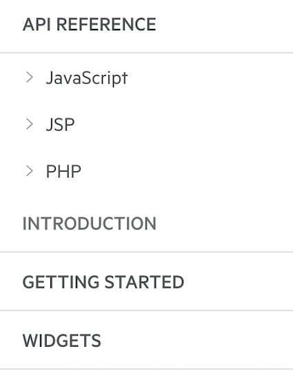
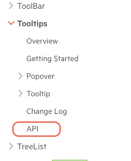
The Kendo UI for jQuery API documentation is accessible from the top of the side navigation bar. You can access the complete API from this single location.  | Because of the library architecture, the Kendo UI for Angular API is defined per package. The API documentation for each package is accessible from the side navigation bar and located at the bottom of the section dedicated to the respective package.  |
Data Binding
The differences in the libraries determine the way you bind the components to data.
| Kendo UI for jQuery | Kendo UI for Angular |
|---|---|
The Kendo UI for jQuery widgets utilize JSON configuration objects | The Kendo UI for Angular components use the mechanics of the Angular framework, and most configuration options are passed as input properties. |
Let's define a basic Grid component and compare both implementations.
Binding Kendo UI for jQuery Grid
You can bind local or remote data by using the dataSource.data property of the Grid or by utilizing the Kendo UI DataSource component as a mediator between the Grid and the underlying data. The DataSource plays a central role in all web applications built with Kendo UI for jQuery.
To define the columns, set the columns property of the Grid to a columns configuration array.
Using the dataSource.data property.
<script>
    $(document).ready(function() {
        $("#grid").kendoGrid({
            dataSource: {
                data: products,
            },
            columns: [
                { field: "ProductName", title: "Name"},
                { field: "UnitPrice", title: "Unit Price", format: "{0:c}", width: "130px" },
                { field: "UnitsInStock", title: "Units In Stock", width: "130px" }
            ]
        });
    });
</script>
Using the Kendo UI DataSource component.
<script>
$(document).ready(function () {
    var service = "https://demos.telerik.com/kendo-ui/service",
        dataSource = new kendo.data.DataSource({
          data: products,
        });
    $("#grid").kendoGrid({
        dataSource: dataSource,
        columns: [
            { field: "ProductName", title:"Name"},
            { field: "UnitPrice", title: "Unit Price", format: "{0:c}", width: "120px" },
            { field: "UnitsInStock", title:"Units In Stock", width: "120px" }],
    });
});
</script>
The products collection comes from the following content source:
<script src="../content/shared/js/products.js"></script>Binding Kendo UI for Angular Grid
All data-bound Kendo UI for Angular components provide a built-in data property that expects the data collection or an object representing the component data.
You can bind local or remote data to the Grid through the built-in data property of the component or the built-in data-binding directive. Learn more about the differences between using the data property and the binding directive.
Refer to the Columns Definition section for more information about the ways to define Data Grid columns.
@Component({
    selector: 'my-app',
    template: `
        <kendo-grid [data]="gridData">
            <kendo-grid-column field="ProductName" title="Name"> </kendo-grid-column>
            <kendo-grid-column field="UnitPrice" title="Price" format="{0:c}" [width]="130"> </kendo-grid-column>
            <kendo-grid-column field="UnitsInStock" title="Units In Stock" [width]="130"> </kendo-grid-column>
        </kendo-grid>
    `
})
The gridData is a field in the component containing the objects array.
export class AppComponent {
    public gridData: Product[] = [
        {
            ProductID: 1,
            ProductName: 'Chai',
            UnitPrice: 18,
            UnitsInStock:5,
            Category: {
                CategoryID: 1,
                CategoryName: 'Beverages'
            }
        },
        ...
    ];
}
Defining Templates
The templates help you customize different parts of a component and allow you to take full control over the content.
Using jQuery
Depending on the widget and the part that needs customization, the widgets expose different properties like template, headerTemplate, valueTemplate, and others.
For example, you can customize the Kendo UI for jQuery Grid cell values by setting the template property to:
-
a string that wraps the value in HTML.
html<script> $("#grid").kendoGrid({ columns: [ { field: "First Name", template: "<strong>#: name # </strong>" }], dataSource: [ { name: "Jane" }, { name: "John" } ] }); </script> -
a function that is returned by
kendo.template.html<script id="name-template" type="text/x-kendo-template"> <strong>#: name #</strong> </script> <script> $("#grid").kendoGrid({ columns: [ { field: "First Name", template: kendo.template($("#name-template").html()) }], dataSource: [ { name: "Jane" }, { name: "John" } ] }); </script> -
a function that returns a string.
html<script> $("#grid").kendoGrid({ columns: [ { field: "First Name", template: function(dataItem) { return "<strong>" + kendo.htmlEncode(dataItem.name) + "</strong>"; } }], dataSource: [ { name: "Jane" }, { name: "John" } ] }); </script>
Using Angular
To define a template, you must use the <ng-template> tag. This allows you to take full control over the rendered content in the respective component section.
For example, you can customize the header and footer of a Grid column by applying the kendoGridHeaderTemplate and kendoGridFooterTemplate directives on the <ng-template> tag.
<kendo-grid [data]="gridData">
    <kendo-grid-column field="ProductName" title="Name">
        <ng-template kendoGridHeaderTemplate>
            Custom title
        </ng-template>
        <ng-template kendoGridFooterTemplate>
            Custom footer
        </ng-template>
    </kendo-grid-column>
</kendo-grid>
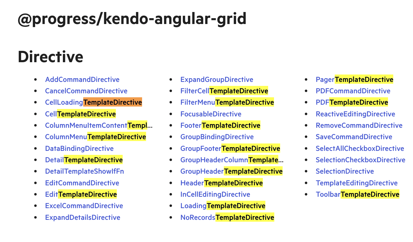
The templates of each Kendo UI for Angular component are documented in a separate article providing further details and examples of their usage. For a reference, check the Column Templates of the Grid.
You can find all templates of a certain component in its API section. The following screenshot highlights all templates of the Grid.
