or
4 answers
266 views
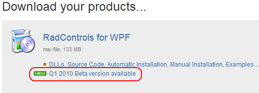
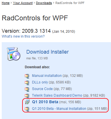
We are proud to announce the availability of Q1 2010 Beta release that
will give you a preview of what you can expect with the official Q1
release expected in March.
The Q1 2010 Beta release adds 3 interactive controls to the suite – RadMap, RadBook and RadTransition. Just like in the Silverlight suite, the 6 out-of-the box themes get a major facelift, and the performance of the suite is optimized through streamlining the templates and reducing assembly size. The Grid, Map, Chart and Scheduler controls implement serious new features.
Check ONLINE DEMOS
The downloads are now available in your account (or free trials): both full installation (MSI) or manual installation (ZIP)
Full details (release notes) can be found at: http://www.telerik.com/community/labs/radcontrols-for-wpf-q1-2010.aspx
For any questions, suggestions, etc, please use this forum thread. We will try to handle all your inquiries in a timely manner. You can also use the dedicated forums for the new controls - Book, Map and TransitionControl.

Boyan
Telerik team

answered
on
24 Feb 2010
4 answers
305 views
RadControls for WPF Q3 2009.
I have predefined GroupDescriptors in XAML on the RadGrid, to show a Particular Group at start.
However the AggregateFunctions do not show up on the Group Footers or Headers. The Group Footers also look broken, as some grid lines are missing.
In the UI, if a user removes the prefined GroupDescriptor, and creates a new group through the UI with the same Column, the AggregateFunctions do show up.
I have also attempted to do this through C#, and get the same results.
Is there a particular way of predefining the GroupDescriptors so the Column's AggregateFunctions show up in the Group Footer?
Additional question. Is there way of defining a Column AggregateFunction to only appear in the GroupFooter, and not the header without writing a new ControlTemplate for the GridViewGroupRow?
| public class Receipt : INotifyPropertyChanged |
| { |
| #region fields |
| string _source; |
| double _amount; |
| double _associatedAmount; |
| double _allocatedAmount; |
| double _availableAmount; |
| DateTime _receiptEffectiveDate; |
| string _receiptApplication; |
| #endregion |
| #region ctor |
| public Receipt() |
| { |
| } |
| public Receipt(string source, double amount, double associatedAmount, double allocatedAmount, double availableAmount, DateTime receiptEffectiveDate, string receiptApplication) |
| { |
| Source = source; |
| Amount = amount; |
| AssociatedAmount = associatedAmount; |
| AllocatedAmount = allocatedAmount; |
| AvailableAmount = AvailableAmount; |
| ReceiptEffectiveDate = receiptEffectiveDate; |
| ReceiptApplication = receiptApplication; |
| } |
| #endregion |
| #region properties |
| public string Source |
| { |
| get { return _source; } |
| set |
| { |
| _source = value; |
| NotifyPropertyChanged("Source"); |
| } |
| } |
| public double Amount |
| { |
| get { return _amount; } |
| set |
| { |
| _amount = value; |
| NotifyPropertyChanged("Amount"); |
| } |
| } |
| public double AssociatedAmount |
| { |
| get { return _associatedAmount; } |
| set |
| { |
| _associatedAmount = value; |
| NotifyPropertyChanged("AssociatedAmount"); |
| } |
| } |
| public double AllocatedAmount |
| { |
| get { return _allocatedAmount; } |
| set |
| { |
| _allocatedAmount = value; |
| NotifyPropertyChanged("AllocatedAmount"); |
| } |
| } |
| public double AvailableAmount |
| { |
| get { return _availableAmount; } |
| set |
| { |
| _availableAmount = value; |
| NotifyPropertyChanged("AvailableAmount"); |
| } |
| } |
| public DateTime ReceiptEffectiveDate |
| { |
| get { return _receiptEffectiveDate; } |
| set |
| { |
| _receiptEffectiveDate = value; |
| NotifyPropertyChanged("ReceiptEffectiveDate"); |
| } |
| } |
| public string ReceiptApplication |
| { |
| get { return _receiptApplication; } |
| set |
| { |
| _receiptApplication = value; |
| NotifyPropertyChanged("ReceiptApplication"); |
| } |
| } |
| #endregion |
| #region Interface INotifyPropertyChanged |
| public event PropertyChangedEventHandler PropertyChanged; |
| private void NotifyPropertyChanged(string propertyName) |
| { |
| if (PropertyChanged != null) |
| PropertyChanged(this, new PropertyChangedEventArgs(propertyName)); |
| } |
| #endregion |
| } |
| public Window2() |
| { |
| InitializeComponent(); |
| ObservableCollection<Receipt> list2 = new ObservableCollection<Receipt>(); |
| list2.Add(new Receipt("HELLO", 1123, 456, 1, 8, DateTime.Today, "B")); |
| list2.Add(new Receipt("HELLO", 2123, 456, 2, 7, DateTime.Today, "B")); |
| list2.Add(new Receipt("HELLO", 3123, 456, 3, 6, DateTime.Today, "C")); |
| list2.Add(new Receipt("HELLO", 4123, 456, 4, 5, DateTime.Today, "C")); |
| list2.Add(new Receipt("WORLD", 1123, 456, 5, 4, DateTime.Today, "A")); |
| list2.Add(new Receipt("WORLD", 2123, 456, 6, 3, DateTime.Today, "B")); |
| list2.Add(new Receipt("WORLD", 3123, 456, 7, 2, DateTime.Today, "C")); |
| list2.Add(new Receipt("WORLD", 4123, 456, 8, 1, DateTime.Today, "D")); |
| Binding binding = new Binding(); |
| binding.Source = list2; |
| uxRadGridView.SetBinding(RadGridView.ItemsSourceProperty, binding); |
| } |
| <telerik:RadGridView xmlns:telerik="http://schemas.telerik.com/2008/xaml/presentation" |
| AutoGenerateColumns="False" |
| CanUserFreezeColumns="False" |
| CanUserSortColumns="True" |
| CanUserInsertRows="True" |
| ShowGroupPanel="True" |
| ShowColumnFooters="True" |
| ShowGroupFooters="True" |
| AutoExpandGroups="True" |
| Grid.Row="1" x:Name="uxRadGridView" UseAlternateRowStyle="False" telerik:StyleManager.Theme="Office_Black"> |
| <telerik:RadGridView.GroupDescriptors> |
| <telerik:GroupDescriptor Member="Amount" /> |
| </telerik:RadGridView.GroupDescriptors> |
| <telerik:RadGridView.Columns> |
| <telerik:GridViewDataColumn IsFilterable="False" DataMemberBinding="{Binding Source}" /> |
| <telerik:GridViewDataColumn IsFilterable="False" DataMemberBinding="{Binding Amount}" /> |
| <telerik:GridViewDataColumn IsFilterable="False" Header="Associated Amount" DataMemberBinding="{Binding AssociatedAmount}" |
| DataFormatString="{}{0:c}" TextAlignment="Right" HeaderTextAlignment="Right" FooterTextAlignment="Right" > |
| <telerik:GridViewDataColumn.AggregateFunctions> |
| <telerik:SumFunction ResultFormatString="{}{0:c}" SourceField="AssociatedAmount" /> |
| </telerik:GridViewDataColumn.AggregateFunctions> |
| </telerik:GridViewDataColumn> |
| <telerik:GridViewDataColumn IsFilterable="False" Header="Allocated Amount" DataMemberBinding="{Binding AllocatedAmount}" |
| DataFormatString="{}{0:c}" TextAlignment="Right" HeaderTextAlignment="Right" FooterTextAlignment="Right" > |
| <telerik:GridViewDataColumn.AggregateFunctions> |
| <telerik:SumFunction ResultFormatString="{}{0:c}" SourceField="AllocatedAmount" /> |
| </telerik:GridViewDataColumn.AggregateFunctions> |
| </telerik:GridViewDataColumn> |
| <telerik:GridViewDataColumn IsFilterable="False" Header="Available Amount" DataMemberBinding="{Binding AvailableAmount}" |
| DataFormatString="{}{0:c}" TextAlignment="Right" HeaderTextAlignment="Right" FooterTextAlignment="Right" > |
| <telerik:GridViewDataColumn.AggregateFunctions> |
| <telerik:SumFunction ResultFormatString="{}{0:c}" SourceField="AvailableAmount" /> |
| </telerik:GridViewDataColumn.AggregateFunctions> |
| </telerik:GridViewDataColumn> |
| <telerik:GridViewDataColumn IsFilterable="False" Header="Receipt Effective Date" DataMemberBinding="{Binding ReceiptEffectiveDate}" /> |
| </telerik:RadGridView.Columns> |
| </telerik:RadGridView> |
Pavel Pavlov
Telerik team
answered
on
24 Feb 2010
1 answer
96 views
Dear team,
Is there any quick way, that I can completely style the default RadGrid control and also create my own theme in fly? I'm finding it very difficult to style them, since I'm not from development side... It will be great help, if you can send me any samples for this. I found out one (http://www.telerik.com/community/forums/wpf/gridview/authoring-own-theme.aspx), which I was looking for, but this is not working with the Q2 2009 .dlls
We are using Q2 2009 version, which is free for MSDN subscribers (http://www.telerik.com/community/promos/msdn-wpf.aspx)
Many thanks
Kalin Milanov
Telerik team
answered
on
24 Feb 2010
3 answers
88 views
I am getting an error trying to change my column collection after it has been previously loaded.
I am using as much of an MVVM approach as I can, to work around some of the gridview properties that aren't DependencyProperties i had to get a little creative. Everything was working fine, but it seems as if something in the last release(2009.3.1208.35) is causing an error.
I have a property in my ViewModel that is a GridViewColumnCollection. A multibinding converter is used to get the Columns property of the Grid and set it into the ViewModel( which is the Datacontext for the Grid)
My Grid is declared as such:
| <telerik:RadGridView Name="gridviewRecordList" Margin="0,2,2,2" ScrollMode="RealTime" AutoGenerateColumns="False" IsReadOnly="True" > |
| <telerik:RadGridView.ItemsSource> |
| <Binding Path="GetAllRecords" Mode="OneWay"/> |
| </telerik:RadGridView.ItemsSource> |
| <telerik:RadGridView.SelectedItem> |
| <Binding Path="CurrentRecord" Mode="Default"/> |
| </telerik:RadGridView.SelectedItem> |
| <telerik:RadGridView.ShowGroupPanel> |
| <Binding Path="CurrentListToolView.IsGroupingAllowed" Mode="TwoWay" UpdateSourceTrigger="PropertyChanged" /> |
| </telerik:RadGridView.ShowGroupPanel> |
| <telerik:RadGridView.ShowColumnFooters> |
| <Binding Path="CurrentListToolView.ShowColumnFooter" Mode="TwoWay" UpdateSourceTrigger="PropertyChanged" /> |
| </telerik:RadGridView.ShowColumnFooters> |
| </telerik:RadGridView> |
Here's the Xaml for the column binding converter:
| <Label.Content> |
| <MultiBinding> |
| <MultiBinding.Converter> |
| <local:ColumnConverter /> |
| </MultiBinding.Converter> |
| <Binding ElementName="gridviewRecordList" Path="DataContext" UpdateSourceTrigger="PropertyChanged"/> |
| <Binding ElementName="gridviewRecordList" Path="Columns" UpdateSourceTrigger="PropertyChanged"/> |
| </MultiBinding> |
| </Label.Content> |
| If o IsNot Nothing And o.GetType.BaseType Is GetType(ASISplitWindowVM) And values.Count = 2 Then |
| If values(1).GetType.BaseType Is GetType(GridViewColumnCollection) Then |
| Dim columnColl As GridViewColumnCollection = CType(values(1), GridViewColumnCollection) |
| Dim viewModel As ASISplitWindowVM = CType(o, ASISplitWindowVM) |
| viewModel.ColumnList = columnColl |
| viewModel.LoadListToolColumns() |
| End If |
| End If |
The LoadListToolColumns Method reads through saved column data and creates GridViewDataColumns to add to the ColumnList Object(which since the ColumnList and the GridView.Columns are the same object it will update the UI when the ColumnList is changed).
This was all working fine, and still does work fine the first time it runs, but if I call LoadListToolColumns to try to load a different set of columns( after doing a ColumnList.Clear() ). Then I get an error, it works without error using version 2009.3.1103.35.
This error is thrown after all my code has executed successfully:
| System.NullReferenceException was unhandled |
| Message=Object reference not set to an instance of an object. |
| Source=Telerik.Windows.Controls.GridView |
| StackTrace: |
| at Telerik.Windows.Controls.GridView.GridViewCellsPanel.SetDataGridCellPanelWidth(IList children, Double newWidth) |
| at Telerik.Windows.Controls.GridView.GridViewCellsPanel.ArrangeOverride(Size arrangeSize) |
| at System.Windows.FrameworkElement.ArrangeCore(Rect finalRect) |
| at System.Windows.UIElement.Arrange(Rect finalRect) |
| at MS.Internal.Helper.ArrangeElementWithSingleChild(UIElement element, Size arrangeSize) |
| at System.Windows.Controls.ItemsPresenter.ArrangeOverride(Size arrangeSize) |
| at System.Windows.FrameworkElement.ArrangeCore(Rect finalRect) |
| at System.Windows.UIElement.Arrange(Rect finalRect) |
| at System.Windows.Controls.Grid.ArrangeOverride(Size arrangeSize) |
| at System.Windows.FrameworkElement.ArrangeCore(Rect finalRect) |
| at System.Windows.UIElement.Arrange(Rect finalRect) |
| at System.Windows.Controls.Control.ArrangeOverride(Size arrangeBounds) |
| at System.Windows.FrameworkElement.ArrangeCore(Rect finalRect) |
| at System.Windows.UIElement.Arrange(Rect finalRect) |
| at System.Windows.Controls.Grid.ArrangeOverride(Size arrangeSize) |
| at System.Windows.FrameworkElement.ArrangeCore(Rect finalRect) |
| at System.Windows.UIElement.Arrange(Rect finalRect) |
| at System.Windows.ContextLayoutManager.UpdateLayout() |
| at System.Windows.ContextLayoutManager.UpdateLayoutCallback(Object arg) |
| at System.Windows.Media.MediaContext.InvokeOnRenderCallback.DoWork() |
| at System.Windows.Media.MediaContext.FireInvokeOnRenderCallbacks() |
| at System.Windows.Media.MediaContext.RenderMessageHandlerCore(Object resizedCompositionTarget) |
| at System.Windows.Media.MediaContext.RenderMessageHandler(Object resizedCompositionTarget) |
| at System.Windows.Threading.ExceptionWrapper.InternalRealCall(Delegate callback, Object args, Int32 numArgs) |
| at MS.Internal.Threading.ExceptionFilterHelper.TryCatchWhen(Object source, Delegate method, Object args, Int32 numArgs, Delegate catchHandler) |
| at System.Windows.Threading.DispatcherOperation.InvokeImpl() |
| at System.Windows.Threading.DispatcherOperation.InvokeInSecurityContext(Object state) |
| at System.Threading.ExecutionContext.runTryCode(Object userData) |
| at System.Runtime.CompilerServices.RuntimeHelpers.ExecuteCodeWithGuaranteedCleanup(TryCode code, CleanupCode backoutCode, Object userData) |
| at System.Threading.ExecutionContext.RunInternal(ExecutionContext executionContext, ContextCallback callback, Object state) |
| at System.Threading.ExecutionContext.Run(ExecutionContext executionContext, ContextCallback callback, Object state, Boolean ignoreSyncCtx) |
| at System.Threading.ExecutionContext.Run(ExecutionContext executionContext, ContextCallback callback, Object state) |
| at System.Windows.Threading.DispatcherOperation.Invoke() |
| at System.Windows.Threading.Dispatcher.ProcessQueue() |
| at System.Windows.Threading.Dispatcher.WndProcHook(IntPtr hwnd, Int32 msg, IntPtr wParam, IntPtr lParam, Boolean& handled) |
| at MS.Win32.HwndWrapper.WndProc(IntPtr hwnd, Int32 msg, IntPtr wParam, IntPtr lParam, Boolean& handled) |
| at MS.Win32.HwndSubclass.DispatcherCallbackOperation(Object o) |
| at System.Windows.Threading.ExceptionWrapper.InternalRealCall(Delegate callback, Object args, Int32 numArgs) |
| at MS.Internal.Threading.ExceptionFilterHelper.TryCatchWhen(Object source, Delegate method, Object args, Int32 numArgs, Delegate catchHandler) |
| at System.Windows.Threading.Dispatcher.InvokeImpl(DispatcherPriority priority, TimeSpan timeout, Delegate method, Object args, Int32 numArgs) |
| at MS.Win32.HwndSubclass.SubclassWndProc(IntPtr hwnd, Int32 msg, IntPtr wParam, IntPtr lParam) |
| at MS.Win32.UnsafeNativeMethods.DispatchMessage(MSG& msg) |
| at System.Windows.Threading.Dispatcher.PushFrameImpl(DispatcherFrame frame) |
| at System.Windows.Threading.Dispatcher.PushFrame(DispatcherFrame frame) |
| at System.Windows.Threading.Dispatcher.Run() |
| at System.Windows.Application.RunDispatcher(Object ignore) |
| at System.Windows.Application.RunInternal(Window window) |
| at System.Windows.Application.Run(Window window) |
| at System.Windows.Application.Run() |
| at MainUI.Application.Main() in C:\Documents and Settings\nicka.ASICSLOCAL\My Documents\Visual Studio 2010\Projects\Oasis 2010\Oasis\MainUI\obj\Debug\Application.g.vb:line 77 |
| at System.AppDomain._nExecuteAssembly(RuntimeAssembly assembly, String[] args) |
| at System.AppDomain.ExecuteAssembly(String assemblyFile, Evidence assemblySecurity, String[] args) |
| at Microsoft.VisualStudio.HostingProcess.HostProc.RunUsersAssembly() |
| at System.Threading.ThreadHelper.ThreadStart_Context(Object state) |
| at System.Threading.ExecutionContext.Run(ExecutionContext executionContext, ContextCallback callback, Object state, Boolean ignoreSyncCtx) |
| at System.Threading.ExecutionContext.Run(ExecutionContext executionContext, ContextCallback callback, Object state) |
| at System.Threading.ThreadHelper.ThreadStart() |
| InnerException: |
Any ideas?

Vlad
Telerik team
answered
on
24 Feb 2010
1 answer
119 views
Hi,
Attempt to set .Left and .Top property on RadWindow produces exception.
I’m trying to open modal RadWindow at the specific location on screen. The WindowStartupLocation is set to “Manual”. The code runs like this :
windowAdjustment.Left = _rightClickPoint.X;
windowAdjustment.Top = _rightClickPoint.Y;
windowAdjustment.ShowDialog();
It works perfectly the first time. But setting .Left property the second time causes exception “{“Object reference not set to an instance of an object"} System.Exception {System.NullReferenceException}”
The top of the stack trace :
at Telerik.Windows.Controls.RadWindowPopup.WindowPopupWindowFactory.WindowPopupWindowImpl.Move(Double left, Double top) in c:\Builds\...\Navigation\Window\WindowPopup\WindowPopupWindowImpl.cs:line 39
at Telerik.Windows.Controls.RadWindow.Move(Double x, Double y) in c:\Builds\...\Navigation\Window\RadWindow.cs:line 2028
at Telerik.Windows.Controls.RadWindow.OnLeftChanged(DependencyObject d, DependencyPropertyChangedEventArgs e) in c:\Builds\...\Navigation\Window\RadWindow.cs:line 1713
Any ideas anyone ?
Regards,
Sergey
Miroslav Nedyalkov
Telerik team
answered
on
24 Feb 2010
3 answers
447 views
Hi,
I just want to refresh single Radtreeview item instead of to refresh all items of a Radtreeview, can anyone tell me how?
Miroslav
Telerik team
answered
on
23 Feb 2010
2 answers
136 views
Q309 Prerelease build 1419 references components in unavailable build 1418
Just downloaded build 1419 from the website. The Telerik.Windows.Controls.Docking.dll references build 1418 which is not publicly available. Anyone know a workaround for this until we get another prerelease from Telerik?
Just downloaded build 1419 from the website. The Telerik.Windows.Controls.Docking.dll references build 1418 which is not publicly available. Anyone know a workaround for this until we get another prerelease from Telerik?
Hristo
Telerik team
answered
on
23 Feb 2010
3 answers
185 views
Hello,
In my application I add a usercontrol containing raddocking to the visual tree. When I remove this usercontrol from the visual tree it stays in memory because it seems that raddocking still has a reference to something. See example code below.
In my application I add a usercontrol containing raddocking to the visual tree. When I remove this usercontrol from the visual tree it stays in memory because it seems that raddocking still has a reference to something. See example code below.
| <UserControl xmlns:my="clr-namespace:Telerik.Windows.Controls;assembly=Telerik.Windows.Controls.Docking" x:Class="UserControl1" |
| xmlns="http://schemas.microsoft.com/winfx/2006/xaml/presentation" |
| xmlns:x="http://schemas.microsoft.com/winfx/2006/xaml" |
| xmlns:mc="http://schemas.openxmlformats.org/markup-compatibility/2006" |
| xmlns:d="http://schemas.microsoft.com/expression/blend/2008" |
| mc:Ignorable="d" |
| d:DesignHeight="300" d:DesignWidth="300"> |
| <Grid> |
| <my:RadDocking></my:RadDocking> |
| </Grid> |
| </UserControl> |
| <Window x:Class="MainWindow" |
| xmlns="http://schemas.microsoft.com/winfx/2006/xaml/presentation" |
| xmlns:x="http://schemas.microsoft.com/winfx/2006/xaml" |
| Title="MainWindow" Height="350" Width="525"> |
| <Grid> |
| <DockPanel Name="DockPanel1"> |
| <StackPanel Orientation="Horizontal" DockPanel.Dock="top" HorizontalAlignment="Center" VerticalAlignment="Top" > |
| <Button Name="Add" Click="Add_Click" Margin="5">Add</Button> |
| <Button Name="Remove" Click="Remove_Click" Margin="5" >remove</Button> |
| </StackPanel> |
| </DockPanel> |
| </Grid> |
| </Window> |
| Class MainWindow |
| Private uc As New UserControl1 |
| Private Sub Add_Click(ByVal sender As System.Object, ByVal e As System.Windows.RoutedEventArgs) |
| If Not DockPanel1.Children.Contains(uc) Then |
| DockPanel1.Children.Add(uc) |
| End If |
| End Sub |
| Private Sub Remove_Click(ByVal sender As System.Object, ByVal e As System.Windows.RoutedEventArgs) |
| If DockPanel1.Children.Contains(uc) Then |
| DockPanel1.Children.Remove(uc) |
| End If |
| uc = Nothing |
| End Sub |
| End Class |
Miroslav Nedyalkov
Telerik team
answered
on
23 Feb 2010
3 answers
127 views
hi,
i have this sample code:
| RadPane FormRadPane = new RadPane() { Header = "Not Document Pane", CanDockInDocumentHost = false }; |
| TextBlock txtBlock = new TextBlock(); |
| txtBlock.Text = "This Pane Cannot be docked in to document host"; |
| FormRadPane.Content = txtBlock; |
| RadPaneGroup NewPaneGroup = new RadPaneGroup(); |
| NewPaneGroup.Items.Add(FormRadPane); |
| RadSplitContainer FormSplitContainer = new RadSplitContainer(); |
| FormSplitContainer.InitialPosition = DockState.FloatingDockable; |
| FormSplitContainer.Items.Add(NewPaneGroup); |
| MainDockingControl.Items.Add(FormSplitContainer); |
i've put a breakpoint on the last code row.
in the immediate window in run time i write:
| FormSplitContainer.ChildrenOfType<RadPane>() |
and it i get no items i.e. "Items Count = 0".
meaning - the split container doesn't contain any panes.
is that a bug?
Miroslav Nedyalkov
Telerik team
answered
on
23 Feb 2010
3 answers
193 views
hi,
i have a simple DockControl XAML:
what happens is when i float (undock) all of the panes from the DocumentHost i can't dock them again in the DocumentHost
only dock them to four sides, the compass doesn't give me the option, it's like the DocumentHost Disappear when it has no Panes
docking inside it, is there a solution to this situation or do i have to make sure that a least on pane will stay in the DocumentHost
so i can dock to it?
thank so much in advance.
i have a simple DockControl XAML:
| <radDock:RadDocking FlowDirection="RightToLeft" DockPanel.Dock="Bottom"> |
| <radDock:RadDocking.DocumentHost> |
| <radDock:RadPaneGroup> |
| <radDock:RadPane Header="Bottom Docked Control - Pane #1" CanFloat="true"> |
| <TextBlock>Bottom Docked Control - Pane #1</TextBlock> |
| </radDock:RadPane> |
| <radDock:RadPane Header="Bottom Docked Control - Pane #2" CanFloat="true"> |
| <TextBlock>Bottom Docked Control - Pane #2</TextBlock> |
| </radDock:RadPane> |
| <radDock:RadPane Header="Bottom Docked Control - Pane #3" CanFloat="true"> |
| <TextBlock>Bottom Docked Control - Pane #3</TextBlock> |
| </radDock:RadPane> |
| </radDock:RadPaneGroup> |
| </radDock:RadDocking.DocumentHost> |
| </radDock:RadDocking> |
what happens is when i float (undock) all of the panes from the DocumentHost i can't dock them again in the DocumentHost
only dock them to four sides, the compass doesn't give me the option, it's like the DocumentHost Disappear when it has no Panes
docking inside it, is there a solution to this situation or do i have to make sure that a least on pane will stay in the DocumentHost
so i can dock to it?
thank so much in advance.
Konstantina
Telerik team
answered
on
23 Feb 2010


