or
3 answers
147 views
Hello,
In my project I'm using a custom collection which derrives from ObservableCollection, ex. CustomGanttCollection : ObservableCollection<CustomGanttTask>
This gives me the possibility to add some extra methods...
The same way as I declared my CustomGanttCollection
, I declared my custom gantt task as: CustomGanttTask : GanttTask
Now I thought using my CustomCollection as the Collection where the ChildTask are stored in by overriding the Children property of GanttTask in my CustomGantTask like:
Offcourse I do add some tasks in my ViewModel to the children...
Although this works (no compile errors, when I take a look at the Children property everything looks fine,...) the GanttView Component won't show me the childtasks.
Is there a way that I can use my custom collection as the children's collection? The GanttView must be able to use the collection as it already uses one for the top-level tasks...
In my project I'm using a custom collection which derrives from ObservableCollection, ex. CustomGanttCollection : ObservableCollection<CustomGanttTask>
This gives me the possibility to add some extra methods...
The same way as I declared my CustomGanttCollection
, I declared my custom gantt task as: CustomGanttTask : GanttTask
Now I thought using my CustomCollection as the Collection where the ChildTask are stored in by overriding the Children property of GanttTask in my CustomGantTask like:
private <span style="font-size: 14px;">CustomGanttCollection _children</span><br>public <span style="font-size: 14px;">CustomGanttCollection Children<br></span>{<br><span class="Apple-tab-span" style="white-space:pre"> </span>get<br><span class="Apple-tab-span" style="white-space:pre"> </span>{<br><span class="Apple-tab-span" style="white-space:pre"> </span>return _children;<br><span class="Apple-tab-span" style="white-space:pre"> </span>}<br>}Offcourse I do add some tasks in my ViewModel to the children...
Although this works (no compile errors, when I take a look at the Children property everything looks fine,...) the GanttView Component won't show me the childtasks.
Is there a way that I can use my custom collection as the children's collection? The GanttView must be able to use the collection as it already uses one for the top-level tasks...
10 answers
1.0K+ views
How do I set the ToolTip of a data cell to the content of the cell or at
least to a string based content, if the cell has a string-based
content?
This would be useful, if the cell width is to small to display the whole content.
I already have this style:
(I have labels as content in all my cells).
This works in principle, but I always get lots of data errors in the debug window output, because there seem to be some automatically generated cells who don't have my Label in it.
"
System.Windows.Data Error: 40 : BindingExpression path error: 'Text' property not found on 'object' ''String' (HashCode=757206908)'. BindingExpression:Path=Content.Text; DataItem='GridViewCell' (Name=''); target element is 'GridViewCell' (Name=''); target property is 'ToolTip' (type 'Object')
"
Any way to get rid of these errors?
Is there a better way to set the ToolTip of data cells to the content of cells?
Thanks
This would be useful, if the cell width is to small to display the whole content.
I already have this style:
<Style x:Key="CellStyle1" TargetType="{x:Type tk:GridViewCell}"> <Setter Property="ToolTip" Value="{Binding RelativeSource={RelativeSource Mode=Self}, Path=Content.Text}" /> </Style>(I have labels as content in all my cells).
This works in principle, but I always get lots of data errors in the debug window output, because there seem to be some automatically generated cells who don't have my Label in it.
"
System.Windows.Data Error: 40 : BindingExpression path error: 'Text' property not found on 'object' ''String' (HashCode=757206908)'. BindingExpression:Path=Content.Text; DataItem='GridViewCell' (Name=''); target element is 'GridViewCell' (Name=''); target property is 'ToolTip' (type 'Object')
"
Any way to get rid of these errors?
Is there a better way to set the ToolTip of data cells to the content of cells?
Thanks


1 answer
113 views
Hi!
I can set different color for each label with CreateItemStyleDelegate, could I do the same for the color of point marks of a line series?
I would specify the color of each point mark with databinding as I bind the point to it's value.
I can set different color for each label with CreateItemStyleDelegate, could I do the same for the color of point marks of a line series?
I would specify the color of each point mark with databinding as I bind the point to it's value.

Evgenia
Telerik team

answered
on
21 Jun 2013
1 answer
212 views
HI,
I use in my application a gridview with four buttons to delete and add a row and to save or cancel the edit. The delete and add buttons work perfectly but not the save insert/edit button. I don't understand where is the problem in my code, if someone could help.
This is my xaml :
I use in my application a gridview with four buttons to delete and add a row and to save or cancel the edit. The delete and add buttons work perfectly but not the save insert/edit button. I don't understand where is the problem in my code, if someone could help.
This is my xaml :
<Grid Name="indicatorPage" Visibility="Hidden" Margin="0,194,0,-194"> <Grid.RowDefinitions> <RowDefinition Height="Auto" /> <RowDefinition /> </Grid.RowDefinitions> <StackPanel Orientation="Horizontal" HorizontalAlignment="Center" Margin="0,5,0,0"> <telerik:RadButton Width="150" Content="Delete selected rows" Margin="0,0,5,0" Command="telerikGrid:RadGridViewCommands.Delete" CommandTarget="{Binding ElementName=gvIndicatorConf}" /> <telerik:RadButton Width="150" Content="Add new row" Margin="0,0,5,0" Command="telerikGrid:RadGridViewCommands.BeginInsert" CommandTarget="{Binding ElementName=gvIndicatorConf}" /> <telerik:RadButton Width="150" Content="Save insert/edit" Margin="0,0,5,0" Command="telerikGrid:RadGridViewCommands.CommitEdit" CommandTarget="{Binding ElementName=gvIndicatorConf}" /> <telerik:RadButton Width="150" Content="Cancel insert/edit" Command="telerikGrid:RadGridViewCommands.CancelRowEdit" CommandTarget="{Binding ElementName=gvIndicatorConf}" /> </StackPanel> <telerik:RadGridView x:Name="gvIndicatorConf" ItemsSource="{Binding IndicatorConf}" AddingNewDataItem="radGridView_AddingNewDataItem" Margin="0,5,0,0" Grid.Row="1" AutoGenerateColumns="False" telerik:StyleManager.Theme="Windows8" MaxHeight="7000" MaxWidth="1000"> <telerik:RadGridView.Columns> <telerik:GridViewColumn Width="90"> <telerik:GridViewColumn.CellTemplate> <DataTemplate> <telerik:RadButton Content="Delete" Command="telerikGrid:RadGridViewCommands.Delete" CommandParameter="{Binding}" /> </DataTemplate> </telerik:GridViewColumn.CellTemplate> </telerik:GridViewColumn> <telerik:GridViewDataColumn DataMemberBinding="{Binding Code}" Header="Code" UniqueName="Code" /> <telerik:GridViewDataColumn DataMemberBinding="{Binding Descritpion}" Header="Descritpion" UniqueName="Descritpion" /> <telerik:GridViewDataColumn DataMemberBinding="{Binding Connecter}" Header="Connecter" UniqueName="Connecter" IsReadOnly="True"/> <telerik:GridViewDataColumn DataMemberBinding="{Binding Period}" Header="Period" UniqueName="Period" /> </telerik:RadGridView.Columns> </telerik:RadGridView> </Grid>
Thanks !
Yoan
Telerik team
answered
on
21 Jun 2013
1 answer
154 views
I have a problem where after applying the Filter, it opens up all the nodes.
I am using FilterDescriptor.
We have a Huge Tree and we don't want the Tree and its children to open after applying the Filter. Any idea how to stop it from opening after applying the Filter?
I am not able to attach the project, but will attach the screen shot.
Here is code snippet.
I am using FilterDescriptor.
We have a Huge Tree and we don't want the Tree and its children to open after applying the Filter. Any idea how to stop it from opening after applying the Filter?
I am not able to attach the project, but will attach the screen shot.
Here is code snippet.
private void RadContextMenu_ItemClick(object sender, Telerik.Windows.RadRoutedEventArgs e) { if ((e.OriginalSource as RadMenuItem).Header.Equals("Show Spain")) { FilterDescriptor descriptor = new FilterDescriptor(); descriptor.Member = "Country"; descriptor.Operator = FilterOperator.IsEqualTo; descriptor.Value = "Spain"; this.RadTreeListView1.FilterDescriptors.Add(descriptor); } CompositeFilterDescriptor mainFilter = new CompositeFilterDescriptor(); if ((e.OriginalSource as RadMenuItem).Header.Equals("Show England")) { FilterDescriptor descriptor = new FilterDescriptor(); descriptor.Member = "Country"; descriptor.Operator = FilterOperator.IsEqualTo; descriptor.Value = "England"; mainFilter.FilterDescriptors.Add(descriptor); this.RadTreeListView1.FilterDescriptors.Add(mainFilter); } if ((e.OriginalSource as RadMenuItem).Header.Equals("Show England - France")) { mainFilter = new CompositeFilterDescriptor(); mainFilter.LogicalOperator = FilterCompositionLogicalOperator.Or; FilterDescriptor descriptor = new FilterDescriptor(); descriptor.Member = "Country"; descriptor.Operator = FilterOperator.IsEqualTo; descriptor.Value = "England"; mainFilter.FilterDescriptors.Add(descriptor); descriptor = new FilterDescriptor(); descriptor.Member = "Country"; descriptor.Operator = FilterOperator.IsEqualTo; descriptor.Value = "France"; mainFilter.FilterDescriptors.Add(descriptor); this.RadTreeListView1.FilterDescriptors.Add(mainFilter); } if ((e.OriginalSource as RadMenuItem).Header.Equals("Clear Filter")) { this.RadTreeListView1.FilterDescriptors.RemoveAt(0); } }
Yoan
Telerik team
answered
on
21 Jun 2013
1 answer
144 views
Is ist possible to set DocumentSource with an non local source?
Like e.g:
thx ...
Like e.g:
Me.pdfViewer.DocumentSource = New PdfDocumentSource(New Uri("http://195.243.234.82/download/6879-45_1_20130620_085341.pdf", UriKind.Absolute))thx ...
Alexander
Telerik team
answered
on
21 Jun 2013
10 answers
215 views
Hello!
Since I updated to 2010 Q1 my CellEditTemplate stopped working. I get an System.InvalidCastException when leaving the textbox.
My binding properties:
In my application I have an custom designed TextBox to prevent the user to enter invalid values, but the same exception appears for a regular Textbox.
This is extremly annoying that something stopped working when updating to a new and improved (?!) version.
//Anna
Since I updated to 2010 Q1 my CellEditTemplate stopped working. I get an System.InvalidCastException when leaving the textbox.
| <telerikGrid:RadGridView x:Name="ARVolymGridView" AutoGenerateColumns="False" ShowGroupPanel="False" ItemsSource="{Binding ARVolymer, Mode=OneWay, UpdateSourceTrigger=PropertyChanged}" > |
| <telerikGrid:RadGridView.Columns> |
| <telerikGrid:GridViewDataColumn DataMemberBinding="{Binding Sortiment, UpdateSourceTrigger=PropertyChanged}" Header="Sortiment"/> |
| <telerikGrid:GridViewDataColumn DataMemberBinding="{Binding Volym, Mode=TwoWay, UpdateSourceTrigger=PropertyChanged}" Header="M3f" > |
| <telerikGrid:GridViewDataColumn.CellEditTemplate> |
| <DataTemplate> |
| <TextBox Text="{Binding Volym, UpdateSourceTrigger=PropertyChanged, Mode=TwoWay}"/> |
| </DataTemplate> |
| </telerikGrid:GridViewDataColumn.CellEditTemplate> |
| </telerikGrid:GridViewDataColumn> |
| </telerikGrid:RadGridView.Columns> |
| </telerikGrid:RadGridView> |
My binding properties:
| public string Sortiment |
| { |
| get { return _arVolym.Sortiment; } |
| set |
| { |
| if (_arVolym.Sortiment != value) |
| { |
| _arVolym.Sortiment = value; |
| OnPropertyChanged("Sortiment"); |
| } |
| } |
| } |
| public int Volym |
| { |
| get { return _arVolym.Volym; } |
| set |
| { |
| if (_arVolym.Volym != value) |
| { |
| _arVolym.Volym = value; |
| OnPropertyChanged("Volym"); |
| } |
| } |
| } |
In my application I have an custom designed TextBox to prevent the user to enter invalid values, but the same exception appears for a regular Textbox.
This is extremly annoying that something stopped working when updating to a new and improved (?!) version.
//Anna
Maya
Telerik team
answered
on
21 Jun 2013
1 answer
124 views
I wonder if there is a way (other than feeding Log(x)) to render TreeMap charts to use logarithmic values?
I can feed the log(x) as the value but tooltips would not be equal even I'd convert the value using exp(x).
I can feed the log(x) as the value but tooltips would not be equal even I'd convert the value using exp(x).
Nikolay
Telerik team
answered
on
21 Jun 2013
1 answer
150 views
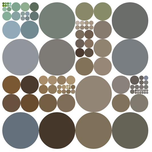
Can treemap chart be somehow modified to look like this using FillSceneGraph or something?
http://i.stack.imgur.com/aXuOb.png
http://i.stack.imgur.com/aXuOb.png
Nikolay
Telerik team
answered
on
21 Jun 2013
1 answer
146 views
I updated to the latest release of telerik controls using the control panel. I now have XAML error messages saying that there is a conflict between the Telerik versions that the project references and a referenced project references. Picture of error message attached. Do you have a suggestion as to how I can clean this up?
Both projects reference the same version of telerik controls.
Both projects reference the same version of telerik controls.
Yana
Telerik team
answered
on
21 Jun 2013


