
 Rank 1
I'm wondering if it is possible to set the rowstyle in a RadGridView according the containing data item. I was trying something like this:
| <UserControl.Resources> |
| <Style TargetType="{x:Type telerik:GridViewRow}"> |
| <Setter Property="Background" Value="#00FF00"/> |
| <Style.Triggers> |
| <DataTrigger Binding="{Binding RelativeSource={RelativeSource DataContext}, |
| Path=HighlightRow}" Value="True"> |
| <DataTrigger.Setters> |
| <Setter Property="Foreground" Value="#FF0000"/> |
| <Setter Property="FontSize" Value="14"/> |
| </DataTrigger.Setters> |
| </DataTrigger> |
| </Style.Triggers> |
| </Style> |
| </UserControl.Resources> |
but that does actually not succeed! I already found out, that the DataSource property of the GridViewRow does not contain the single row data, but the whole DataGrid data.
so, what would be the best was to do that?
Regards
Simon
19 Answers, 1 is accepted

You should bind the DataTrigger directly to the name of the property since the business object is the data context for the row. Here is how to do it (My business object is an email message with boolean Spam property):
| <Window x:Class="Ticket209422_RowStyleAccordingToDataItem.Window1" |
| xmlns="http://schemas.microsoft.com/winfx/2006/xaml/presentation" |
| xmlns:x="http://schemas.microsoft.com/winfx/2006/xaml" |
| xmlns:telerik="http://schemas.telerik.com/2008/xaml/presentation" |
| Title="Window1" Height="300" Width="300"> |
| <Grid> |
| <telerik:RadGridView Name="RadGridView1"> |
| <telerik:RadGridView.Resources> |
| <Style TargetType="{x:Type telerik:GridViewRow}"> |
| <Setter Property="Background" Value="#00FF00" /> |
| <Style.Triggers> |
| <DataTrigger Binding="{Binding Path=Spam}" Value="True"> |
| <DataTrigger.Setters> |
| <Setter Property="Background" Value="Red" /> |
| <Setter Property="Foreground" Value="#FF0000" /> |
| <Setter Property="FontSize" Value="14" /> |
| </DataTrigger.Setters> |
| </DataTrigger> |
| </Style.Triggers> |
| </Style> |
| </telerik:RadGridView.Resources> |
| </telerik:RadGridView> |
| </Grid> |
| </Window> |
I have attached the sample project that contains this. Please examine it and do not hesitate to contact us again if you have any other questions.
All the best,
Ross
the Telerik team
Instantly find answers to your questions on the new Telerik Support Portal.
Check out the tips for optimizing your support resource searches.
Rank 1
Thank you very much!
Simon
Rank 1
You need to bind to the DefaultView of the DataTable. Please, let me know if this does not help.
Best wishes,
Ross
the Telerik team
Instantly find answers to your questions on the new Telerik Support Portal.
Check out the tips for optimizing your support resource searches.
Rank 1
Thanks,
Reeta
Rank 1
Great example.
I have a related question-
Is it possible to change the style of just a single cell in a row, for instance change a cell's background to red
if its value is below zero ?
Thanks
Erez
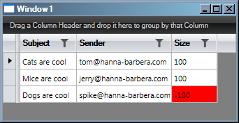
You can achieve this very easily. You need to turn of the auto-generation of columns for the grid. Then define the columns that you want to show. In the column of interest, set the GridViewDataColumn.CellStyle property. The Style that you are defining can be any according to your needs, but for the sake of example I have implemented it with a DataTrigger and and an IValueConverter.
In the sample that I have created, the grid is bound to a list of email messages. Each message has an integer property called Size. If the size is less than zero, my IValueConverter returns true which stands for error. The DataTrigger paints the cell red if it value is true, i.e. if we have an error. But you can extend this sample in any direction that you want.
Here is the business object:
| public class Message |
| { |
| public string Subject |
| { |
| get; |
| set; |
| } |
| public string Sender |
| { |
| get; |
| set; |
| } |
| public int Size |
| { |
| get; |
| set; |
| } |
| } |
Here is the SizeToErrorConverter:
| public class SizeToErrorConverter : IValueConverter |
| { |
| public object Convert(object value, Type targetType, object parameter, CultureInfo culture) |
| { |
| if ((int)value < 0) |
| { |
| // If the size is less than zero we have an error. |
| return true; |
| } |
| // Otherwise it is OK. |
| return false; |
| } |
| public object ConvertBack(object value, Type targetType, object parameter, CultureInfo culture) |
| { |
| throw new NotImplementedException(); |
| } |
| } |
And here is how to put it all together:
| <Window x:Class="Ticket209422_CellStyleAccordingToValue.Window1" |
| xmlns="http://schemas.microsoft.com/winfx/2006/xaml/presentation" |
| xmlns:x="http://schemas.microsoft.com/winfx/2006/xaml" |
| xmlns:telerik="http://schemas.telerik.com/2008/xaml/presentation" |
| xmlns:local="clr-namespace:Ticket209422_CellStyleAccordingToValue" |
| Title="Window1" Height="300" Width="300"> |
| <Grid> |
| <Grid.Resources> |
| <local:SizeToErrorConverter x:Key="MySizeToErrorConverter" /> |
| </Grid.Resources> |
| <telerik:RadGridView Name="grid" AutoGenerateColumns="False"> |
| <telerik:RadGridView.Columns> |
| <telerik:GridViewDataColumn HeaderText="Subject" |
| DataMemberBinding="{Binding Subject}" /> |
| <telerik:GridViewDataColumn HeaderText="Sender" |
| DataMemberBinding="{Binding Sender}" /> |
| <telerik:GridViewDataColumn HeaderText="Size" DataMemberBinding="{Binding Size}"> |
| <telerik:GridViewDataColumn.CellStyle> |
| <Style TargetType="telerik:GridViewCell"> |
| <Style.Triggers> |
| <DataTrigger Binding="{Binding Path=Size, Converter={StaticResource MySizeToErrorConverter}}" Value="True"> |
| <Setter Property="Background" Value="Red" /> |
| </DataTrigger> |
| </Style.Triggers> |
| </Style> |
| </telerik:GridViewDataColumn.CellStyle> |
| </telerik:GridViewDataColumn> |
| </telerik:RadGridView.Columns> |
| </telerik:RadGridView> |
| </Grid> |
| </Window> |
And you can see the result we will get when we run the sample application:
I have attached the sample project that I have prepared. Feel free to use it as a starting point. Please, do not hesitate to contact us again if you have any other questions.
Greetings,
Ross
the Telerik team
Instantly find answers to your questions on the new Telerik Support Portal.
Check out the tips for optimizing your support resource searches.
Rank 1
Guys, your service is f**king amazing !!!
Erez
Rank 1
One more thing- I'm trying to combine a cell tooltip with the a changing cell xaml.
When I add the line:
<Setter Property="ToolTip" Value="{Binding Content, RelativeSource={RelativeSource Self}}"/>
like so:
<telerik:RadGridView Name="grid" AutoGenerateColumns="False">
<telerik:RadGridView.Resources>
<Style TargetType ="{x:Type telerik:GridViewCell}">
<Setter Property="ToolTip" Value="{Binding Content, RelativeSource={RelativeSource Self}}"/>
</Style>
</telerik:RadGridView.Resources>
<telerik:RadGridView.Columns>
The the cell with the '-100' value does not change to red.
Thanks,
Erez
I might be able to solve it by putting a tooltip definition under each and every "telerik:GridViewDataColumn" however it seems
like a tiresome solution.
You can move the "red coloring" logic up to the ToolTip Style and in MySizeToErrorConverter decide whether to paint each cell red or not according to the value, since the style will now be applied to all cells and not only to cells in the intereger column. In the converter you can check whether the incoming value is integer for example. Or you can implement any other custom logic in the converter.
Alternatively, you can define a Style for each column.
Please, let me know if you have trouble implementing this scenario.
Best wishes,
Ross
the Telerik team
Instantly find answers to your questions on the new Telerik Support Portal.
Check out the tips for optimizing your support resource searches.
Rank 1
I took your first offer and moved the "red coloring logic" next to the tooltip with a slight change (pointing to self instead of to Size)
and also changed the logic in the converter (check if type is Int32).
Seems to work. Thanks!!!
E r e z
The XAML:
<Window x:Class="Ticket209422_CellStyleAccordingToValue.Window1"
xmlns="http://schemas.microsoft.com/winfx/2006/xaml/presentation"
xmlns:x="http://schemas.microsoft.com/winfx/2006/xaml"
xmlns:telerik="http://schemas.telerik.com/2008/xaml/presentation"
xmlns:local="clr-namespace:Ticket209422_CellStyleAccordingToValue"
Title="Window1" Height="300" Width="300">
<Grid>
<Grid.Resources>
<local:SizeToErrorConverter x:Key="MySizeToErrorConverter" />
</Grid.Resources>
<telerik:RadGridView Name="grid" AutoGenerateColumns="False">
<telerik:RadGridView.Resources>
<Style TargetType ="{x:Type telerik:GridViewCell}">
<Setter Property="ToolTip" Value="{Binding Content, RelativeSource={RelativeSource Self}}"/>
<Style.Triggers>
<DataTrigger Binding="{Binding Content, RelativeSource={RelativeSource Self}, Converter={StaticResource MySizeToErrorConverter}}" Value="True">
<Setter Property="Background" Value="Red" />
</DataTrigger>
</Style.Triggers>
</Style>
</telerik:RadGridView.Resources>
<telerik:RadGridView.Columns>
<telerik:GridViewDataColumn HeaderText="Subject"
DataMemberBinding="{Binding Subject}">
</telerik:GridViewDataColumn>
<telerik:GridViewDataColumn HeaderText="Sender"
DataMemberBinding="{Binding Sender}">
</telerik:GridViewDataColumn>
<telerik:GridViewDataColumn HeaderText="Size" DataMemberBinding="{Binding Size}">
</telerik:GridViewDataColumn>
</telerik:RadGridView.Columns>
</telerik:RadGridView>
</Grid>
</Window>
The SizeToErrorConverter class:
using System.Windows.Media;
namespace Ticket209422_CellStyleAccordingToValue
{
using System;
using System.Globalization;
using System.Windows.Data;
public class SizeToErrorConverter : IValueConverter
{
public object Convert(object value, Type targetType,
object parameter, CultureInfo culture)
{
// NEW CODE //
if (value == null || value.GetType() != typeof(Int32))
{
return false;
}
// NEW CODE END //
if ((int)value < 0)
{
// If the size is less than zero we have an error.
return true;
}
// Otherwise it is OK.
return false;
}
public object ConvertBack(object value, Type targetType,
object parameter, CultureInfo culture)
{
throw new NotImplementedException();
}
}
}
Rank 1
One other thing I noticed is that the trigger only "sticks" to cells that originally have a minus value in them.
If, for example, I change the Size value in the second row (row of jerry@hanna-barbera.com) to a minus value,
the color of the cell does not change to red.
However, if I change the value in the last row (the one with the -100) to a positive value and back to -100,
the red color vanishes and then reapear as expected.
Is this a bug in the grid ?
Thanks,
E r e z
We have found a little glitch in our GridViewCell class concerning local values of some properties being set, but we have managed to invent a very simple workaround for your case.
Just add another unconditional setter to the style which initializes the background color of the cell to Transparent and ensures that no local value will be set later on from our code:
| <Style TargetType="{x:Type telerik:GridViewCell}"> |
| <Setter Property="ToolTip" |
| Value="{Binding Content, RelativeSource={RelativeSource Self}}" /> |
| <Setter Property="Background" Value="Transparent" /> |
| <Style.Triggers> |
| <DataTrigger |
| Binding="{Binding Content, RelativeSource={RelativeSource Self}, Converter={StaticResource MySizeToErrorConverter}}" |
| Value="True"> |
| <Setter Property="Background" Value="Red" /> |
| <Setter Property="FontSize" Value="20" /> |
| </DataTrigger> |
| </Style.Triggers> |
| </Style> |
I have modified the sample project and tested it. Let me know whether it works on your side.
Sincerely yours,
Ross
the Telerik team
Instantly find answers to your questions on the new Telerik Support Portal.
Check out the tips for optimizing your support resource searches.
Rank 1
Hi Ross,
It works ! Thanks.
I have just a couple of related questions:
1) If I run the project and go to the cell with the (-100) value, put a positive value there and press the Tab key on the keyboard,
the value in the cell does not change. In order for the change to work, I have to press the Enter key.
Is this a bug ?
2) I cannot input minus values into the Size cells using the keyboard. The only way to do so is
to paste a minus value using the mouse right click.
Thanks,
Erez
The "tab" issue is a known bug and it has already been fixed. It should be working properly in the Q2 version which is only days away.
In order to input a negative value, you need to go to the beginning of the cell's text and enter the minus sign. To do this: double-click on the cell, click "Home" to go to the beginning and enter the minus sign.
Please, let me know if you have any other questions.
Greetings,
Ross
the Telerik team
Instantly find answers to your questions on the new Telerik Support Portal.
Check out the tips for optimizing your support resource searches.
Rank 1
I've also tried swapping out the binaries that were supplied with your example with the trial version of the Q2 release. It also seems that it is not efficient to apply the style to every cell in the grid when I want to just apply it to a single column.
I'd like to see an example that:
1) Applies styles to a specific column
2) Changes the foreground color
Thanks!
We have discovered a bug connected with the Foreground property and we will try to fix it as soon as possible. I hope that the fix will make its way in our internal build which is due this Friday. Please, excuse us for the inconvenience.
Regards,
Ross
the Telerik team
Instantly find answers to your questions on the new Telerik Support Portal.
Check out the tips for optimizing your support resource searches.
Rank 1
I'm wondering if the foreground bug is slated for fixing in the next release? I just ran into a similar issue where if I bind to Background everything works fine but if I bind to Foreground it doesn't work correctly.
For example, given the following style :
<Style x:Key="PositiveNegativeForegroundStyle" TargetType="{x:Type telerik:GridViewCell}">
<Setter Property="Foreground" Value="{Binding Content, RelativeSource={RelativeSource Self}, Converter={StaticResource SymbolGroupToNegativeColorConverter}}" />
</Style>
and the following converter code :
public object Convert(object value, Type targetType, object parameter, System.Globalization.CultureInfo culture)
{
string result = value as string;
if (result == null)
{
return null;
}
return result.StartsWith("-") ? Brushes.Red : Brushes.Cyan;
}
All negative numbered (string) cells should have a Foreground of Red and all positive numbered (string) cells should have a Foreground color of Cyan. It *seems* to work at first when you see the grid come up for the first time, but if you scroll up and down you will start to see issues where the color assignments are incorrect. However, if you modify the Setter property from "Foreground" to "Background" then the behavior is correct.
Regards,
Anthony
With the introduction of virtualization of RadGridView many things have changed. Containers (rows and cells) are recycled and reused. That is why the colors are messed up.
The correct way to do this is define a CellStyle for the column and through this CellStyle change the cell template. When you modify the cell template you can data bind its foreground to the property of interest through an IValueConverter that returns a Brush.
To demonstrate this I have prepared a very simple project that paints cells according to some property of the business object.
Below I have painted the important moments in yellow:
<Window x:Class="TicketID_209422_CellConditionalFormattingForeground.Window1" xmlns:telerik="http://schemas.telerik.com/2008/xaml/presentation" xmlns:local="clr-namespace:TicketID_209422_CellConditionalFormattingForeground" Title="Window1" Height="700" Width="600"> <Grid> <Grid.Resources> <local:PlayerPositionToBackgroundConverter x:Key="PlayerPositionToBackgroundConverter"/> <ControlTemplate x:Key="GridViewCellTemplate" TargetType="{x:Type telerik:GridViewCell}"> <Border x:Name="PART_CellBorder" Background="{TemplateBinding Background}" BorderBrush="{TemplateBinding BorderBrush}" BorderThickness="{TemplateBinding BorderThickness}"> <telerik:AlignmentContentPresenter x:Name="PART_ContentPresenter" HorizontalAlignment="{TemplateBinding HorizontalContentAlignment}" Margin="{TemplateBinding Padding}" VerticalAlignment="{TemplateBinding VerticalContentAlignment}" ClipToBounds="True" Visibility="Visible" Content="{TemplateBinding Content}" ContentTemplate="{TemplateBinding ContentTemplate}" Foreground="{Binding Converter={StaticResource PlayerPositionToBackgroundConverter}}" TextAlignment="{TemplateBinding TextAlignment}" TextDecorations="{TemplateBinding TextDecorations}" TextTrimming="{TemplateBinding TextTrimming}" TextWrapping="{TemplateBinding TextWrapping}"/> </Border> <ControlTemplate.Triggers> <Trigger Property="IsInEditMode" Value="True"> <Setter Property="Margin" TargetName="PART_ContentPresenter" Value="0"/> <Setter Property="VerticalAlignment" TargetName="PART_ContentPresenter" Value="Stretch"/> </Trigger> <Trigger Property="IsEnabled" Value="False"> <Setter Property="Background" TargetName="PART_CellBorder" Value="#FFEEEEEE"/> <Setter Property="BorderBrush" TargetName="PART_CellBorder" Value="#FFBBBBBB"/> <Setter Property="Foreground" TargetName="PART_ContentPresenter" Value="#FF6F6F6F"/> </Trigger> </ControlTemplate.Triggers> </ControlTemplate> <Style x:Key="GridViewCellStyle" TargetType="{x:Type telerik:GridViewCell}"> <Setter Property="Template" Value="{StaticResource GridViewCellTemplate}"/> </Style> </Grid.Resources> <telerik:RadGridView Name="playersGrid" AutoGenerateColumns="False" ColumnsWidthMode="Auto"> <telerik:RadGridView.Columns> <telerik:GridViewDataColumn Header="Name" DataMemberBinding="{Binding Name}"> </telerik:GridViewDataColumn> <telerik:GridViewDataColumn Header="Number" DataMemberBinding="{Binding Number}"> </telerik:GridViewDataColumn> <telerik:GridViewDataColumn Header="Position" DataMemberBinding="{Binding Position}" CellStyle="{StaticResource GridViewCellStyle}"> </telerik:GridViewDataColumn> <telerik:GridViewDataColumn Header="Country" DataMemberBinding="{Binding Country}"> </telerik:GridViewDataColumn> </telerik:RadGridView.Columns> </telerik:RadGridView> </Grid></Window>Best wishes,
Ross
the Telerik team
Instantly find answers to your questions on the new Telerik Support Portal.
Watch a video on how to optimize your support resource searches and check out more tips on the blogs.