or
1 answer
94 views
Would like to check if this chart is possible using kendo chart
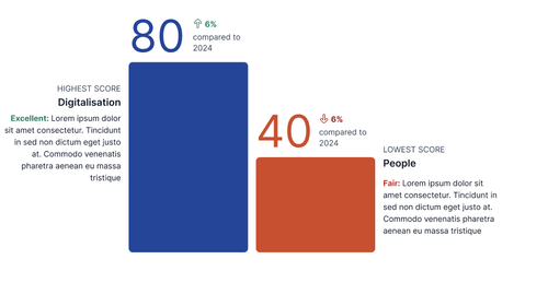
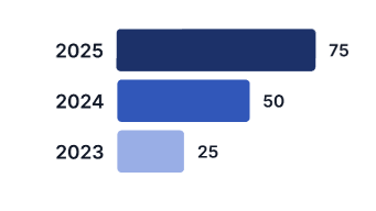
Normal scenario where there is score difference between current and previous year
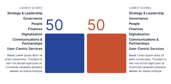
Scenario if multiple domains score the same for highest/ lowest score
Scenario if there is no change compared to the previous report 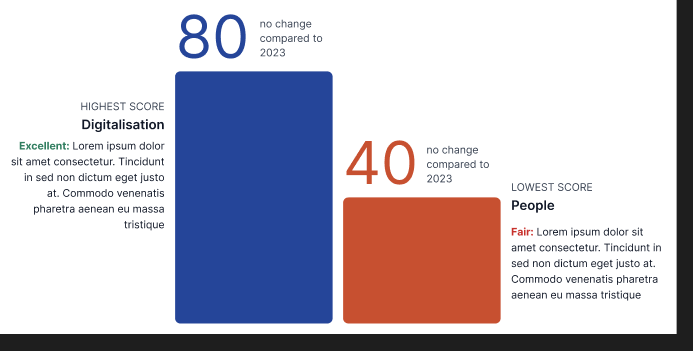
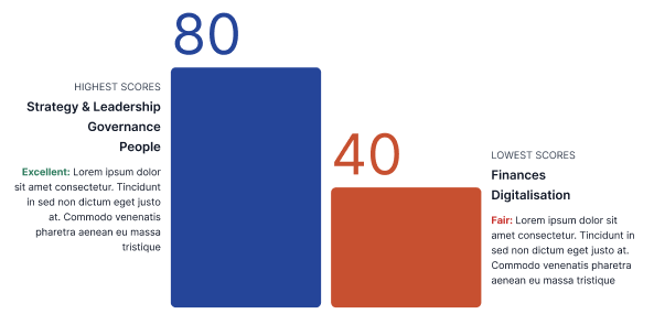
Scenario if all domains score the same for highest/ lowest score
Mobile display


Eyup
Telerik team

answered
on
24 Mar 2026
1 answer
100 views
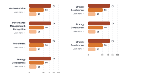
this image below is the expected outcome
dojo link of what i have done
chart will load upon clicking on the various buttons

1 answer
123 views
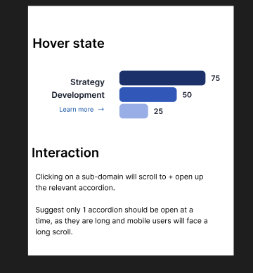
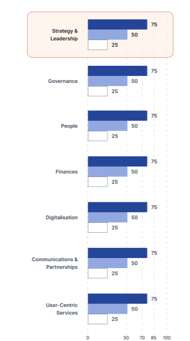
would like to check if the following chart layout is possbile for Kendo Bar chart?
and also i would like to have an onHover event that will change the chart color. for example if i hover on the category or chart for Strategy Development to change its color to like this

Neli
Telerik team
answered
on
26 Feb 2026
1 answer
187 views
Hi Telerik team!
I'm trying to scale my linechart by setting zoom Css property, but this is affecting mouse events and messing up the tooltip position and the marking wrong focused item.
As you can see here:
https://dojo.telerik.com/RQNGZUUK
So, is possible to scale linechart without affect mouse events?
Regards,
Gustavo

Nikolay
Telerik team
answered
on
22 Sep 2025
1 answer
209 views
Helllo
I have a Donut chart working well (see attachment). When I hover over it the category shows its tooltip. I would now to make the Donut clickable. When I click on a category an event would let me know the clicked category for taking further actions. Is something like that possible?


3 answers
119 views
i am trying to render my chart with rounded corner at the side. but cant seems to get it to work.
Expected result
Yordan
Telerik team
answered
on
12 Aug 2025
3 answers
134 views
1 answer
98 views
current chart is looking like this

I want to be able to scale the value axis based on the highest value in the data.
For example, if the highest value is 10,000
The value axis will show 0, 1, 2, 3, 4, 5, 6, 7, 8, 9, 10
The label to display Amount ($k)
1 answer
83 views
categoryaxis.labels.font and seriesDefault.labels.font string set not apply
Nikolay
Telerik team
answered
on
08 Jul 2025
1 answer
129 views
I have a kendo UI Jquery scatterplot chart with markers of type: square and rotation: 45. I'm trying to add a class based on the series to the markers so that certain ones can be styled to have a pointer when the user mouses over them. I found a few Google AI answers but they seem to be wrong. Here is what I tried where chartData is set to my series option on initialization.
Update: I added the class manually in dev tools and it still doesn't trigger the pointer to appear. This seems to be due to there being a separate marker that Kendo is creating in the DOM for the hover event which does not get the class. I need to add a cursor: pointer; style to that element
        chartData.push({
            name: legendSeriesName,
            xField: "x",
            yField: "y",
            data: storeDetailScatterPlotData
                .filter(d => d.seriesName === seriesName && d.accountId === storeDetailAccountId)
                .map(d => ({ x: d.sales, y: d.storeAmt, storeName: d.storeName, storeId: d.storeId, accountId: d.accountId })),
            zIndex: 10 - index,
            color: seriesColor,
            markers: {
                border: seriesColor,
                background: seriesColor,
                type: "square",
                rotation: 45,
                visual: function (e) {
                    var series = e.series.name;
                    var defaultVisual = e.createVisual();
                    defaultVisual.options.attr("class", series);
                    return defaultVisual;
                }
            }
        });
Neli
Telerik team
answered
on
18 Jun 2025


