how to create rounded corner for column chart

1 Answer 36 Views
Charts
Benjamin
Top achievements
Rank 3
Iron
Iron
Veteran
Benjamin asked on 29 May 2025, 07:55 AM

can't seems to find an example for creating column chart looking similar to the image

1 Answer, 1 is accepted

Sort by
0
Accepted
Nikolay
Telerik team
answered on 02 Jun 2025, 02:21 PM

Hello Benjamin,

This can be achieved with a custom visual function for the series.

Here is an example logic:

series: [{
            type: "column",
            data: [1, 2],
            visual: function (e) {
              var rect = e.rect,
                options = e.options.color;

              var curveDistance = rect.size.width / 4;
              var x = rect.origin.x;
              var y = rect.origin.y;
              var bottomRight = rect.bottomRight();
              var bottomRightX = bottomRight.x;
              var bottomRightY = bottomRight.y;
              var gradient = new kendo.drawing.LinearGradient({
                start: [0.5, 0],
                end: [0.5, 1],
                stops: [
                  {
                    offset: 0.3,
                    color: "#2587d0",
                    opacity: 0.6,
                  },
                  {
                    offset: 1,
                    color: "#2587d0",
                    opacity: 1,
                  },
                ],
              });

              var roundedRectPath = new kendo.drawing.Path({
                fill: gradient,
                stroke: {
                  color: "none",
                },
              })
                .moveTo(bottomRightX - curveDistance, y)
                .curveTo(
                  [bottomRightX, y],
                  [bottomRightX, y],
                  [bottomRightX, y + curveDistance],
                )
                .lineTo([bottomRightX, bottomRightY - curveDistance])
                .curveTo(bottomRight, bottomRight, [
                  bottomRightX - curveDistance,
                  bottomRightY,
                ])
                .lineTo([x + curveDistance, bottomRightY])
                .curveTo(
                  [x, bottomRightY],
                  [x, bottomRightY],
                  [x, bottomRightY - curveDistance],
                )
                .lineTo(x, y + curveDistance)
                .curveTo([x, y], [x, y], [x + curveDistance, y])
                .close();

              return roundedRectPath;
            }
          }]

Dojo demo: https://dojo.telerik.com/VZSjIgoF

Regards,
Nikolay
Progress Telerik

Love the Telerik and Kendo UI products and believe more people should try them? Invite a fellow developer to become a Progress customer and each of you can get a $50 Amazon gift voucher.

Benjamin
Top achievements
Rank 3
Iron
Iron
Veteran
commented on 06 Jun 2025, 09:09 AM | edited

Tried removing the gradient, but the column became white. How do I retain the original color?

created a dojo link with my current markup

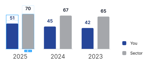
Can I also add how I position the legend to the bottom right outside the chart, similar to my image above?

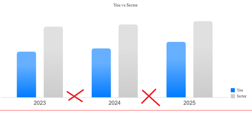
would like to also check how do I add the line to be something like this image

Jay
Top achievements
Rank 3
Iron
Iron
Veteran
commented on 10 Jun 2025, 04:30 PM | edited

How about something like this? Maybe one of the telerik people can suggest how to do the line without using the internals.
Nikolay
Telerik team
commented on 11 Jun 2025, 06:13 AM

Hi Jay,

That is a good approach, and I don't think I can give a better one.

Thank you for sharing it with the community. As a token of gratitude I added some Telerik point to your account.

Regards,

Nikolay

Jay
Top achievements
Rank 3
Iron
Iron
Veteran
commented on 11 Jun 2025, 02:59 PM

Hi Nikolay. Out of curiosity, why is slot() so far off from the box coordinates? I would have thought slot() would have been the way to go, or am I just misunderstanding what slot() is for?
Benjamin
Top achievements
Rank 3
Iron
Iron
Veteran
commented on 12 Jun 2025, 06:18 AM

hi. how to remove these lines?


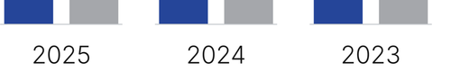
can the legend edges also be rounded? And the column filled color be same as the original color shown in my first image?

Jay
Top achievements
Rank 3
Iron
Iron
Veteran
commented on 12 Jun 2025, 11:48 AM | edited

For the lines, try reducing the size until the line matches what you want.

For the colors, they are what you had in your dojo link. If you want to change them, change them:

For the legend edges, there is a legend.item.markers.visual that can be used to create a custom visual for the markers, which has this kendo demo. However, when I removed type: "line" to make it a bar chart , the visual did not get invoked (dojo). I don't see anything that says the visual is limited to line type charts, but perhaps Nikolay can comment on that.

Benjamin
Top achievements
Rank 3
Iron
Iron
Veteran
commented on 13 Jun 2025, 01:24 AM

tried to make changes to the color. realized the chart seems to have the specified color and some white, in addition to the configured color.
Benjamin
Top achievements
Rank 3
Iron
Iron
Veteran
commented on 13 Jun 2025, 02:19 AM

hi. tried to itegrate to my code, but seems like having js exception which can't seems to find out what went wrong.

this is a dojo link with the exception

Jay
Top achievements
Rank 3
Iron
Iron
Veteran
commented on 13 Jun 2025, 12:56 PM

The exception is because the axis named "category" isn't found. You changed it to field in your dojo. If you change it back, as in

then the exception goes away.

Benjamin
Top achievements
Rank 3
Iron
Iron
Veteran
commented on 14 Jun 2025, 12:54 AM | edited

the field was there because the category value was taken from the json data source.

updated dojo link with field and name for category. the category line seems to be mis align

Jay
Top achievements
Rank 3
Iron
Iron
Veteran
commented on 16 Jun 2025, 11:56 AM

Yeah, you need to adjust the y offset, I had used a bigger font for the category labels in my original example.

Here is a dojo.

Tags
Charts
Asked by
Benjamin
Top achievements
Rank 3
Iron
Iron
Veteran
Answers by
Nikolay
Telerik team
Share this question
or