Will an Unconventional Navigation Placement Hurt Your Website?

Summarize with AI:
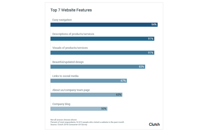
Weighing the top seven features on a website, 94% of people agree that “easy navigation” is the most important feature. How does the placement of navigation come into play?
Even if it’s the content, product inventory or information about services that attracts people to your website, many times it’s the main features of your site that make or break the experience.
According to a Clutch survey on the website features that people value the most, the overwhelming majority of people value the navigation more than anything else:
With the navigation being held in such high esteem, it’s probably safe to assume that web designers should just stick to traditional navigation patterns. Right?
Let’s see what the data has to say about unconventional navigation placement.
What’s the Ideal Placement for Your Website Navigation?
So long as the navigation contains the website’s primary pages, is well-organized and properly labeled, does it even matter where it appears on the website?
Honestly, it does. Because a website placed in an unconventional spot can affect:
- The speed and ease of navigation
- Content discoverability
- Task difficulty
And all this can lead to lower conversion rates and greater dissatisfaction.
Here are four different ways in which an ill-placed website menu can hurt the visitors’ experience:
1. Hidden vs. Visible Menu on Desktop
When we talk about “hidden” menus, what we’re talking about in this context are hamburger menus.
Now, there’s a very good reason why the hamburger menu was created when it was. Designers needed a better way to present the navigation on responsive websites. And this space-saving measure enabled them to do that.
Here’s the problem though: As mobile-first design takes a front seat, some web designers have taken this to mean that the mobile website’s design needs to be translated to desktop. The hamburger menu is one of the features that made the move over.
According to research by the Nielsen Norman Group, this causes big problems for websites and their visitors.
In its study, it compared three different types of navigation:
Hidden navigation like the one the Balenciaga website has in the top-right corner:

Combo navigation where popular pages or categories are present, but so is a hamburger button with a more expansive menu, like Fast Company has:

Visible navigation like the one Small Business Trends uses where all the main categories/pages are visible in the header:

Here’s what the study found:
| Hidden | Combo | Visible | |
|---|---|---|---|
| % sessions where navigation was used | 27% | 50% | 48% |
| Time to navigation | 31 sec. | 23 sec. | 26 sec. |
| Content discoverability without using search | 54% | 80% | 77% |
| Task difficulty on a scale of 1-7 | 2.6 | 2.3 | 2.1 |
| Average time to complete task | 75 sec. | 54 sec. | 50 sec. |
The hidden (hamburger) menu performed the worst on every metric. And, really, what this data tells us is that its design makes critical content discovery tasks very difficult. Not only that, but if the menu (even if it’s only a mini menu) isn’t visible, people don’t really think to interact with it at all.
The Verdict:
Pure and simple. Don’t use the hamburger menu as the sole navigational device on desktop.
If you have a large repository of content or items, use the main menu in the header to display the most popular and useful pages or categories and hide the rest under the hamburger menu. The combination of the two navigational elements will actually help you create a more concise and useful main menu.
2. Horizontal vs. Vertical Navigation Layout
Eye-tracking research has shown us time and time again that the left edge of the page is where visitors focus the majority of their attention. So, does that mean that a vertical, left-aligned navigation would perform better than the conventional horizontal one?
This is something that the Nielsen Norman Group has also explored. The study set out to determine where visitors’ eyes spent the most time on a web page.
Here’s what it found:
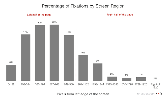
Notice how heavy the left side of the chart is. NNG found that 80% of all fixations on a web page took place on the left half of the screen.
It attributes the lower percentage in the 0-192 pixel region to one of two things: either the white space that commonly fills the left rail or the occasional usage of a left-aligned navigation.
Now, just because the vertical navigation sits in a spot with lower visibility than the rest of the content on the left side of a page, that doesn’t mean it won’t be used. It’s not like visitors spend the majority of their time in the navigation. If they did, you’d have just as big of a problem as you would if they didn’t use it at all.
So, we need to take a step back and look at this another way.
The Verdict:
There are a number of reasons why I think a vertical navigation could be just as effective as a horizontal one:
- Visitors’ eyes are automatically pulled to the left side of the page, so it won’t be hard to find.
- Vertical navigations are always visible, so there’ll be fewer issues with discoverability and usability.
- Users are more than familiar and comfortable with left-aligned menus in web apps, so it should be easy enough to pick up on a website.
There’s just one thing I’d suggest. Take a look at the Mohegan Sun navigation:
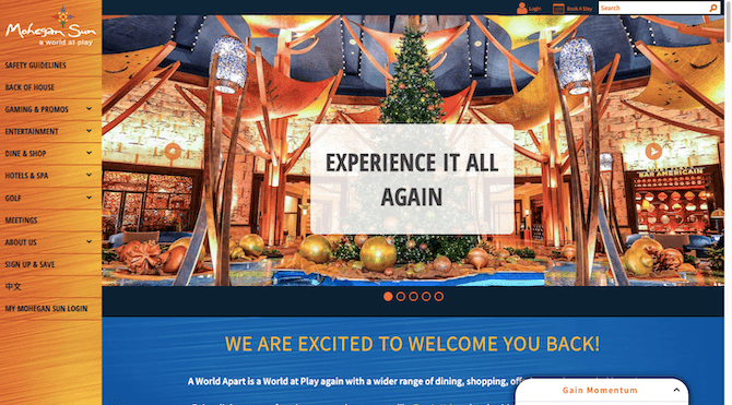
The vertical navigation looks good as it stands. However, whenever one of those drop-down menus is opened, it forces a scroller to appear:
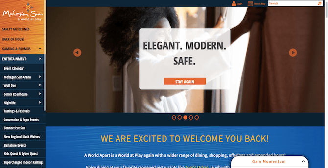
Because of the amount of content stored in this menu, visitors will have to scroll to find all of it. Not only is this annoying, but it might cause confusion and frustration when they try to scroll down the page only to see the menu scroll instead, or vice versa.
So, if your website doesn’t have a simple, single-level site structure, the vertical navigation isn’t a good idea.
3. Top vs. Bottom Navigation on Mobile Sites and PWAs
We’ve already seen that the hamburger menu isn’t a good option for desktop websites. But what about mobile?
The study we looked at before from the Nielsen Norman Group analyzed how the hamburger menu performed on mobile, too. However, because it’s not common to display a visible menu on mobile, it could only analyze the results between the combo and hidden navigation.
Unsurprisingly, the combo navigation design performed the best:
| Hidden | Combo | |
|---|---|---|
| % sessions where navigation was used | 57% | 86% |
| Time to navigation | 26 sec. | 24 sec. |
| Content discoverability without using search | 64% | 85% |
| Task difficulty on a scale of 1-7 | 2.6 | 2.3 |
| Average time to complete task | 70 sec. | 61 sec. |
However, I don’t believe that’s where we should stop with this.
Arturas Leonovas suggests another navigation pattern in this article for Smashing Magazine. He makes a compelling argument for the bottom visible navigation as opposed to any type of top-aligned navigation.
Here’s why:
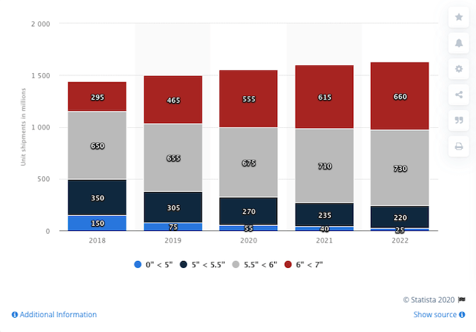
Each year, smartphones are gaining in size. According to Statista, the vast majority of smartphones shipped/sold in the years to come will be between 5.5” and 7”:
Leonovas argues that, as smartphone screens increase, the thumb zone that we used to design for is no longer applicable. This is what it now looks like:
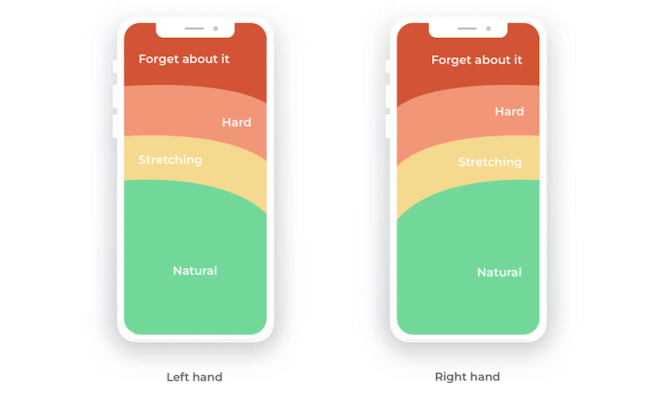
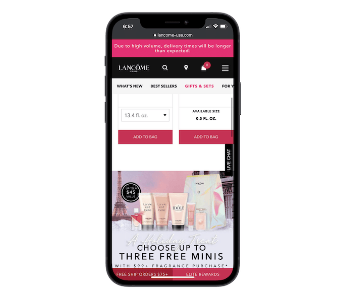
Notice how the header is in the “Forget about it” region. So, that would make the navigation on the Lancome progressive web app, for instance, impossible to reach for with a one-handed grip:
Rather than hope that visitors don’t mind making that impossible reach to the top of the page, there’s another option.
The Verdict:
Leonovas suggests that a bottom navigation is the better option. According to the data, he’s right.
But this is about more than just moving the hamburger icon to the bottom-center or bottom-right of the page (which some sites do). Instead, it’s about building out a visible navigation the same way mobile apps and some PWAs do it.
Sephora has a great example of this:
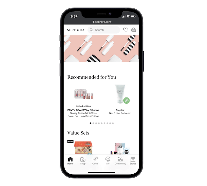
The top bar now holds the search bar, the Loves (wishlist) link and the shopping cart. Arguably, these are secondary items to the main navigational items for:
- Home
- Shop
- Offers
- Me (profile and settings)
- Community
- Stores
And when “Shop” is clicked, the main categories appear from the bottom of the page:
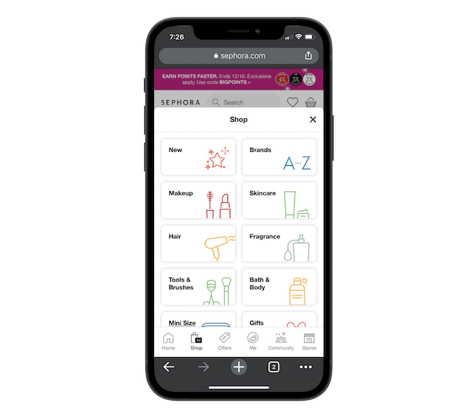
Again, this works well in keeping the main content closer to the new thumb zone.
That said, you don’t have to go this route if it doesn’t make sense for your site. You could always put the main tabs in the bottom bar and then store secondary pages or features under a hamburger menu in the top-right corner. The way you design it is up to you, but the basic principle remains the same:
Make it easy for visitors to navigate around the most popular places on the mobile site by placing those links in the bottom bar.
4. Sticky vs. Non-sticky Menus
The last type of placement we need to talk about is whether the menu should exist only at the top of the site as it does for Redfin:

Or if it should be fixed (i.e. sticky) the way Trulia’s is:
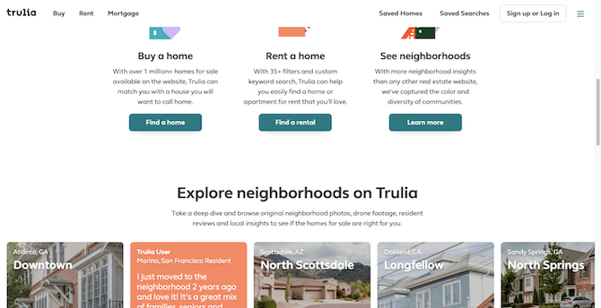
There are certainly some people who believe that sticky menus are a waste of space and make a website feel more cumbersome than it needs to. But there are some studies that show there’s a lot of value in keeping the menu ever-present for visitors.
In this roundup from Convert.com, Milosz Krasinski of Chilli Fruit Web Consulting says that:
“Sticky menus are 22% quicker to navigate and encourage conversion through convenience.”
Jeff Moriaty of Moriarty’s Gem Art also has data to back up his support for sticky menus:
“We have done quite a bit of testing on our website, one being the menu. With the sticky menu, the main area we saw a performance boost was with our bounce rates and pages viewed per session. Our bounce rates actually decreased and we went from an average of 1.5 pages per session to over 3 pages. This was especially true with mobile visitors, which is where 70% of our traffic originates.”
Then you have Sandra Hurley of Hayden Girls who talks about how a sticky menu helped the website’s performance:
“Before our website launched, we went through several iterations and had them tested. 85% of users agreed that having to scroll back to the top in order to be able to access the menu and switch product categories was a big hassle and turned them off continuing the shopping experience.”
Even if aesthetically it might seem as though a sticky menu weighs a site down, that might not actually be the case in your visitors’ eyes—especially if their main concern is with convenience and speed.
The Verdict:
Unless you’re building a small website (with less than 10 pages) and each page is less than 1,000 words, you really shouldn’t be using a non-sticky navigation.
Think about how long people are willing to wait for your web pages to load. It only takes about three seconds before your website starts to lose visitors.
But it’s not just a slow-loading page that’ll make them feel like you’re wasting their time. A navigation that requires scroll upon scroll upon scroll to find it again might cost you as well.
Wrap-Up
As we’ve seen here today, there’s no easy way to answer whether an unconventional placement will hurt your navigation. It’s somewhat of a mixed bag.
It really depends on how long a navigation pattern has been around (which increases visitors’ comfort with it) as well as how our devices are changing and, consequently, forcing our designs to change as well.
That said, there’s plenty of data out there that tells us what will fly with visitors and what won’t. But if you’re still in doubt, A/B testing an unconventional navigation placement on your site wouldn’t be a bad idea. That way, you can know for sure if the new design pattern will pay off.

Suzanne Scacca
A former project manager and web design agency manager, Suzanne Scacca now writes about the changing landscape of design, development and software.
