Tabs: Taboo or Turbo in Enterprise Apps?

Summarize with AI:
Tabs are everywhere in enterprise apps. Used well, they simplify complexity. Used poorly, they frustrate the user. Learn when to use or switch tabs.
Tabs have been around for decades and I haven’t seen complex enterprise software that doesn’t use them.
In all my years designing enterprise apps, two components have proven to be either the strongest asset or the weakest link: tables and tabs.
I already wrote about tables in my post on why you can’t beat the spreadsheet. Now it’s time to take a look at tabs.
The Friendly Developer’s Shortcut
If you’ve ever built enterprise software, you know that tabs are the default. They’re easy to implement. Nest items in code, separate them in the UI. Simple.
Back in the day, developers were also the designers. Tabs were the easiest way to bring order to complex screens. They stuck because they worked.
Also, much of software design simply mimicked the operating system. It’s no surprise enterprise apps followed Microsoft’s example.
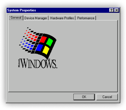
Think of the old Windows settings dialog: a tiny screen packed with tabs.

That pattern became the blueprint for squeezing dozens of options into limited space.
Making use of every pixel was considered an achievement. Mobile-first design? Not even a thing.
The Untabbed Truth
The truth is, you’ll use tabs at some point. They’re too common to ignore. They turbocharge the experience, used well. But there are pros and cons to using them.
Navigation
- Pro: Easy to scan and move between categories
- Con: Too many tabs make scanning hard and moving slow
Disclosure
- Pro: Good for hiding lots of options
- Con: Important info or actions can get lost
Structure
- Pro: Clear structure and focus when used well
- Con: Nested tabs multiply confusion
Switching Tabs: Alternatives
Tabs aren’t the only way to organize complexity. Sometimes other components do the job better.
Accordions
- Pro: Great for progressive disclosure—show one thing at a time
- Con: Expand too many and you’re back to scrolling forever
Panels
- Pro: Easy to read, even with many items
- Con: Take more screen space and clutter the screen fast
Steppers
- Pro: Perfect when groups are steps in a process
- Con: Breaks down if users need to jump around or skip steps
Developer-Friendly, User-Centered
Tabs still have a place. They’re familiar and fast to build and can structure complexity. But they can also turn into a bottleneck—for both users and developers.
User Experience
- Pro: Clear structure and focus when used well
- Con: Hidden content or clumsy navigation slows everyone down
Development
- Pro: Quick to implement, easy to drop in
- Con: Custom solutions require more work to handle states and navigation
Code
- Pro: UI toolkits like Progress Kendo UI libraries give you accessible, tested tab components out of the box
- Con: Writing custom code adds complexity and risks breaking essentials like accessibility
Instead of reinventing tabs, lean on a toolkit that handles the heavy lifting. If you need an alternative, the toolkit makes it easy to switch. That way you can focus on the one thing that matters most: delivering a great user experience.
So tabs are definitely not a taboo—just handle them with care. Use them well, and with a toolkit like Kendo UI, you’re turbocharged.
The Kendo UI component libraries come with a free trial. Give them a shot today!

Teon Beijl
Teon Beijl is a business designer with over a decade of experience in enterprise software for the oil and gas industry.
Formerly Global Design Lead for reservoir modeling, remote operations and optimization software at Baker Hughes, he now helps people who feel stuck through his own business, Unpuzzler. Teon works with leaders on business design and with professionals on career design, leveraging his experience as both designer and leader to help people create clarity and live on purpose—by design. Connect with Teon on LinkedIn or Substack.

