New DataForm with Q2 2015 of UI for Windows Universal
Summarize with AI:
This post discusses the new Telerik DataForm control which offers built-in editors for each of the available primitive types.
DataForm
The DataForm (a.k.a. PropertyGrid) is the perfect component for editing the properties of a business object during runtime. All you have to do is set the Item property to the business object, and the control will automatically generate editors for each public member. The DataForm offers built-in editors for each of the available primitive types (numbers, strings, booleans and enumerations).
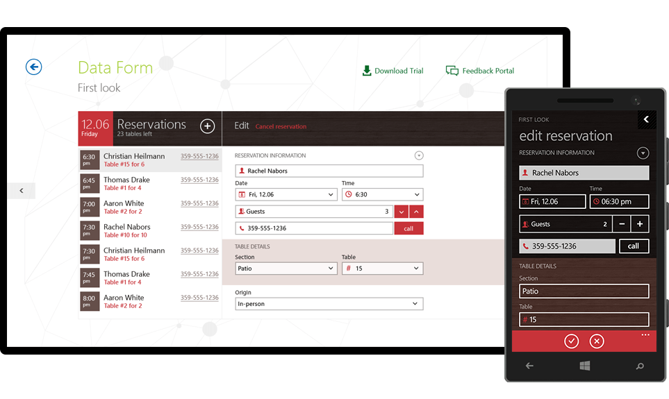
For custom property types, the DataForm offers a mechanism that allows you to provide your own custom editor.
When editing a property, it is important to specify when the value of the property changes. The DataForm offers three commit modes:
- OnLostFocus: The new value is applied as soon as the editor loses focus. This is useful in asynchronous scenarios where you don’t want to disturb the input flow of the user.
- Immediate: The value of the property is updated upon each change. A typical example is when you want to update a string property on every key stroke.
- Manual: The new value of the property is applied only after explicit API call.
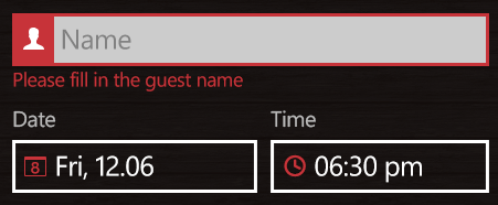
Another important aspect of the DataForm is its built-in error validation mechanism. The DataForm exposes an API that allows you to specify the constraints for each property. You also have the option to check the validity of each new property value and choose whether to apply it or display an error message prompting the user that his input is invalid.
In addition to editing the properties of a business object, Telerik DataForm supports a read-only mode which can be used to only view the values of the properties. Just like with the editors above, you can use the built-in viewers or provide your own property viewers. Read-only can be turned on a property basis by applying the [ReadOnly] attribute.
[Index(1)][ReadOnly]public string Name{ get { return this.name; } set { this.name = value; OnPropertyChanged("Name"); }}By default, the DataForm arranges its property editors in a vertical table view. If you require more complex arrangement, you can override this behavior and provide a layout that fits your scenario best.
Please note that we’re releasing the DataForm with a beta label. The official version should be available with the next major release.
Visual Studio 2015 and Windows 10 Compatibility
With this release, you’ll be able to use Telerik UI for Windows Universal together with Visual Studio 2015 and create Windows 8.1 apps that run on the new Windows 10.
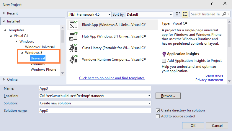
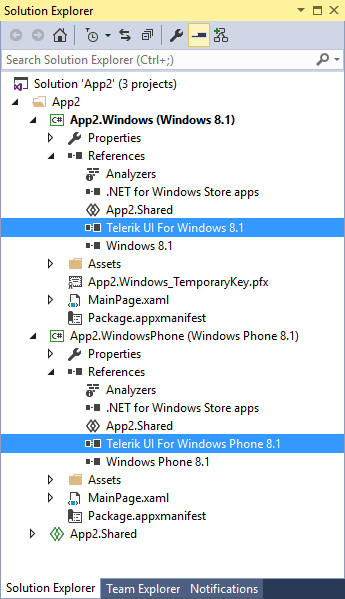
The official version of Windows 10 is scheduled for July 29, 2015 and we are still working on unifying the Windows/Windows Phone code bases of controls. Regardless of that fact, our testing has confirmed that any Windows 8.1 app uses UI for Windows Universal will run without any complications on Windows 10. If you encounter any issues, please share your case on our forums.
Multiple Selection in the ListView Using CheckBoxes
With this release, we’re adding a new selection mode called MultipleWithCheckBoxes. It allows the ListView to handle the selection of multiple items by displaying a CheckBox to the left of each item. Once you complete the selection, you can access the selected items through the SelectedItems collection.
<telerik:RadListView x:Name="listView" SelectionMode="MultipleWithCheckBoxes" />Expander
The last component included in the suite is the Expander, a control that displays a header and allows you, through tapping/clicking on the header, to toggle the visibility of an area that displays content. The main benefit of using the Expander control is it saves screen space, which is important for mobile scenarios.

If you want to get your hands on the bits, click here to download the latest version of UI for Windows Universal. Also feel free to share your feedback on the forums.


Kiril Stanoev
Hi, I'm Kiril and I'm the Product Manager of Telerik UI for Android, Windows Universal and Windows Phone. Feel free to ping me on +KirilStanoev or @KirilStanoev
