Meet the Newest Addition to Telerik UI for Xamarin—RadComboBox

Summarize with AI:
The R3 2020 release brings the long awaited ComboBox control to our Telerik UI for Xamarin suite, which enables you to present your users with a list of options to choose from in a user-friendly and convenient way through a dropdown list. RadComboBox for Xamarin comes packed up with a set of advanced features—editing, searching, single and multiple selection, custom templates and flexible styling API, to name a few.
In this blog post I will walk you through the key features of Telerik Xamarin ComboBox control. Let's start!
Data Binding
First, we need to feed the ComboBox with some data, so it properly displays the available options to the end user. You can set static items to the control's ItemsSource or bind it to a complex object using the DisplayMemberPath property. Let’s take a look at the following quick example with showing cars in a Rent a Car app.
Create a sample Car class:
public class Car
{
    public string Model { get; set; }
    public string CarLogo { get; set; }
}
Add a ViewModel class with a collection of Car objects:
public class ViewModel
{
    public ViewModel()
    {
        this.Cars = new ObservableCollection<Car>()
        {
            new Car {Model = "Ford", CarLogo = "ford1.png"},
            new Car {Model = "Citroen", CarLogo = "citr.png"},
            new Car {Model = "VW", CarLogo = "vw1.png"},
            new Car {Model = "Mazda", CarLogo = "mazda.png"},
            new Car {Model = "Honda", CarLogo = "honda.png"},
            new Car {Model = "Renault", CarLogo = "ren1.png"},
            new Car {Model = "BMW", CarLogo = "bmw.png"},
            new Car {Model = "Mercedes", CarLogo = "merc.png"},
            new Car {Model = "Audi", CarLogo = "audi.png"},
            new Car {Model = "Opel", CarLogo = "opel.png"}
        };
    }

    public ObservableCollection<Car> Cars { get; set; }
}
Let’s go to the UI part—add a RadComboBox instance, bind its ItemsSource and set DisplayMemberPath, so that the cars' names will be shown:
<telerikInput:RadComboBox x:Name="comboBox"
                ItemsSource="{Binding Cars}"
                DisplayMemberPath="Model" />
That’s all needed to include RadComboBox control to your page. Check below the result on an iOS emulator:

Editing and Searching
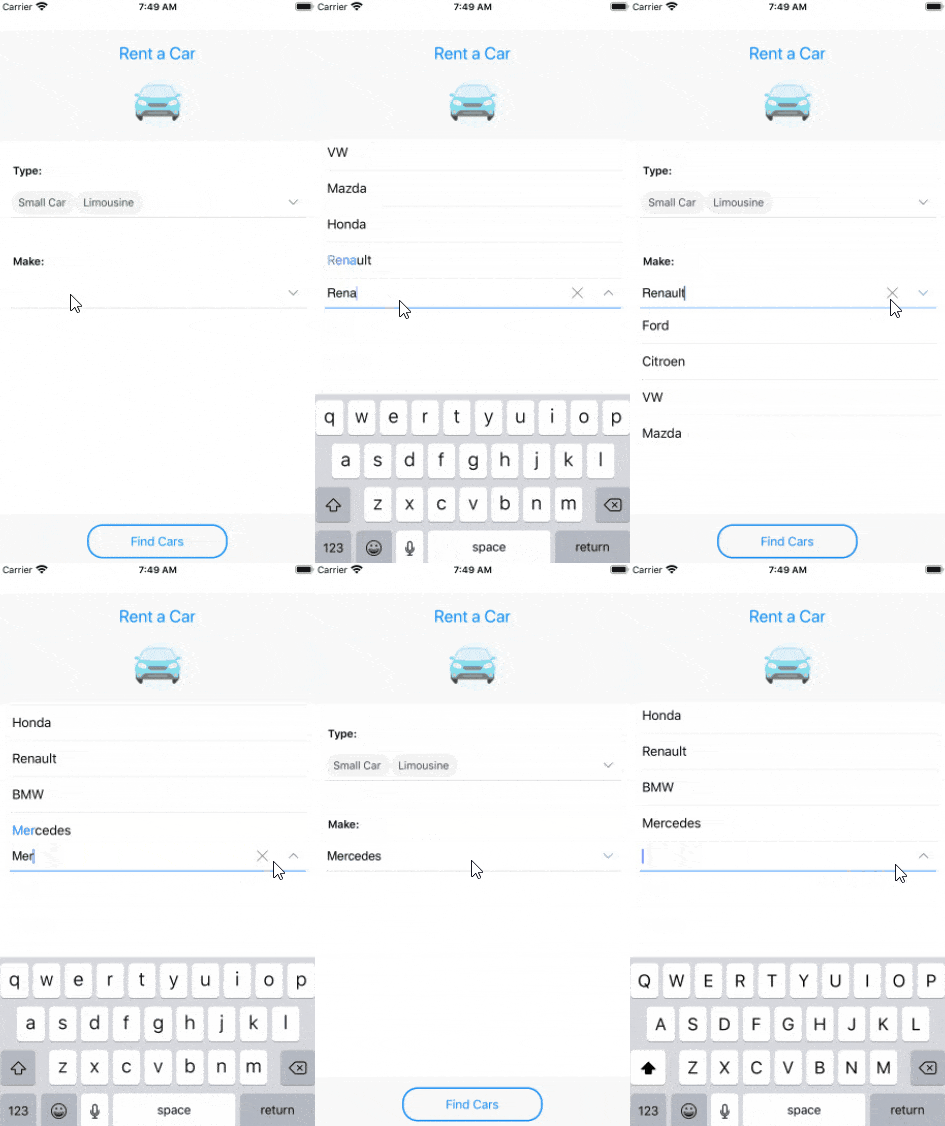
By default RadComboBox control is non-editable—this, however, can be easily changed through the IsEditable Boolean property. When the control is in edit mode, users can type into the text input and thus initiate searching through thе ComboBox ItemsSource. This feature is quite useful for quick selection, especially in the case with more items available. You can also define whether the search mode will be "StartsWith" or "Contains"—by default RadComboBox uses "StartsWith" mode and search results will be returned only if they contain a word that starts with the search term. Other options that can be applied to the SearchMode property are "Contains," "ContainsCaseSensitive" and "StartsWithCaseSensitive".
So, in order to enable searching, you'd need to configure IsEditable and SearchMode properties, as well as the SearchTextPath property, the latter defines the name of the property against which the searching will be performed.
Additionally, the control highlights the matching text inside the dropdown list based on the given input after searching is executed.
Let’s return to our example with the Rent a Car app. Here is the updated RadComboBox definition with editing and searching enabled:
<telerikInput:RadComboBox x:Name="comboBox"
                ItemsSource="{Binding Cars}"
                DisplayMemberPath="Model"
                IsEditable="True"

                       SearchMode="Contains"
                SearchTextPath="Model"/>

Single and Multiple Selection
There are times when you may wish to have a combobox editor that allows multiple selection. You do not have to wait any longer, as our Telerik Xamarin ComboBox provides both single and multiple selection. All you need to set is the SelectionMode property to “Single” or “Multiple,” respectively. The API related to selection feature also includes SelectedItem/SelectedItems and SelectedIndex bindable properties, as well as SelectionChanged event, so you can easily adapt the control to the scenario you have at hand.
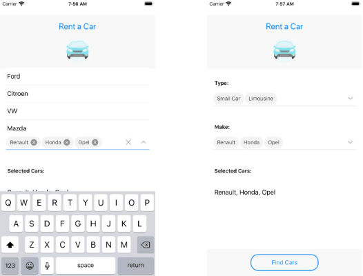
When RadComboBox is in “multiple” selection mode, the selected items are visualized as tokens with a “remove”(x) button, so that users can “deselect” them quickly and intuitively.
Let's see multiple selection in action:
<telerikInput:RadComboBox x:Name="comboBox"
                ItemsSource="{Binding Cars}"
                DisplayMemberPath="Model"
                IsEditable="True"
                SearchTextPath="Model"
                SelectionMode="Multiple"
                SelectedItems="{Binding SelectedCars}"/>
The images below show RadComboBox with multiple selection in and out of focus:

Customizations and Templates
RadComboBox offers a flexible styling API that you can use to enhance the look & feel of your app—you can change the ComboBox background color, style the control’s dropdown box and modify the clear and dropdown buttons. In addition, you can change the Placeholder text color and the Highlighted text color.
Furthermore, through the provided customizable templates—ItemTemplate, SelectedItemTemplate, TokenTemplate and ShowMoreTemplate, you can fully control the visual appearance of the RadComboBox control. I am going to return to my Rent a Car app and try to decorate the ComboBox used to display Car Models. First, add the following styles to the Resources section of your page:
<Color x:Key="ComboBoxBackgroundColor">#F7F7F7</Color>
<Style x:Key="ComboBoxStyle" TargetType="telerikInput:RadComboBox">
    <Setter Property="CornerRadius" Value="12, 12, 0, 0"/>
    <Setter Property="DropDownBackgroundColor" Value="#F8F8F8"/>
    <Setter Property="DropDownBorderThickness" Value="0, 0, 0, 1"/>
    <Setter Property="DropDownBorderColor" Value="#D9D9D9"/>
    <Setter Property="BorderColor" Value="#D9D9D9"/>
    <Setter Property="FocusedBorderColor" Value="#D9D9D9"/>
    <Setter Property="BorderThickness" Value="0, 0, 0, 1"/>
</Style>
<Style x:Key="ComboBoxButtonStyle" TargetType="Button">
    <Setter Property="HeightRequest">
        <Setter.Value>
            <OnPlatform x:TypeArguments="x:Double">
                <On Platform="UWP, Android">50</On>
                <On Platform="iOS">34</On>
            </OnPlatform>
        </Setter.Value>
    </Setter>
</Style>
Then update the ComboBox definition, so now it includes modified templates:
<telerikInput:RadComboBox x:Name="comboBox"
ItemsSource="{Binding Cars}"
DisplayMemberPath="Make"
IsEditable="True"
SearchTextPath="Make"
SelectionMode="Multiple"
Placeholder="Select a model"
SelectedItems="{Binding SelectedCars}"
BackgroundColor="{StaticResource ComboBoxBackgroundColor}"
Style="{StaticResource ComboBoxStyle}"
ClearButtonStyle="{StaticResource ComboBoxButtonStyle}">
<telerikInput:RadComboBox.ItemTemplate>
<DataTemplate>
<StackLayout Padding="16, 15, 0, 15"
Orientation="Horizontal"
BackgroundColor="#F8F8F8">
<Image Source="{Binding CarLogo}"
HorizontalOptions="Center"
VerticalOptions="Center"
HeightRequest="20"
WidthRequest="20"
Margin="0, 0, 10, 0"/>
<Label Text="{Binding Model}"
FontSize="14"
VerticalTextAlignment="Center"
VerticalOptions="Center"
TextColor="Black"/>
</StackLayout>
</DataTemplate>
</telerikInput:RadComboBox.ItemTemplate>
<telerikInput:RadComboBox.SelectedItemTemplate>
<DataTemplate>
<StackLayout Padding="16, 15, 0, 15"
Orientation="Horizontal"
BackgroundColor="#E5E5E5">
<Image Source="{Binding CarLogo}"
HorizontalOptions="Center"
VerticalOptions="Center"
HeightRequest="20"
WidthRequest="20"
Margin="0, 0, 10, 0"/>
<Label Text="{Binding Model}"
FontSize="14"
VerticalTextAlignment="Center"
VerticalOptions="Center"
TextColor="Black"/>
</StackLayout>
</DataTemplate>
</telerikInput:RadComboBox.SelectedItemTemplate>
<telerikInput:RadComboBox.TokenTemplate>
<DataTemplate>
<telerikPrimitives:RadBorder BackgroundColor="#A9E8F1"
CornerRadius="15"
Margin="2">
<StackLayout Orientation="Horizontal"
Margin="3">
<Label Text="{Binding Model}"
TextColor="Black"
VerticalTextAlignment="Center"
Margin="2" FontSize="14" />
<Label FontFamily="{StaticResource IconsFontFamily}"
Text="" FontSize="10"
VerticalTextAlignment="Center"
TextColor="Black"
Margin="2">
<Label.GestureRecognizers>
<TapGestureRecognizer Tapped="TapGestureRecognizer_Tapped"/>
</Label.GestureRecognizers>
</Label>
</StackLayout>
</telerikPrimitives:RadBorder>
</DataTemplate>
</telerikInput:RadComboBox.TokenTemplate>
</telerikInput:RadComboBox>
Add the TapGestureRecognizer_Tapped event handler in code behind:
private void TapGestureRecognizer_Tapped(object sender, System.EventArgs e)
{
    var closeLabel = sender as Label;
    if (closeLabel != null)
    {
        var item = closeLabel.BindingContext as Car;
        if (item != null)
        {
            this.comboBox.SelectedItems.Remove(item);
        }
    }
}
The short screencast below shows the result on iOS emulator:

Let Us Know What You Think
We would love to hear what you think about our controls and how we can improve them. If you have any ideas for features to add, do not hesitate to share this information with us on our Telerik UI for Xamarin Feedback portal.
Don’t forget to check out the various demos of the control in our SDK Sample Browser and the Telerik UI for Xamarin Demos application.
If you have not yet tried the Telerik UI for Xamarin suite, take it out for a spin with a 30-day free trial, offering all the functionalities and controls at your disposal at zero cost. Additionally, you can grab the source code of our Xamarin demo apps and take them for a spin! Make sure you check out our technical guide for Xamarin developers too!
Happy coding with our controls!

Yana Kerpecheva
Yana Kerpecheva is a Senior Technical Support Engineer on the Telerik UI for Xamarin team. She has been working with Telerik products since 2008, when she joined the company. Apart from work, she likes skiing and travelling to new places.
