
Leveling Up Your App With Advanced Bootstrap Features

Summarize with AI:
The following is an excerpt from the new whitepaper The Anatomy of
Responsive ASP.NET Apps
Responsive design changes the way we think about displaying content on our web pages. As the complexity of the user interface increases, the difficulty of building the interface also increases. Because these complex interfaces require creative solutions, Bootstrap has included advanced features that can make short work out of even the toughest scenario.
It's time to take your Bootstrap skills to the next level. Let's learn about powerful features like: fluid containers, visibility, offsets, push/pull and more. By learning these features, you'll be able to recognize when they are needed and know how to implement them. It's time to become a Bootstrap master, and leverage the full power of the framework, let's dig in.
Fluid Containers
If you have used Bootstrap before, you may already know about the container class. The container is a class that is applied to the outermost grid element. The whitespace can vary depending on device size resulting in a maximum layout width at each breakpoint. Most of the time the default values are good enough for a given project, however if your project requires more customization you may need a fluid container.
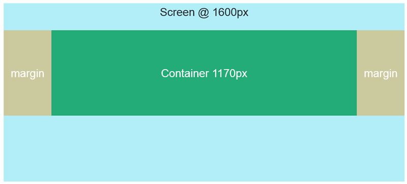
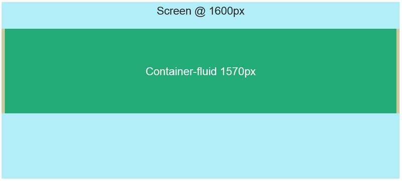
Bootstrap has a second container class, container-fluid. The container-fluid class works very differently than the basic container. Instead of having break points that determine the amount of whitespace to use, container-fluid creates a layout that fills the entire width of the screen.
A fluid container is useful for full screen applications, but it also can be used to create a custom page width for your layout. Having a custom page width can be especially useful when you want set the maximum value that your layout will grow to, but not grow past. Let's see how this can be done in just a few easy steps.
- Start by changing an existing
containertocontainer-fluid. -
Specify a
max-widthforcontainer-fluid. The value will be the largest size the layout will expand to, once the layout fills this space it will stop growing, no matter how large the screen is. The CSS should be placed so that it overrides any default values frombootstrap.css..container-fluid { max-width: 1400px; // Custom max width for this layout }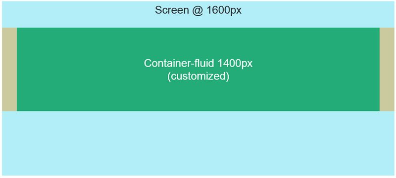
-
We can further customize the container by adding whitespace. By adding additional padding to the container, smaller screens will have a noticeable buffer between the edge of the screen and the application elements.
.container-fluid {
        max-width: 1400px;
		padding:30px; // Whitespace or outside gutter
}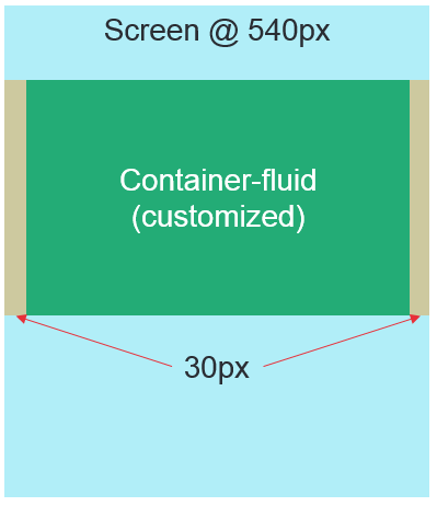
The basic container is a good starting point for most apps, however using the fluid container puts you in control of the page size. Build the application to your requirements and users' needs, instead of always conforming to the frameworks default values.
Nested Rows
Rows and columns are the fundamental building blocks of a Bootstrap grid. It's common practice to divide up a layout into pieces like navigation and content, but the grid is capable of so much more. Rows in Bootstrap can be infinitely nested, which means we have limitless control over how the grid is divided up. Once outer elements like navigation and content are defined, inner elements can be created that contain UIs that have their own grids.
Each column can contain a row which can then be divided up again into 12 units, these units are relative to the container.
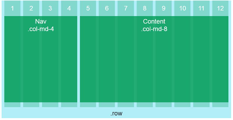
Let's look at building a social media UI as an example of nested grids. We start with the outer most layout elements. These layout elements will contain a navigation and content section.
<div class="row">
    <nav class="col-md-4">
        <!-- Navigation -->
    </nav>
    <section class="col-md-8">
        <!-- Content -->
    </section>
</div>
Next, we add a new .row to the content section. The new row will contain the UI for social media posts.
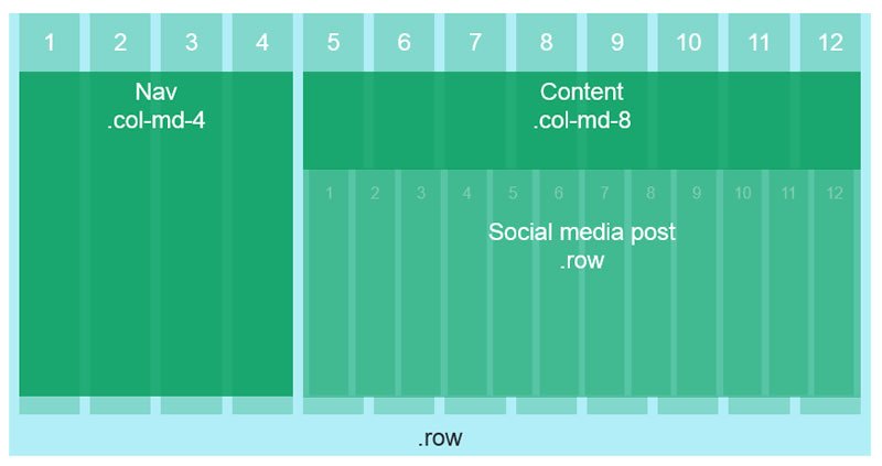
<div class="row">
    <nav class="col-md-4">
        <!-- Navigation -->
    </nav>
    <section class="col-md-8">
        <!-- Content -->
        <div class="row">
            <!-- Social Media Posts -->
        </div>
    </section>
</div>
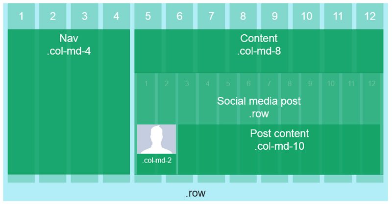
The new row is divisible into 12 more columns. This row will be a social media post, so we'll make space for an avatar that's 2 columns wide and the post content will use the remaining 10 columns.
<div class="row">
    <nav class="col-md-4">
        <!-- Navigation -->
    </nav>
    <section class="col-md-8">
        <!-- Content -->
        <div class="row">
            <!-- Social Media Post -->
            <div class="col-md-2">
                <!-- Avatar -->
            </div>
            <div class="col-md-10">
                <!-- Post Content -->
            </div>
        </div>
    </section>
</div>
Offsets
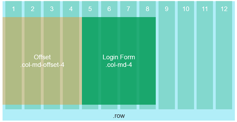
Sometimes UIs need a little help adapting to different screen sizes. Offsets are a great tool when elements need to create additional whitespace or horizontal positioning. Offsets can be used to horizontally center an element without creating unnecessary columns to achieve the effect. Offsets are created by adding the offset class .col-[screen size]-offset-[width] to an element.
In this example, we'll use offsets to center a login box on the screen. The login panel will be 4 columns wide, this means we will need 4 columns of white space on either side. Your first instinct may be to use three elements, each 4 columns wide and leave the outer two empty.
<div class="row">
  <div class="col-md-4">
    <!-- empty -->
  </div>
  <div class="col-md-4">
    <!-- login form -->
  </div>
  <div class="col-md-4">
    <!-- empty -->
  </div>
</div>
This approach would work, however the additional markup will increase page size and create needless clutter in when editing the page. Instead, let's use the offset class to achieve the same effect using less markup.
<div class="row">
  <div class="col-md-4 col-md-offset-4">
    <!-- login form -->
  </div>
</div>
Push/pull
Content that uses a mix of text and media can be difficult to manage at different screen sizes. Creating one layout that can adapt appropriately can mean displaying elements on the screen in a different order than they appear in the markup. When you encounter this problem, the first instinct might be to reach for a JavaScript solution, however the issue can be resolved with a few simple CSS classes.
Let's use an alternating split view layout as an example. In this example, the large layout will alternate between image | text, then text | image and so on.
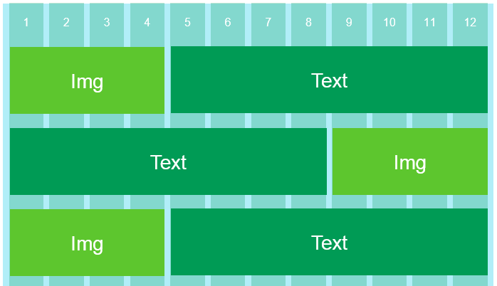
The layout for small screens should also alternate between image and text, except it should do so vertically.

If the markup is created thinking from a desktop-first approach, then alternating the layout in the markup might seem like the right idea. However, the order in which the elements are defined in markup will change both the large and small layouts, resulting in a large layout which behaves correctly but a small layout that does not.
<div class="row">
    <div class="col-lg-4">
        <!-- img -->
    </div>
    <div class="col-lg-8">
        <!-- text -->
    </div>
</div>

<div class="row">
    <div class="col-lg-8">
        <!-- text -->
    </div>
    <div class="col-lg-4">
        <!-- img -->
    </div>
</div>
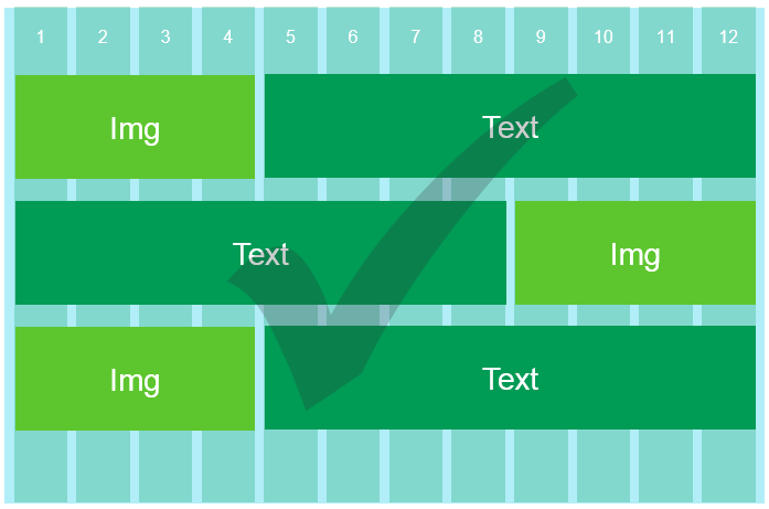
Instead of changing the source code order, build the layout starting mobile first. Next, use the push/pull classes to move the elements horizontally around the grid. This is done by pushing the left elements to the right, and pulling the right elements to the left, effectively swapping their positions.
<div class="row">
    <div class="col-lg-4">
        <!-- img -->
    </div>
    <div class="col-lg-8">
        <!-- text -->
    </div>
</div>

<div class="row">
    <div class="col-lg-4 col-lg-push-8">
        <!-- img -->
    </div>
    <div class="col-lg-8 col-lg-pull-4">
        <!-- text -->
    </div>
</div>
Adding col-lg-push-8 and col-lg-pull-4 to the elements causes them to swap positions on a large screen.
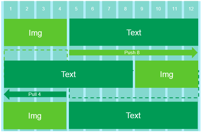
Push/pull classes can be used with multiple columns in a row and at different screen sizes.
Wrap up
The Bootstrap grid system is a powerful tool for creating layouts. Understanding Bootstrap's advanced features puts you in full control allowing you to build exactly what's needed for your project. Custom containers with container-fluid allow you to fine tune the overall width of a layout. When complex UIs are needed, nested rows can solve even the most complex app layouts. Finally, offsets and push\pull classes let you determine when and where elements move about the grid. Be a layout master and combine Bootstrap's advanced features in your next project.
Header image courtesy of Eloïse L

Ed Charbeneau
Ed