In UX, Less Isn't Always More

Summarize with AI:
A lot of amazing work is being done in the UX space by Luke Wroblewski and others. There is a plethora of great advice about solving UX problems by simplifying forms, even reducing the number of fields down to just a single input. However, in this article I'm going to share a story about an instance I encountered where users actually were looking for a place to input their data, even though we didn't want or need it.
Can You Reset My Password?
The problem arose when we released our new application. Shortly after launch, support starting getting requests from users to help reset their password. The users would complain that they never received their password reset email.
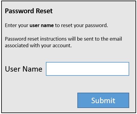
The form itself was extremely simple; a user is prompted to enter their user name and the system generates an email response with a secure link to complete the process.
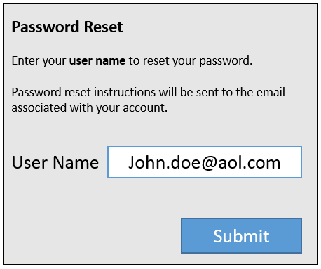
Initially we started troubleshooting the form by looking for system errors, however we only found a properly working password reset form. Next we contacted support and asked them to try and collect some additional feedback from users who experienced this problem. Almost immediately we received an email from support containing a screen shot a user submitted, and that's when we knew there was a problem.
We started logging all of the inputs each time a password reset was unsuccessful and we found that users were entering all sorts of things: email, first name, last name, full name, pretty much anything but their user name.
A Change of Plan
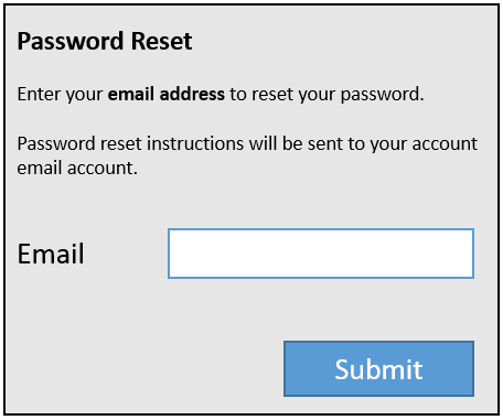
Using this information we decided to change the process. Instead of asking for a user name, we'll ask for the email address.
Unfortunately, instead of fixing the problem we created a new one. The support tickets came in but this time the message was, "I forgot which email account I used to sign up".
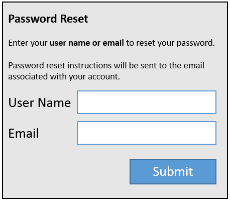
Knowing we could key off of both User Name or Email, we decided to include both fields on the form. We hoped this would give users the option to use either in case they couldn't remember one or the other.
Once again, the support requests came in. Even with the addition of the email field, the user name field caused issues. We looked at the logs and saw the same pattern as before: first name, last name, or full name was consistently entered in the field.
A Fix is Found
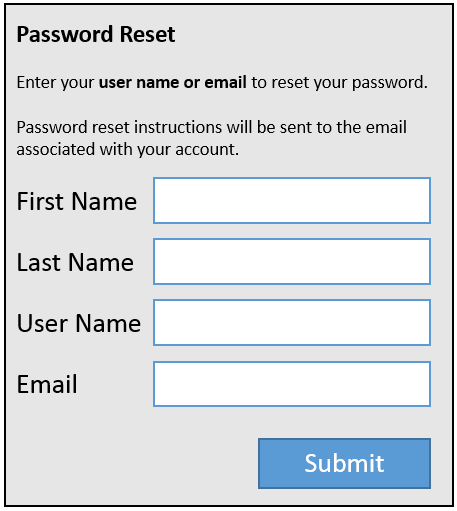
Before resorting to a fix on the back-end, we tried one more change to the form. Since users seemed to want a place to enter their name, or were simply confused at what a user name was, we gave it to them. We added two dummy fields to the form, first name and last name. Neither field was collected or served a purpose other than to guide the user's input. The only requirement was that either the email or user name were filled out.
The final form worked successfully, months went by and not a single support ticket came up regarding the password reset process.
Conclusion
Including first name and last name fields removed the confusion around what belonged in the user name field. In addition, there was no need to rewrite back-end code which would have been more time consuming than adding two fields.
There are no hard and fast rules in user experience design, so it's important to keep an open mind. Frequently less is more and simpler is better, but in this case adding unnecessary steps actually improved the experience for our users.
Header image courtesy of Floriana

Ed Charbeneau
Ed

