Dark Mode Support in Telerik UI for Xamarin Controls

Summarize with AI:
Being more friendly to user’s eyes, battery saving or just a matter of taste, no matter what’s the reason behind, as a mobile developer, probably you have already considered providing dark mode of your app.
As always, we’re here to help be more productive, so with the first release for the year (R1 2021) we introduced dark mode support for our Telerik Xamarin controls. In short, this means that now our controls will respond to light/dark mode changes both on iOS and Android devices without the need to style them separately.
Let me start from the beginning—dark mode feature of iOS and Android basically is an additional mode to the standard system appearance where all the elements of the operating system are styled in a professionally designed, darker color palette. The mobile platform vendors have designed the dark theme so that the foreground content is perfectly outlined, and all accessibility features are supported as well. Some of the benefits of using the dark theme might be:
- Lower power usage
- Better experience for users with vision impairment
- Better vision for all users in a low-environment
It turned out there’s much interest in using dark theme among mobile users and we decided that our controls supporting it would be a valuable addition to the suite. Starting with R1 2021 release, our Telerik UI for Xamarin controls will automatically use a darker theme palette when the device mode is switched.
Let’s check the dark mode feature in more details on both iOS and Android.
Dark Mode Support on iOS
For iOS the functionality was introduced in version 13. There is an option in the Settings of the mobile device, so users can choose the dark theme—this will set the darker color palette to the system as well as all running applications. Generally, people expect all apps to respect their system preferences.
Dark Theme Support on Android
On Android the feature for applying the dark theme for the whole device is available since Android 10 (API Level 29). Older Android versions wouldn’t have the option to switch between Light/Dark mode, however, you can add such a switch on app level. Contrary to iOS, when you set the dark mode in Android, the currently running applications are reloaded to apply the new look.
In order to support Dark theme in your application on Android, there is one additional step you would need to take. You must set your app’s theme to inherit from a DayNight theme—go to Resources/values/styles.xml file located in the Android project and app the theme like this:
<style name="MainTheme" parent="Theme.AppCompat.DayNight">Let’s See It in Action
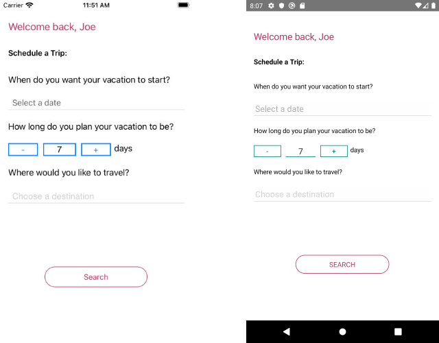
To illustrate better the Telerik Xamarin controls capability of responding to Light/Dark theme changes, I will use the quick example below. In short, it is a simple reservation form which uses some of our components, namely DatePicker, NumericInput, AutoCompleteView and Button:
<Grid BackgroundColor="{AppThemeBinding Light=White, Dark=Black}"> <StackLayout Margin="16, 40, 16, 0"> <Label Text="Welcome back, Joe" TextColor="#B73562" FontSize="20" Margin="0,0,0,24" /> <Label Text="Schedule a Trip:" TextColor="{AppThemeBinding Light=Black, Dark=Default}" FontSize="15" FontAttributes="Bold" Margin="0, 0, 0, 21" /> <Label Text="When do you want your vacation to start?" TextColor="{AppThemeBinding Light=Black, Dark=Default}" Margin="0,6" /> <telerikInput:RadDatePicker x:Name="FromDate" MinimumDate="{Binding MinDate}" MaximumDate="{Binding MaxDate}" Date="{Binding StartDate}" Placeholder="Select a date" Margin="0,10"/> <Label Text="How long do you plan your vacation to be?" TextColor="{AppThemeBinding Light=Black, Dark=Default}" Margin="0,6" /> <StackLayout Orientation="Horizontal" HeightRequest="25" Margin="0,10"> <telerikInput:RadNumericInput x:Name="daysNumber" WidthRequest="200" /> <Label Text="days" TextColor="{AppThemeBinding Light=Black, Dark=Default}" /> </StackLayout> <Label Text="Where would you like to travel?" TextColor="{AppThemeBinding Light=Black, Dark=Default}" Margin="0,6" /> <telerikInput:RadAutoCompleteView Watermark="Choose a destination" ItemsSource="{Binding Destinations}" Margin="0,10" /> <telerikInput:RadButton Text="Search" CornerRadius="20" Padding="10,5,10,5" BorderColor="#B73562" BorderWidth="1" VerticalOptions="CenterAndExpand" HorizontalOptions="CenterAndExpand" WidthRequest="200" HeightRequest="40" TextColor="#B73562" FontSize="15" BackgroundColor="Transparent" /> </StackLayout></Grid>In the sample I used AppThemeBinding for Xamarin.Forms Labels TextColor and Grid BackgroundColor, so they to be updated according to the Dark/Light theme changes. For more details on this, you can take a look at the Respond to system theme changes in Xamarin.Forms applications topic on Microsoft Docs.
Here is the result on Android and iOS using the regular system appearance (without switching to Dark mode):

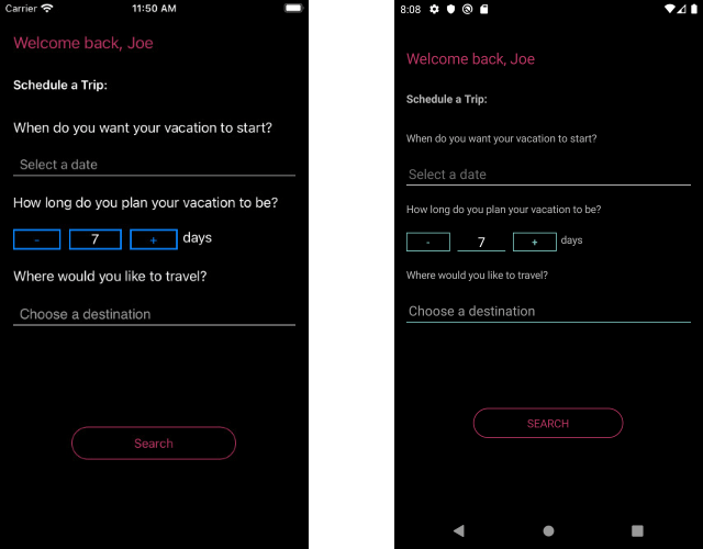
If the app users prefer the dark mode appearance, the same reservation form will be switched to the darker color palette without any additional effort on your side:

Share Your Feedback
We hope the Dark mode support in Telerik UI for Xamarin controls will enhance your app features and will be loved by your users. As always, we encourage you to share your ideas or opinions on the controls and thus play a role for shaping our roadmap. You can write in the Telerik UI for Xamarin Feedback portal or simply raise a ticket.

Yana Kerpecheva
Yana Kerpecheva is a Senior Technical Support Engineer on the Telerik UI for Xamarin team. She has been working with Telerik products since 2008, when she joined the company. Apart from work, she likes skiing and travelling to new places.
