
Creating a Checkbox Like it’s 2020

Summarize with AI:
If we are going to style a checkbox for the future, it needs to be not only aesthetically pleasing but navigable with keyboard for screen readers. This is almost 2020, yo, let’s style like it is.
There are many cool demos out there of fancy checkboxes. These all include some version of hiding the OG checkbox and styling the label and/or pseudo elements. However, many of these cool checkboxes do not take accessibility into account.
There is a marvelous man who created the https://100dayscss.com challenge and inspired me with day No. 66. I not only wanted to teach how this could be done, but how it could be done accessibly.
Building the Custom Checkbox
Disclaimer: There are many ways to accomplish this effect, I will be walking through just one, the way I thought up! Feel free to play around and come up with a custom way yourself. After all, that is the spirit of the 100 Day CSS Challenge!
Steps
Click to see the code in the steps below.
First, start the Codepen, and then proceed with the following:
- Build out the elements
- Hiding the checkbox
- Build checkbox with label
- Animate the checkbox on check/uncheck
- Build/position expression lines with spans.
- Animate the expression lines
- Test accessibility with ChromeVox
- Make things even fancier
Step 1: The Checkbox & Label
<div class="frame">
  <div class="center">

    <input type="checkbox" id="pretty-checkbox">
    <label for="pretty-checkbox"></label>

  </div>
</div>
$cb: cubic-bezier(0.17, 0.67, 0.83, 0.67);
$checkbox-size: 1.5em;

input[type="checkbox"] {
  @extend .center;
  opacity: 0;
  pointer-events: none;

  & + label {
    @extend .center;
    width: $checkbox-size;
    height: $checkbox-size;
    border-radius: 50%;
    border: solid 2px white;
    cursor: pointer;
    box-shadow: 1px 1px 1px 1px rgba(3, 79, 32, 0.5);
    transition: box-shadow 0.4s $cb, background 0.4s $cb;
  }

  &:checked + label {
    background-color: purple;
    box-shadow: 1px 1px 1px 1px rgba(3, 79, 32, 0.5), 0 0 0 5px white inset;
  }
}
Here we are selecting and styling our checkbox and label for the normal and :checked states. We want the OG checkbox to disappear. We could use something like display: none; for this, however, that isn’t helpful for screen readers. So another way of accomplishing this is to give the checkbox opacity: 0; and pointer-events: none;.
Usually, this alternative disappearing treatment would be accompanied by visibility: none;. However, setting the visibility to none here actually disables toggling of the label with the keyboard (which for accessibility is no bueno). So we are going to leave the visibility line off.
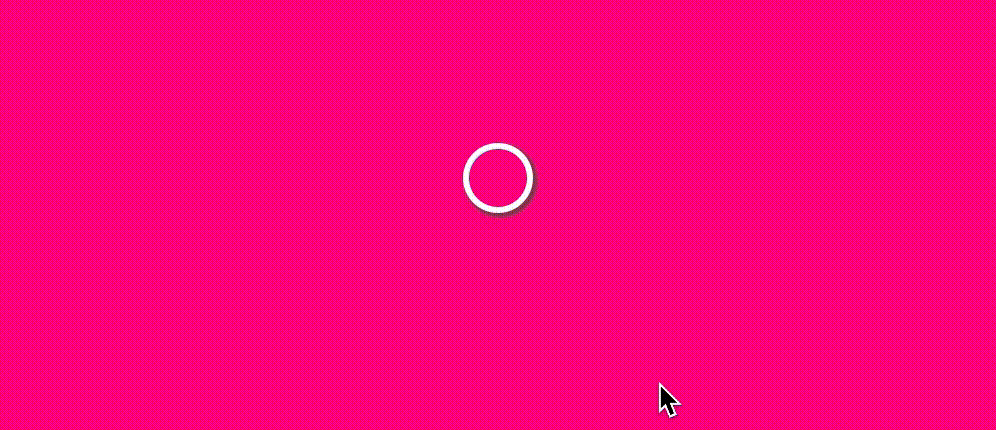
We then are styling the label to look like this fancy version of a fill-in-bubble or checkbox:

It’s selected state on &:checked + label looks like this:

After this, we move onto the next step: Build/position expression lines with spans.
Step 2: Expression Lines
Now we are going to add 12 spans with the class of expression-lines. We can (and do) accomplish this with four spans and pseudo elements in the final Codepen, so head there if you’d like to jump straight into the deep end. For now we are starting off simple!
<div class="frame">
  <div class="center">

    <input type="checkbox" id="pretty-checkbox">
    <label for="pretty-checkbox"></label>

    <span class="expression-lines"></span>
    <span class="expression-lines"></span>
    <span class="expression-lines"></span>

    <span class="expression-lines"></span>
    <span class="expression-lines"></span>
    <span class="expression-lines"></span>

    <span class="expression-lines"></span>
    <span class="expression-lines"></span>
    <span class="expression-lines"></span>

    <span class="expression-lines"></span>
    <span class="expression-lines"></span>
    <span class="expression-lines"></span>

  </div>
</div>
Here we have a few variables ($distance, $height, $offset) that we will use to create/position the expression lines, as well as animate them in the next step.
$distance: 1.125em; // 18px
$height: 1.25em; // 20px
$offset: 1.25em; // 20px

.expression-lines {
  height: $height;
  width: 1px;
  background-color: white;

  bottom: $distance;
  position: absolute;

  transform-origin: center $height + $distance;

  $lines: 12;
  @for $i from 1 through $lines {
    &:nth-of-type(#{$i}) {
      transform: rotate(360deg / $lines * $i);
    }
  }
}
We are giving each expression line a height of 20px in ems for scalability; so go ahead, give the body a 200% font-size and watch this puppy scale! They are also being given a width of 1px, a white color and some positioning with bottom, position, and transform-origin.
The wonderful loop you see is simply spreading them out evenly around the checkbox. So we get this effect:

Onward to the next step: Animate the expression lines.
Step 3: Animating the Expression Lines
Now to animate the expression on checkbox:checked! We need the expression lines to start off invisible, so we are going to add to the above styles opacity: 0;. We shall then animate not only the opacity, but the position of the expression lines to get the spring effect.
$offset: 1.25em; // 20px
input[type="checkbox"]:checked ~ .expression-lines {
  animation: spring 0.6s ease forwards;
}

@keyframes spring {
  0% {
    opacity: 1;
    height: 0px;
    transform-origin: center $distance;
  }
  100% {
    height: $height;
    bottom: $distance + $offset;
    transform-origin: center $height + $distance + $offset;
  }
}
The spring keyframe is used for our expression lines, to grow them and move them at the same time. The transform-origin is very important, we need this to change when we are animating the expression lines away from the checkbox, so that they evenly "grow" out.
See the Pen Creating a checkbox like it’s 2020 by Alyssa Nicoll (@alyssamichelle) on CodePen.
Step 4: Testing Accessibility with ChromeVox
As I mentioned when we were building out our checkbox, display: none; is known to be pretty unfriendly to screen readers, as is visibility: none;. So let’s check how our checkbox is performing without using either of those two methods.
In this video I’m using ChromeVox as my screen reader. When I press tab, the checkbox is automatically selected. I can then toggle between checked and unchecked using the space bar!
To show you what happens (prepare for the jank) when we use one of the above lines of code, I added display: none; to the checkbox and tried again!
Now, when I try tabbing over to the checkbox, the checkbox label that we have styled disappears completely. I continue trying by selecting the invisible checkbox with my mouse (not very accessible on so many accounts) and then I try toggling between checked and unchecked using the space bar. As you can see, nothing happens. So simply put, TLDR, don’t use display: none; or visibility: none; when trying to animate/create fancy lovely-ness with your CSS.
Step 5: Getting Even Fancier with our CSS
Originally when I did this challenge, I used pseudo elements and only four divs to create all 12 expression lines:
<div class="frame">
  <div class="center">

    <input type="checkbox" id="pretty-checkbox">
    <label for="pretty-checkbox"></label>

    <span class="expression-lines"></span>
    <span class="expression-lines"></span>
    <span class="expression-lines"></span>
    <span class="expression-lines"></span>

  </div>
</div>
Using Pseudo Elements for Label and Expression Lines (Less Markup)
This is just the way my brain first thought of doing this challenge. It is less markup but more complicated CSS, so I decided to simplify for teaching in this post. However, I want to show it off here, incase you are a CSS super nerd and interested in pulling off such a feat.
No Inner Ring of Death
Check it out here. This example not only includes the use of pseudo element fun, but it also removes the small inner ring of residue that was caused by me animating the inner box shadow to make the circle grow.
Before:

After:

This example accomplishes this instead by using a pseudo element of the elements, building out a circle and growing/shrinking it on check instead.
See the Pen Custom Accessible Checkbox — NO INNER RING OF DEATH by Alyssa Nicoll (@alyssamichelle) on CodePen.
I hope you’ve learned something from this checkbox fun! Remember to always keep accessibility in the back of your mind while creating. We can always do better. :)
Happy Coding!

Alyssa Nicoll
Alyssa is an Angular Developer Advocate & GDE. Her two degrees (Web Design & Development and Psychology) feed her speaking career. She has spoken at over 30 conferences internationally, specializing in motivational soft talks, enjoys gaming on Xbox and scuba diving in her spare time. Her DM is always open, come talk sometime.