How to Edit Entities and Card Deck Layouts in UI for Android
Summarize with AI:
Kiril
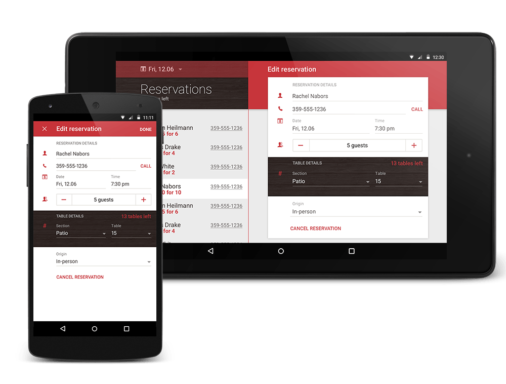
The Telerik® UI for Android DataForm, also known as PropertyGrid, is the perfect component for editing the properties of a business object during runtime. All you have to do is provide the DataForm with an entity (business object), and the control will automatically generate editors for each public member. The DataForm offers built-in editors for each of the available primitive types—numbers, strings, booleans and enumerations.
Here what you can do with the DataForm’s features, at a glance:
- Edit the properties of a business object
- Use default and custom editors
- Provide a read-only mode
- Deploy commit modes
- Extensive layout mechanism
- Receive validation with feedback
- Get hint text support
Using the DataForm
Editing the Properties of a Business Object
The DataForm works with an instance of a business object. Initializing the DataForm with an object to work with can be achieved with a single line of code:
dataForm.setEntity(entity);By default, the DataForm provides a set of built-in editors for each of the available primitive types.
- For numeric types, such as integer, float and double, the DataForm uses the native Android NumberPicker. The NumberPicker is a widget that enables the user to select a number from a predefined range.
- For string types, the DataForm uses the native Android TextView.
- For boolean types, the DataForm uses the native Android Switch. The Switch is a two-state toggle switch widget that can select between two options. The user may drag the "thumb" back and forth to choose the selected option, or simply tap to toggle as if it were a checkbox.
- For enumerations, the DataForm uses the native Android Spinner. Spinners provide a quick way to select one value from a set. In the default state, a spinner shows its currently selected value. Touching the spinner displays a drop-down menu with all other available values, from which the user can select a new one.
For scenarios that involve custom property
Specify Property Changes
When editing a property it is important to specify when the value of the property changes. The DataForm offers three commit modes:
- OnLostFocus: The new value is applied as soon as the editor loses focus. This is useful in asynchronous scenarios where you don’t want to disturb the input flow of the user.
- Immediate: The value of the property is updated upon each change. A typical example is when you want to update a string property on every keystroke.
- Manual: The new value of the property is applied only after an explicit API call.
Data Validation
Another important aspect of the DataForm is its built-in data validation mechanism. The DataForm exposes an API that allows you to specify the constraints for each property. You also have the option to check the validity of each new property value and choose whether to apply it or display an error message prompting the user that his input is invalid.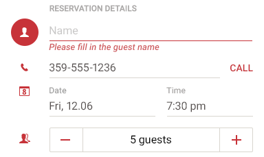
The Telerik DataForm has a read-only mode and can be used to only view the properties of the business object. Enabling the read-only mode is done via a single line of code: setReadOnly(true).
dataForm.setEntity(entity);Just like with the editors above, the developer can take advantage of the
@DataFormProperty(label = "Section", index = 4, readOnly = true)public TableSection getTableSection() { return tableSection;}The default layout behavior of the DataForm is to arrange the property editors in a vertical table view. If you require more complex arrangement you have the option to override the default behavior and provide a layout that fits your scenario best.
Property name labels not always fit in the mobile device's screen size which may confuse the user. The DataForm control allows you to set hint text to give the end-user a hint what should be done. To enable a hint text use the EditText.setHint method.

We’re releasing the DataForm with a beta label. The official version should be available with the next major release.
“Deck of Cards” Layout
The ‘Deck of Cards’ layout is a new type of layout strategy that you can use with our ListView for Android.

This new layout can be enabled by using the DeckOfCardsLayoutManager.
DeckOfCardsLayoutManager deckOfCardsLayoutManager = new DeckOfCardsLayoutManager(this);listView.setLayoutManager(deckOfCardsLayoutManager);Using the perspectiveItemsCount

The “Deck of Cards” easily integrates with the existing ListView's SwipeExecuteBehavior. This is ideal for apps that want to emulate the 8fact app’s behavior.

The new layout supports scrolling as well. Scrolling can be performed with an up/down swipe gesture. You can also use the scrollToNext and scrollToPrevious methods to
Calendar
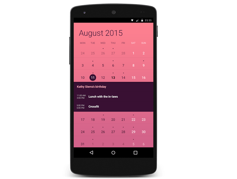
The Calendar for Android now supports inline events that can be enabled by a single line of code:
telerikCalendarView.setEventsDisplayMode(EventsDisplayMode.Inline);Developers have full control over the customization of events when using the inline display mode. They can change the event’s background color, title text size, the color of the start and end time as well as the text size of the start and end time.
Categorical Bubble Chart
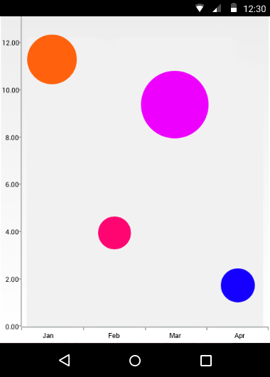
The ScatterBubbleSeries can now be used in categorical scenarios. Each bubble is associated with a category, a value and bubble size.
Animations
With this
All you have to do is create an instance of the ChartAnimationPanel and use its addView method. The view you’re adding should be of the RadChartViewBase
After
If you want to get your hands on the bits, click here to download the latest version of UI for Android. Also feel free to share your feedback on the forums.

Kiril Stanoev
Hi, I'm Kiril and I'm the Product Manager of Telerik UI for Android, Windows Universal and Windows Phone. Feel free to ping me on +KirilStanoev or @KirilStanoev
