3 Ways to Implement Form Dropdowns in Vue Using Kendo UI

Summarize with AI:
We'll use examples to demonstrate three different ways you can easily add Dropdown functionalities to your Vue.js application using Kendo UI.
Dropdowns are toggleable, contextual overlays for rendering lists of links and related contents. They are a major part of any application’s user interface composition. They help manage screen space by stacking data options within a single UI element, thereby allowing more element space on the application’s screen for the developer to render more content. One unique feature that identifies Dropdowns is that they are toggled by clicking, not by hovering.
In this post, we’ll go over three different ways we can implement Dropdowns in a Vue application using Kendo UI. You might ask, what is Kendo UI? Kendo UI is a product developed by Progress to ease the process of building UI components in JavaScript.
Kendo UI is a collection of JavaScript UI components with libraries for React, Vue, Angular, and jQuery. Having understood what Kendo UI is, let’s get to the business of building UI Dropdowns with it.
Set up a Vue Project
First, we have to create a Vue.js project with which we can demonstrate the implementation of Dropdowns. Without further ado, open a terminal window on your preferred directory and run the command below:
vue create dropdown-demo
If you don’t have Vue CLI installed globally, please follow this guide to do so and come back to continue with this lesson afterward.
When you’re done bootstrapping your Vue application, change into the new Vue application directory and start the development server
$ cd dropdown-demo
$ npm run serve
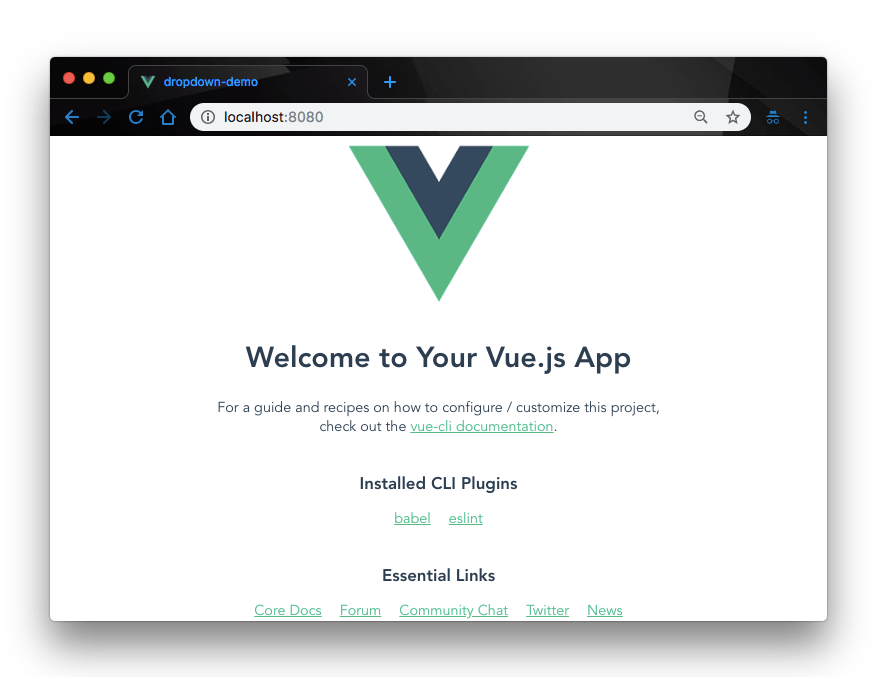
This will serve your Vue application on localhost:8080. Navigate to it on your browser and you will see your Vue application live.

Add Kendo UI to Your Project
Next, let’s add Kendo UI to our new Vue project. For the scope of this demonstration, we’ll need:
- The Kendo UI package
- The Kendo UI default theme package
- The Kendo UI Dropdown wrapper for Vue
To do that, open a terminal window in the project’s root directory and run the commands below:
// Install kendo ui vue package
$ npm install --save @progress/kendo-ui
// Install kendo ui dropdown wrapper for vue
$ npm install --save @progress/kendo-dropdowns-vue-wrapper
// Install kendo ui default theme package
$ npm install --save @progress/kendo-theme-default
Now that we have all the necessary Kendo UI packages in our project, let’s go ahead and build our Dropdowns.
1. Implement Dropdown with Kendo UI ComboBox
Kendo UI has a ComboBox component that allows the users to choose from a list of options or enter custom values through the keyboard. It works the same as the usual select element but with more features and functionalities. To add our Dropdown with ComboBox, first open the main.js file and update it with the code below:
      import Vue from "vue";
      import App from "./App.vue";

      import { DropdownsInstaller } from "@progress/kendo-dropdowns-vue-wrapper";
      Vue.use(DropdownsInstaller);

      Vue.config.productionTip = false;
      new Vue({
        render: h => h(App)
      }).$mount("#app");
Here, we import the DropdownsInstaller package and tell Vue to use this package in our app. Next, we rename the default HelloWorld.vue file in the components directory to Dropdown.vue and update it with the code below:
    //src/components/Dropdown.vue

    <template>
      <div class="hello">
        <h3>{{ msg }}</h3>
        <div id="vueapp" class="vue-app">
          <div class="col-xs-12 col-sm-6 example-col">
            <div class="col-xs-12 col-sm-6 example-col">
              <p>Select Favorite Sports</p>
              <kendo-combobox
                :data-source="dataSourceArray"
                :filter="'contains'"
                @select="onSelect"
                :index="0"
              ></kendo-combobox>
            </div>
          </div>
        </div>
      </div>
    </template>
    <script>
    import "@progress/kendo-ui";
    import "@progress/kendo-theme-default/dist/all.css";
    import { ComboBox } from "@progress/kendo-dropdowns-vue-wrapper";
    export default {
      name: "Dropdown",
      props: {
        msg: String
      },
      data: function() {
        return {
          dataSourceArray: [
            "Football",
            "Tennis",
            "Basketball",
            "Baseball",
            "Cricket",
            "Field Hockey",
            "Volleyball"
          ]
        };
      },
      methods: {
        onSelect: function(e) {
          console.log(e.dataItem);
        }
      }
    };
    </script>
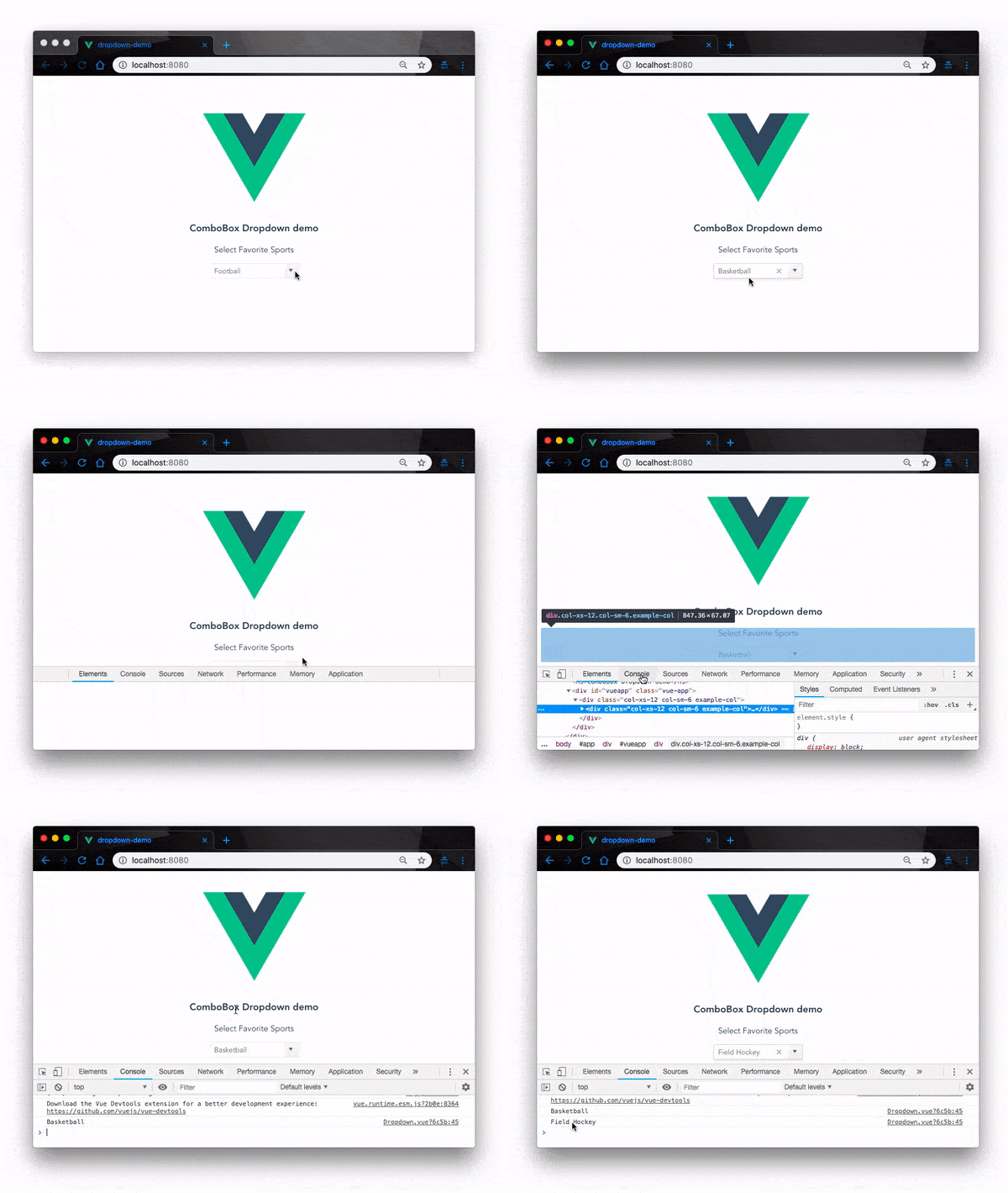
Here, we created the Dropdown in the Vue template using the kendo-combobox widget. In the script section of the component, we defined the dataSourceArray array to populate our widget. We added an onSelect event to listen for a select event on our Dropdown and when an item is selected, we simply log it to the console.
Finally, open the App.vue file and update it with the code below to render our Dropdown component on the screen:
    //src/App.vue

      <template>
        <div id="app">
          <img alt="Vue logo" src="./assets/logo.png">
          <Dropdown msg="ComboBox Dropdown demo"/>
        </div>
      </template>
      <script>
      import Dropdown from "./components/Dropdown.vue";
      export default {
        name: "app",
        components: {
          Dropdown
        }
      };
      </script>
      <style>
      #app {
        font-family: "Avenir", Helvetica, Arial, sans-serif;
        -webkit-font-smoothing: antialiased;
        -moz-osx-font-smoothing: grayscale;
        text-align: center;
        color: #2c3e50;
        margin-top: 60px;
      }
      </style>
Test ComboBox Dropdown
Now check back on the browser at localhost:8080, the app functionality you’ll get at the moment is:

2. Implement Dropdown with Kendo UI DropdownList
Yet another way we can implement Dropdowns in our view application using Kendo UI is with the Kendo UI DropdownList component.
The DropDownList component provides a list of predefined options and allows for a single item selection from that list. To demonstrate this, open the Dropdown.vue component in your project and update the <template> section of the file with the code below:
    //src/components/Dropdown.vue
    <template>
      <div class="hello">
        <h3>Kendo ui DropdownList demo</h3>
        <div id="vueapp" class="vue-app">
          <div class="col-xs-12 col-sm-6 example-col">
            <div class="col-xs-12 col-sm-6 example-col">
              <p>Select Favorite Sports</p>
              <kendo-dropdownlist
              :data-source="dataSourceArray"
              @select="onSelect"
              :index="0">
              </kendo-dropdownlist>
            </div>
          </div>
        </div>
      </div>
    </template>
Note: You don’t have to update any other part of the project, just the template section of your
Dropdown.vuefile.
Here we have replaced the kendo-combobox widget we had in the last example with the kendo-dropdownlist widget.
Test Dropdownlist Dropdown
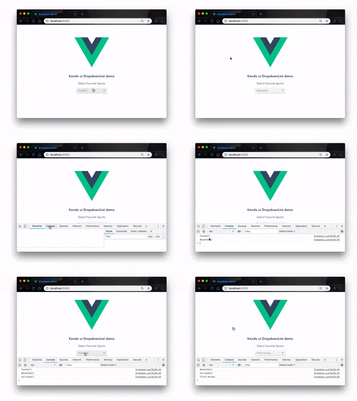
Navigate back to the browser on the same port and try out the app again. We should get the same functionality like so:

The most noticeable difference between ComboBox and Dropdownlist Dropdowns is that with ComboBox, the Dropdown allows users to choose values through the keyboard by typing values into the dropdown field. With Dropdownlist, users can’t type values, they can only select.
3. Implement Dropdown with Kendo UI Multiselect
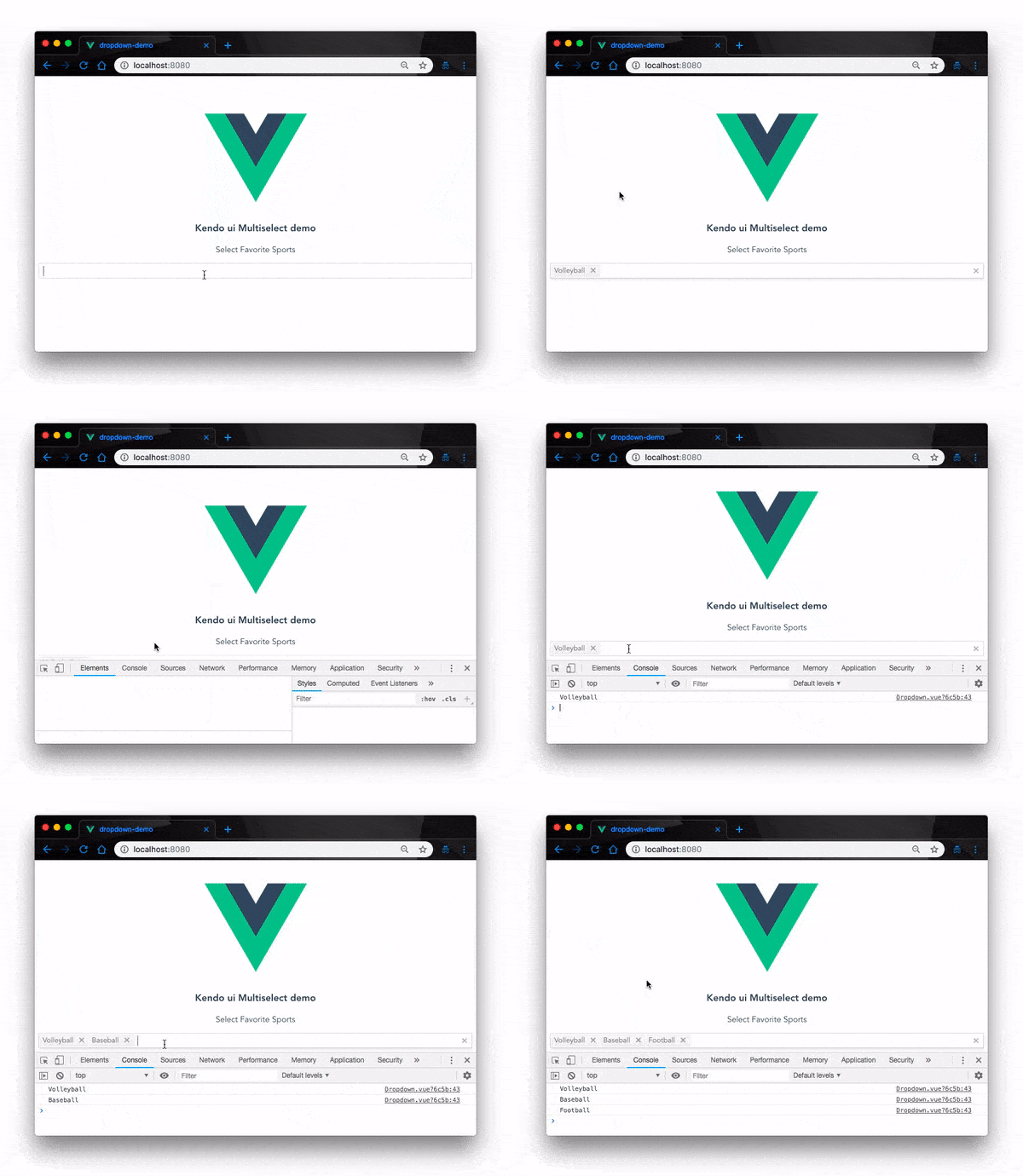
Kendo UI has a Multiselect Dropdown component that allows users to select multiple options from a predefined Dropdown list. To demonstrate Multiselect Dropdown functionality, open the Dropdown.vue component in your Vue project and update the <template> section of the file with the code below:
    //src/components/Dropdown.vue
      <template>
        <div class="hello">
          <h3>Kendo ui Multiselect demo</h3>
          <div id="vueapp" class="vue-app">
            <div class="col-xs-12 col-sm-6 example-col">
              <p>Select Favorite Sports</p>
              <kendo-multiselect
              :data-source="dataSourceArray"
              @select="onSelect"
              :filter="'contains'"></kendo-multiselect>
            </div>
          </div>
        </div>
      </template>
Note: You don’t have to update any other part of the project, just the template section of your
Dropdown.vuefile.
Here we have replaced the kendo-dropdownlist widget we had in the last example with the kendo-multiselect widget.
Test Multiselect Dropdown
Again, navigate back to the browser on the same port (localhost:8080) and try out the app again. We should get the same functionality like so:

Conclusion
In this post, we have demonstrated with examples three different ways you can add Dropdown functionalities to your Vue.js application using Kendo UI. This is only the surface of what Kendo UI can do. With Kendo UI, you can add other UI components and handle complex user interface compositions. Feel free to look up the documentation for more.
For More Info on Vue
Want to learn about creating great user interfaces with Vue? Check out Kendo UI for Vue, our complete UI component library that allows you to quickly build high-quality, responsive apps. It includes all the components you’ll need, from grids and charts to schedulers and dials.

Christian Nwamba
Chris Nwamba is a Senior Developer Advocate at AWS focusing on AWS Amplify. He is also a teacher with years of experience building products and communities.
