Group Templates
Group rows help organize data rows into a tree structure when data grouping is applied.
For runnable examples, refer to the demos on templates in the Grid.
A group row contains an expanding and collapsing group icon that enables end-users to expand and collapse a group row, and thus show or hide its child rows. One of the main features of group rows is to display group summary values. The Grid provides three different templates that can be used to customize the appearance of the group rows:
ClientGroupHeaderTemplate—Renders a template that will be displayed for the entire group row. Usually the main objective is to show an information about the entire group. By default if no template is defined the name of the field and the current group value is displayed.ClientGroupHeaderColumnTemplate—Renders a template in the group row aligned to the column itself. Usually it is used to show an aggregate value for a specific column in the context of the current group. Visually the template content is displayed aligned to the column itself. This functionality is introduced in R3 2018 release.ClientGroupFooterTemplate—Renders a template in the group footer row aligned to the column. Pretty much it works in the same way as theClientGroupHeaderColumnTemplatefor the group footer row.
If no template is defined, the name of the field and the current group are displayed in the following way.
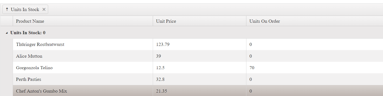
The only difference in the use of ClientGroupHeaderTemplate is that the template content is compiled and displayed instead of the field and current group value.
TypeScript Type for the Handler Argument
The TypeScript definition for groupHeaderTemplate is string | Function; it does not provide a dedicated type for the argument of a ClientGroupHeaderTemplateHandler function. At runtime, the handler receives an object with the field, value, items, and aggregates properties.
Define a local interface for the handler argument when you need type checking:
interface GridGroupHeaderTemplateData {
    field: string;
    value: unknown;
    items: kendo.data.DataSourceItemOrGroup[];
    aggregates: Record<string, unknown>;
}

function myGroupHeaderTemplate(data: GridGroupHeaderTemplateData): string {
    return `<strong>Group: ${String(data.value)}</strong>`;
}
The kendo.data.DataSourceGroup interface is the closest built-in type, but it is not an exact match because it also requires the hasSubgroups property.
Client Group Header Handler in ASP.NET MVC
The ClientGroupHeaderTemplateHandler method is available in the ASP.NET MVC wrapper. Repository history places its first tagged support in the 2023.3.1114 release. The handler receives the current group data, including the group value and the records in items. The following example adds a radio button and a hidden JSON value containing the BondNumber values for the current group:
@(Html.Kendo().Grid<BondRecordViewModel>()
    .Name("BondGrid")
    .Groupable()
    .Columns(columns =>
    {
        columns.Bound(p => p.BondRecNumber)
            .ClientGroupHeaderTemplateHandler("confirmBillingGroup");
        columns.Bound(p => p.BondNumber).Title("Bond Number");
        columns.Bound(p => p.Premium);
        columns.Bound(p => p.Commission);
        columns.Bound(p => p.Surety);
        columns.Bound(p => p.BillingWorksheetNumber).Title("Billing Worksheet Number");
    })
    .DataSource(dataSource => dataSource
        .Ajax()
        .Group(groups => groups.Add(p => p.BondRecNumber))
        .Read(read => read.Action("ReadBondRecords", "Billing"))
    )
)This example assumes a single, flat grouping level. With nested grouping, process the leaf group or recursively collect records from nested group items. The hidden input is a client-side convenience; validate the selected records on the server before processing billing.
Both ClientGroupHeaderColumnTemplate and ClientGroupFooterTemplate work in a similar way. ClientGroupHeaderColumnTemplate displays the content as aligned to the column in the group row. ClientGroupFooterTemplate displays the content as aligned to the column in the group footer row. Their content is displayed as aligned to the column as shown in the following way.
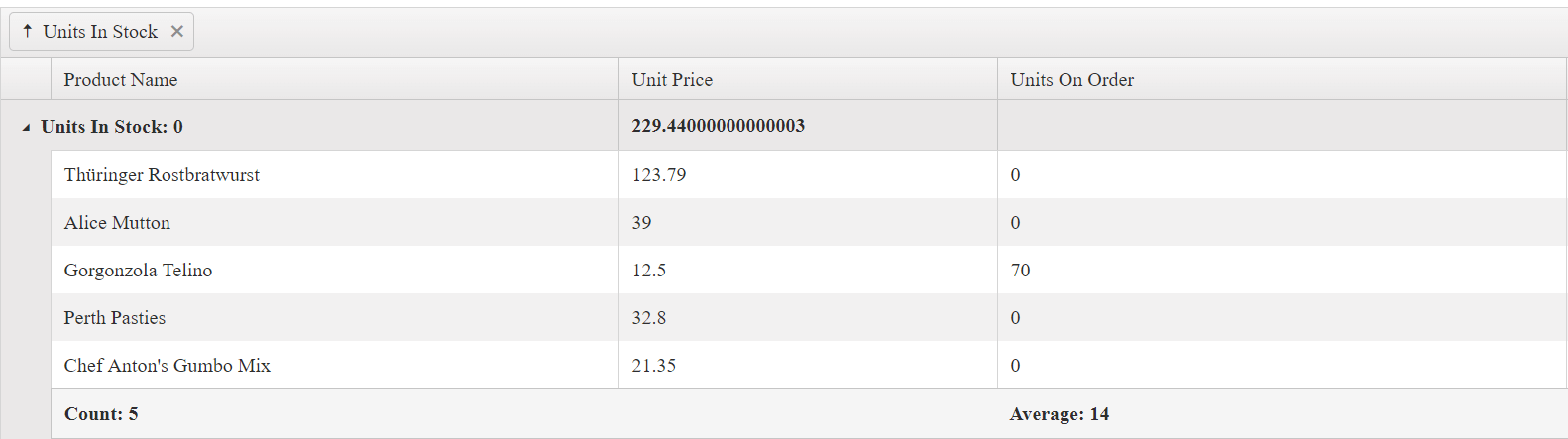
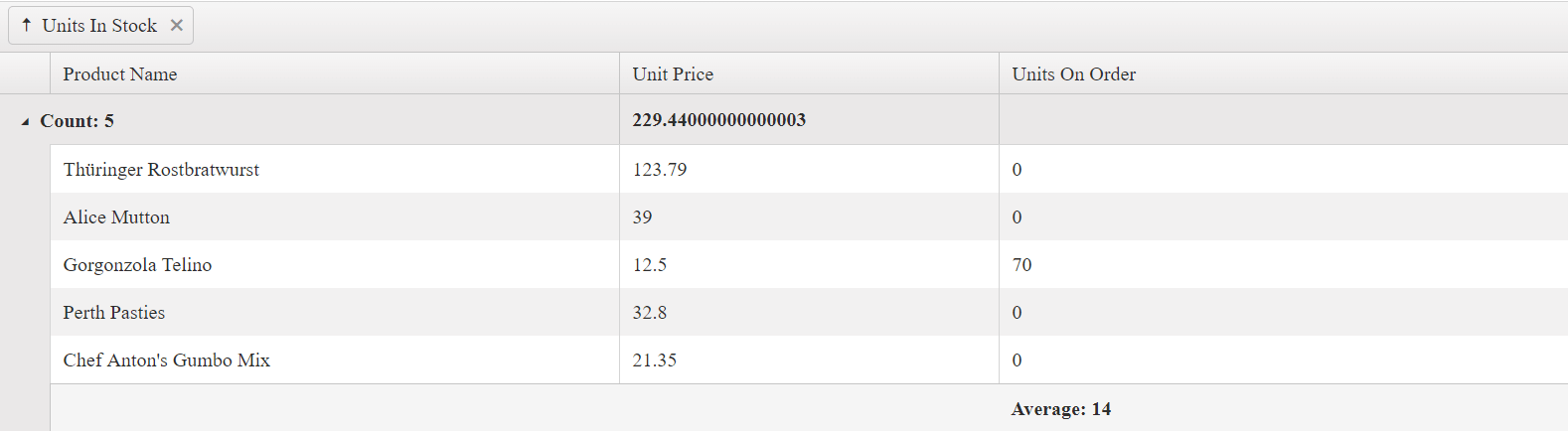
Due to the fact that ClientGroupHeaderTemplate is displayed next to the expanding icon of the group row, it takes precedence over the ClientGroupHeaderColumnTemplate of the first visible column. If you want to show the ClientGroupHeaderColumnTemplate content for the first column of the Grid, do not set the ClientGroupHeaderTemplate for the group column. The following Grid configuration shows that commenting the ClientGroupHeaderTemplate for the Units In Stock column shows the ClientGroupHeaderColumnTemplate for the Product Name column.
@(Html.Kendo().Grid<Kendo.Mvc.Examples.Models.ProductViewModel>()
    .Name("Grid")
    .Columns(columns =>
    {
        columns.Bound(p => p.ProductName)
            .ClientGroupHeaderColumnTemplate("Count: #=count#");
        columns.Bound(p => p.UnitPrice).Format("{0:C}");
        columns.Bound(p => p.UnitsOnOrder);
        columns.Bound(p => p.UnitsInStock);
            //.ClientGroupHeaderTemplate("Min: #= min #");
    })
    .Pageable()
    .Sortable()
    .DataSource(dataSource => dataSource
        .Ajax()
        .Aggregates(aggregates =>
        {
            aggregates.Add(p => p.UnitsInStock).Min();
            aggregates.Add(p => p.ProductName).Count();
        })
        .Group(groups => groups.Add(p => p.UnitsInStock))
        .Read(read => read.Action("Aggregates_Read", "Grid"))
    )
)
In a server-binding scenario, you can set the group templates without the Client prefix—GroupHeaderTemplate, GroupHeaderColumnTemplate, and GroupFooterTemplate. For more information, refer to the demo on server aggregates of the Grid.