New to Telerik UI for WinUI? Start a free 30-day trial
Split Button
Updated on Mar 26, 2026
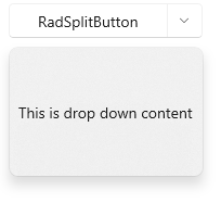
The RadSplitButton control is a dropdown-based button containing two button parts. One clickable button that displays normal content and one that opens the dropdown content. The drop down content can be populated with any element, like a simple text, a list with items or any other complex UI.
The SplitButton's button part is populated using its Content property. The drop down part is added via the DropDownContent property. Additionally, the contents can be customized using the ContentTemplate, DropDownContentTemplate and the associated DataTemplateSelector properties.
The following example shows how to define a button and set its contents.
Defining RadSplitButton
XAML
<telerikControls:RadSplitButton Content="RadSplitButton" DropDownWidth="180" DropDownHeight="120">
	<telerikControls:RadDropDownButton.DropDownContent>
		<TextBlock Text="This is drop down content!" Margin="8" VerticalAlignment="Center" />
	</telerikControls:RadDropDownButton.DropDownContent>
</telerikControls:RadSplitButton>
SplitButton with opened DropDownContent