Customizing KendoReact Buttons in the Dialog Component Using ThemeBuilder
Environment
| Product | ThemeBuilder | KendoReact |
|---|---|---|
| Version | Any | 8.2.0 |
Description
I use KendoReact with ThemeBuilder and want to change the styling of the buttons inside the Dialog component. How can I achieve this through ThemeBuilder if the Dialog component does not have any exposed component parts to style these buttons?
Solution
To customize the appearance of the buttons in a Dialog component through ThemeBuilder:
-
Add the code for the buttons in your application and override the default configuration as needed by specifying appearance-related props in the application code:
jsx<DialogActionsBar> <Button onClick={toggleDialog} size="large">No</Button> <Button onClick={toggleDialog} size="large">Yes</Button> </DialogActionsBar> -
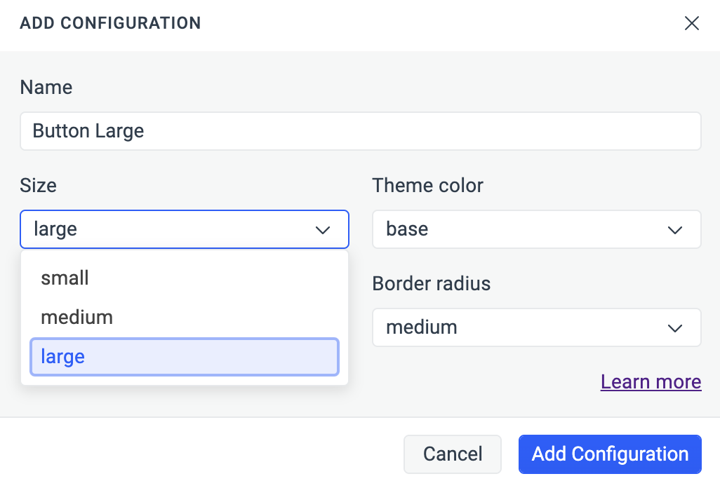
Create a component configuration for the Button in ThemeBuilder based on the chosen options during the code implementation.
-
Apply the desired changes to the component configuration through ThemeBuilder.
Notes
By default, when you add Button components in your application without specifying any appearance-related props, they default to the following configuration:
- Size: medium
- Fill mode: solid
- Theme color: base
- Rounded: medium
<Button>Default Button</Button>ThemeBuilder follows the same logic. When you choose to add a Button component configuration, it defaults to the same options.