Managing Interactive States
ThemeBuilder provides a convenient way to add and manage interactive state styles for Kendo and custom components. This lets you define styles that apply in response to user interactions like hovering over or focusing a button.
Adding states dynamically is currently supported only for custom components.
Adding or Removing States
-
Open the targeted component in Advanced Edit mode.
-
Drill down to the desired component part.
-
In the INTERACTIVE STATES section, click the + button to add new states.
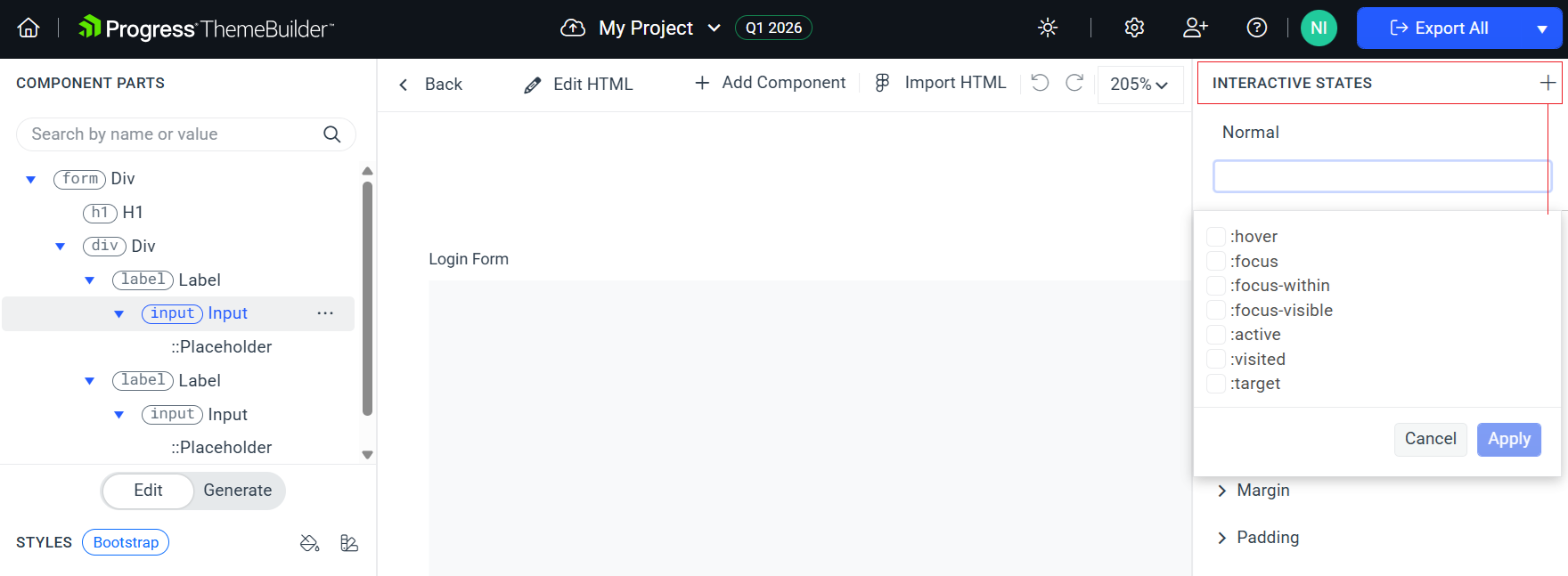
Starting with version Q1 2026, you can create a template for a combination of two or more states. You can reuse that template to define styling rules for cases when multiple states are active at the same time.
-
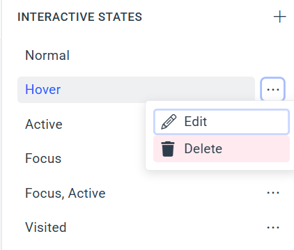
To delete or edit an existing state, click its context menu button and select the desired action.
Applying Styles to a State
After you add the desired states to your component, create their corresponding styles:
-
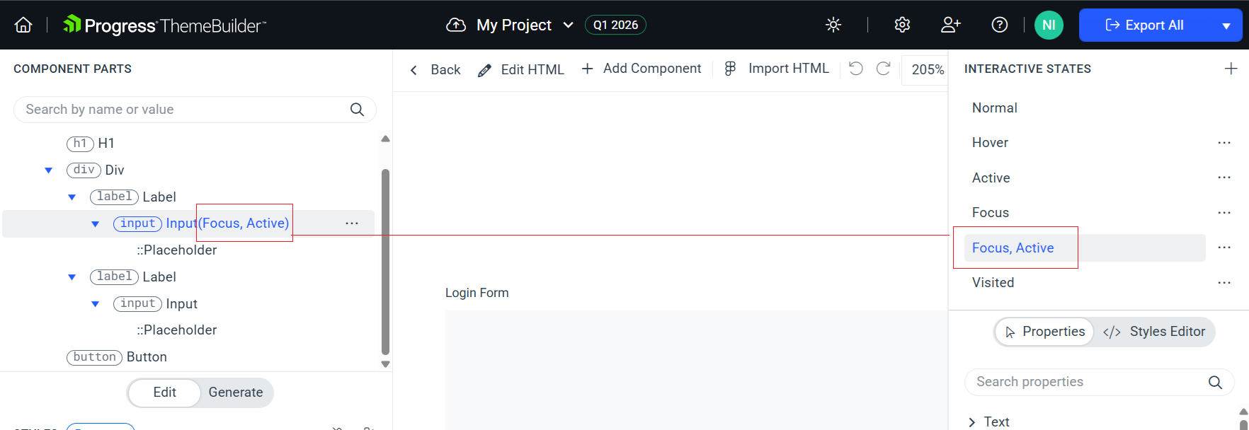
Navigate to the INTERACTIVE STATES section.
-
Set the component to the state that you want to edit by selecting the desired state in the INTERACTIVE STATES popup. The COMPONENT PARTS tree shows the selected state in brackets, for example, Button(Active).
-
Edit the properties in the pane on the right. All displayed properties apply to the currently selected state.