
Telerik UI for WinUI
What's New
New component: Map
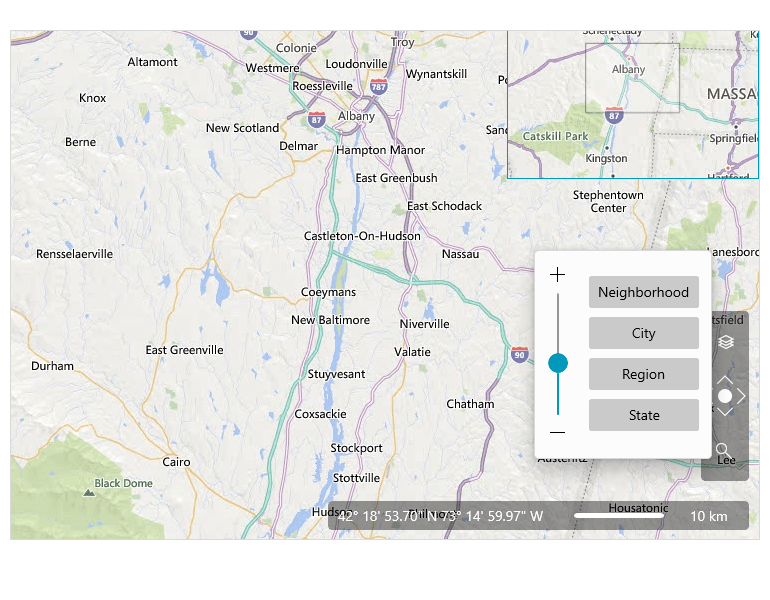
The new Map control for WinUI enables you to visualize rich geographical information right into your new desktop application! The control is highly configurable and allows you to visualize data from external sources, supports pan and zooming functionality, and gives users the ultimate flexibility with various navigation capabilities like command bar and scale control.
The Map control features the following key capabilities:
- Support for various map sources: visualize geo data from external (e.g., Bing Map Source, empty provider, OpenStreetMap) and custom providers.
- Pan and Zoom: panning and zooming are supported for mouse, keyboard, and navigational controls.
- Navigation controls support: the Map control for WinUI provides ultimate navigation flexibility with a command bar for switching between the different views, a zoom bar control for controlling the zoom level and out-of-the-box scale control.
- KLM Data Import: easily encode a set of features in KML (e.g. images, polygons, textual descriptions, etc.), import and visualize the data through the Map control right into your WinUI app.
- Support for search and routing: the control comes with a built-in search mechanism and Bing Maps routing support.
- Geocoding Support: the built-in support for geocoding turns a textual representation of a place or address into a map representation of its location.
New component: MaskedInput
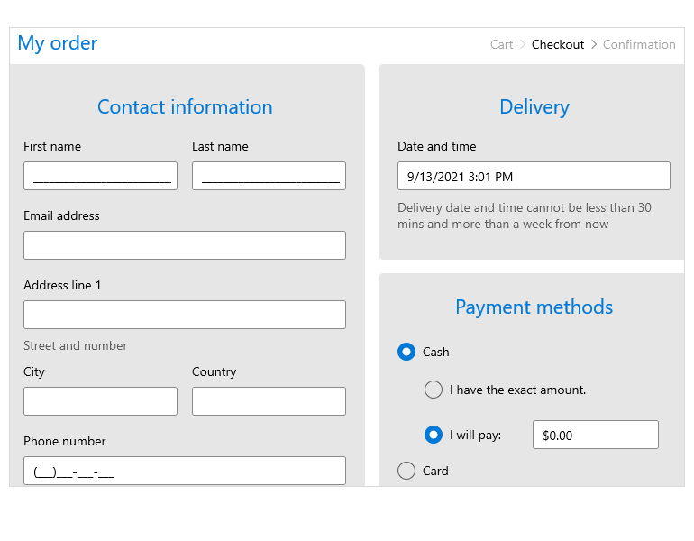
The MaskedInput control allows you to format text inputs into your WinUI app via input validation and masks, such as date, IP Address, SSN, phone number, digits, currency and decimals.
The Telerik UI for WinUI MaskedInput control ships with several powerful features, including:
- Support for multiple Mask Types: the control comes with multiple built-in Mask Types such as Standard, Numeric, DateTime, etc.
- Prompt Character: define a prompt character that will be displayed in the absence of user input.
- Value Format: set the behavior of the Value property by enabling whether to hold literals and prompt, depending on the scenario.
- Keyboard Support: the MaskedInput control comes with support for both standard keyboard input as well as support for arrow-key navigation.
- Globalization Support: the MaskedInput control comes with out-of-the-box globalization support.
- Undo/Redo Support: the control supports Undo and Redo operations.
New component: Expander
If you are looking to save space in your WinUI application without compromising ease of navigation, the Expander control can help you achieve these objectives. This flexible control allows you to provide content in an expandable drop-down area.
The WinUI Expander control comes with the following out-of-the-box features:
- Expand Direction: the control gives you ultimate flexibility in setting the direction of the content – it could expand up, down, on the right, or on the left.
- Click Mode: easily determine the type of action that will prompt when the content is expanded. The control supports three Click Modes: Release, Press and Hoover.
- Content Alignment: the Expander control allows you to align its content in different positions.
- Animation: you can either disable the animations support or customize them to your liking.
To learn more about the Telerik UI for WinUI Expander control, visit our product documentation.

New component: Sparklines
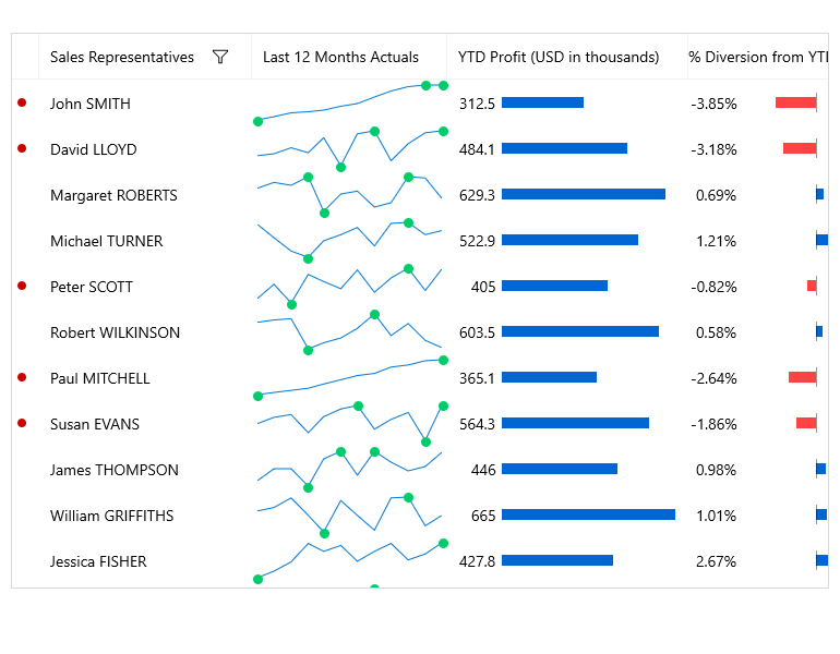
The Telerik UI for WinUI continues to add powerful data visualization controls to its’ suite! Sparkline is a lightweight set of controls designed to visualize trends. The Sparkline for WinUI comes in small size and with excellent performance and supports the following features:
- Sparkline types: built-in support for five types of sparklines (line, scatter point, area, column and win-loss) to show data trends.
- Indicators: the Sparkline for WinUI support multiple markers that highlight the data points in the line and area sparklines and makes them more readable.
- Horizontal axis: you can easily control the range of the plotted data and customize the axis indicator.
New component: DataBar
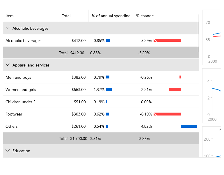
If you are planning to develop a WinUI app heavy on data visualization, we’ve put some extra effort into this release to equip you with even more controls in that department! The new DataBar control is a lightweight and highly performant designed to enable you to represent numeric values visually. The control comes with all the features you’d need, including:
- Support for multiple visualizations: the control comes with multiple built-in visualizations such as a single value bar or a stacked bars.
- ToolTip support: the tooltip feature lets you display additional information about the displayed value when the mouse hovers the bar.
- Data binding support: easily bind the data to the properties in the view model.
- Customizable Axis and Bars: the public API offers flexible customizations for both the Axis and Bar elements of the control
New component: RadialMenu
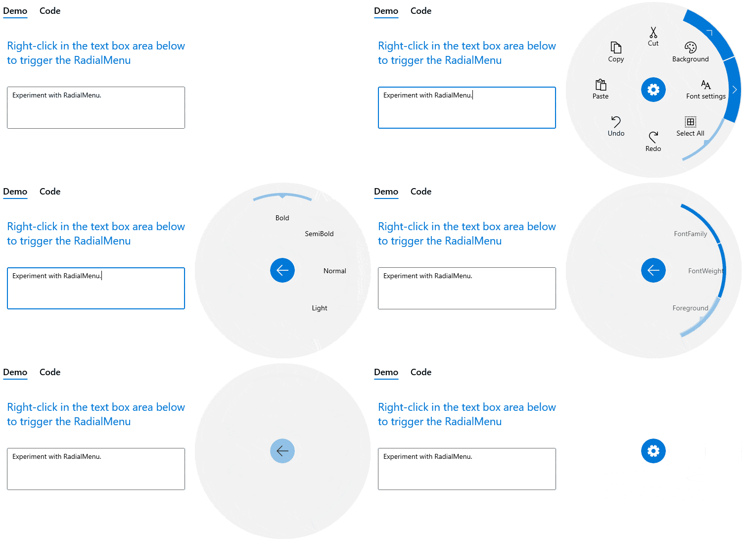
RadialMenu is an innovative control build as a hierarchy of menu items in a circular layout. This space-saving control can accommodate more menu items in a given space than the traditional vertical or horizontal menu. The RadialMenu is especially useful on touch devices as they enable the developers to place many commands and options in a flexible and dynamic UI container. This feature-rich control comes with the following capabilities:
- Nested Items: easily implement more complex layouts such as grouping clipboard operations by adding a clipboard as the main menu and cutting, copying, and pasting as children.
- ContextMenu usage: you can use the RadialMenu control as a context menu for another FrameworkElement.
- Triggers for actions: the RadialMenu comes with several built-in triggers for actions, including Tap, Focus and Hoover. However, you can easily customize the behavior of the control and create a different trigger action.
- Selection: built-in support for selection functionality allows you to highlight items upon click or by setting a property.
- Commands: you can quickly and easily customize the available commands.
Visual Studio Extensions for WinUI
As part of our commitment to empowering developers, with R3 2021 we launch our Telerik UI for WinUI Visual Studio Extensions. The extension allows you to easily create a new WinUI project along with referenced Telerik assemblies.
You can access the extension through the Extensions | Telerik | Telerik UI for the WinUI menu in Visual Studio.
Support for Visual Studio 2022 in Telerik UI for WinUI
For more information visit the Telerik UI for WinUI VS Documentation
CRM Sample Application
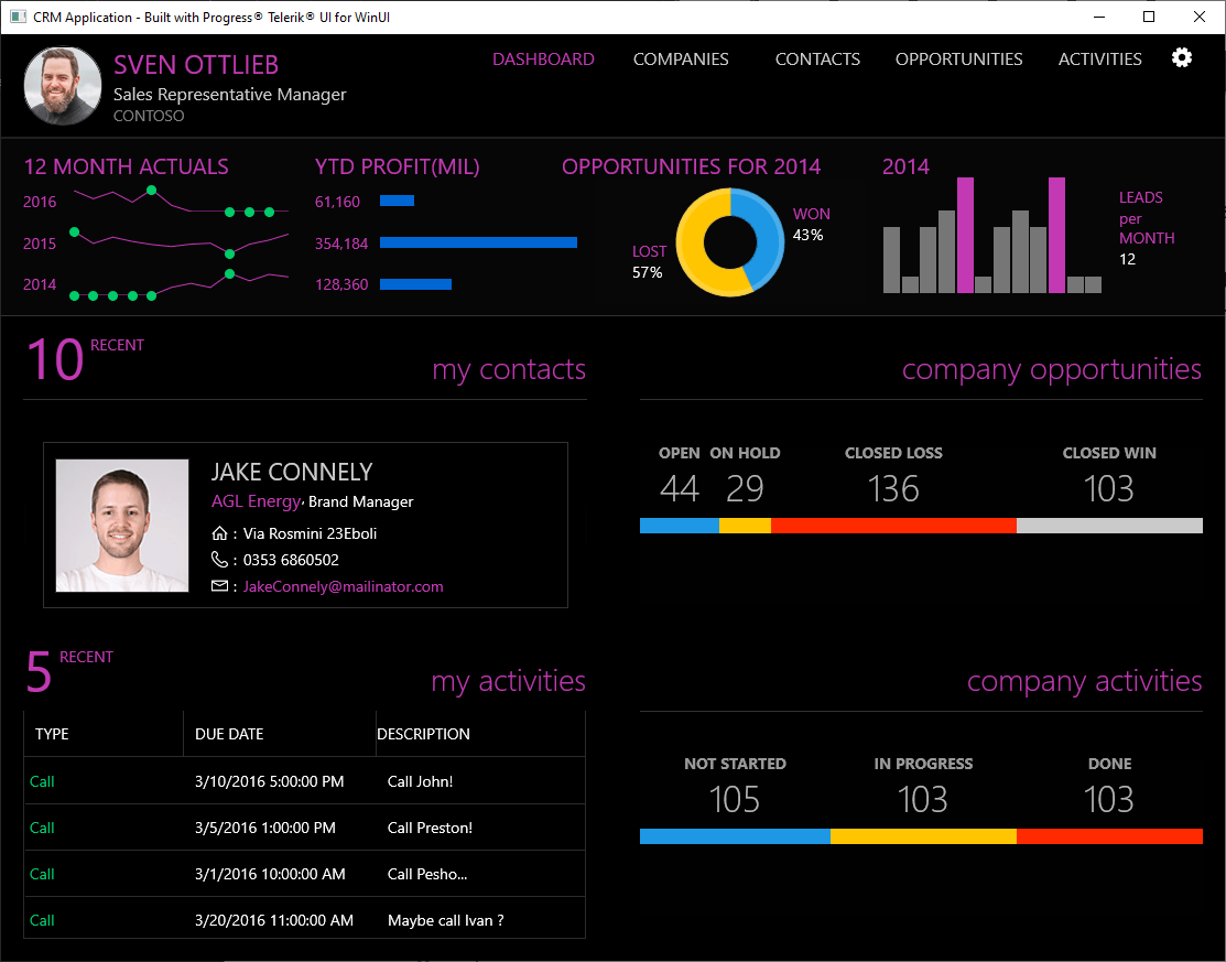
With R3 2021 we are introducing an advanced WinUI sample application – the Telerik UI for WinUI CRM app! This line-of-business application was built exclusively with Telerik UI for WinUI components. And it’s an excellent showcase of what you can do with our controls. The application includes data visualization of contacts, opportunities and various daily activities by any sales team and incorporates the multiple components from the Telerik UI for WinUI library, including:
Grab the Telerik UI for WinUI CRM demo app now and see what you can build with the WinUI framework and the power of the Telerik UI!
Support for EventToCommandBehavior
R3 2021 for WinUI ships a new MVVM Helper called the Telerik EventToCommandBehavior. When using the MVVM pattern, you need to ensure all controls follow that pattern. This is where the EventToCommandBehavior MVVM Helper comes into play – it allows your events to fire and your code to respond accordingly, all within the ViewModel without the need to touch the code-behind. For example, this Helper will enable you to use an event in the ViewModel to execute a custom logic, bind a specific event to the desired command, define a custom command, etc.
New features & Roadmap
Have a feature request?
Post your feedback via the WinUI UserVoice portal or the Public forums
What's new across all Telerik products?
See the updates feed

Next Steps
See Telerik UI for WinUI in action and check out how much it can do out-of-the-box.
Try Telerik UI for WinUI with dedicated technical support.