Customize Columns Headers of RadGanttView
Environment
| Product Version | 2024.1.423 |
| Product | RadGanttView for WPF |
Description
The header of the RadGanttView's ColumnDefinition class is represented by a ColumnHeaderContainer element. The default style of this element sets its ContentTemplate property to a TextBlock element. This element displays the value set to the Header property of the ColumnDefinition class. This prevents setting complex structure for the headers of the columns.
Solution
Create a new Style with TargetType="ColumnHeaderContainer" and add a new Setter for the ContentTemplate property. Then, set it to a new DataTemplate with a ContentPresenter instance in it.
Creatring a new Style that targets the ColumnHeaderContainer and sets a custom DataTemplate to its ContentTemplate property
    <!--If NoXaml is used base the Style on the default one: BasedOn="{StaticResource ColumnHeaderContainerStyle}"-->
    <Style TargetType="telerik:ColumnHeaderContainer">
        <Setter Property="ContentTemplate">
            <Setter.Value>
                <DataTemplate>
                    <ContentPresenter Content="{Binding Header}"/>
                </DataTemplate>
            </Setter.Value>
        </Setter>
    </Style>
Setting a complex structure to the Header property of a ColumnDefinition instance
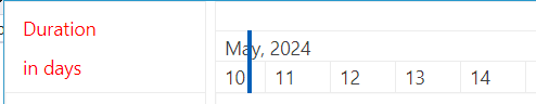
    <telerik:ColumnDefinition MemberBinding="{Binding DurationDays}" Width="100">
        <telerik:ColumnDefinition.Header>
            <StackPanel Orientation="Vertical">
                <Label Content="Duration" Foreground="Red"/>
                <Label Content="in days" Foreground="Red"/>
            </StackPanel>
        </telerik:ColumnDefinition.Header>
    </telerik:ColumnDefinition>
GanttView ColumnDefinition with complex structure set to its Header property