New to Telerik UI for WPF? Start a free 30-day trial
Styling the RadTreeViewItem
Updated on Sep 15, 2025
The RadTreeViewItem can be styled by creating an appropriate Style and setting it to the Style property of the control or by creating an implicit style.
Targeting the RadTreeViewItem Element
In order to style all RadTreeViewItem elements in a RadTreeView, you should create a style targeting RadTreeViewItem.
Example 1: Creating an implicit style targeting RadTreeViewItem
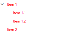
XAML
	<Grid>
        <Grid.Resources>
            <!-- If you are using the NoXaml binaries, you will have to base the style on the default one for the theme like so:
			<Style TargetType="telerik:RadTreeViewItem" BasedOn="{StaticResource RadTreeViewItemStyle}">-->

			<Style TargetType="telerik:RadTreeViewItem">
				<Setter Property="Foreground" Value="Red" />
			</Style>
        </Grid.Resources>

        <telerik:RadTreeView>
            <telerik:RadTreeView.Items>
                <telerik:RadTreeViewItem Header="Item 1">
                    <telerik:RadTreeViewItem Header="Item 1.1" />
                    <telerik:RadTreeViewItem Header="Item 1.2" />
                </telerik:RadTreeViewItem>
                <telerik:RadTreeViewItem Header="Item 2" />
            </telerik:RadTreeView.Items>
        </telerik:RadTreeView>
    </Grid>
Figure 1: RadTreeViewItem with Red Foreground in the Fluent theme
You can also use the ItemContainerStyle and ItemContainerStyleSelector properties of the RadTreeView in order to style its items.