Document Ruler
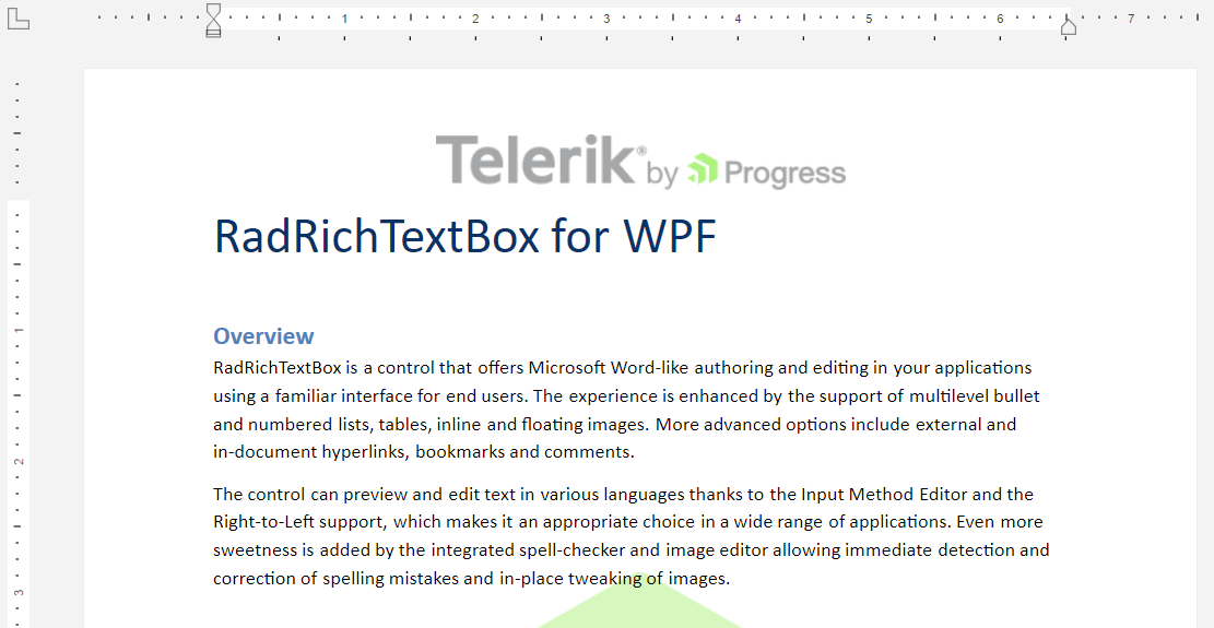
The DocumentRuler element allows you to visualize a guide that will assist you in aligning text, tables, graphics, and other elements via the thumbs of the horizontal and vertical rulers. To display the document ruler, wrap it around a RadRichTextBox instance.
Displaying the DocumentRuler
    <telerik:DocumentRuler>
        <telerik:RadRichTextBox Name="radRichTextBox" />
    </telerik:DocumentRuler>
RadRichTextBox with DocumentRuler
Customizing the Appearance of the Document Ruler
The DocumentRuler object derives from the DocumentRulerBase class, which exposes the following API for customizing the appearance:
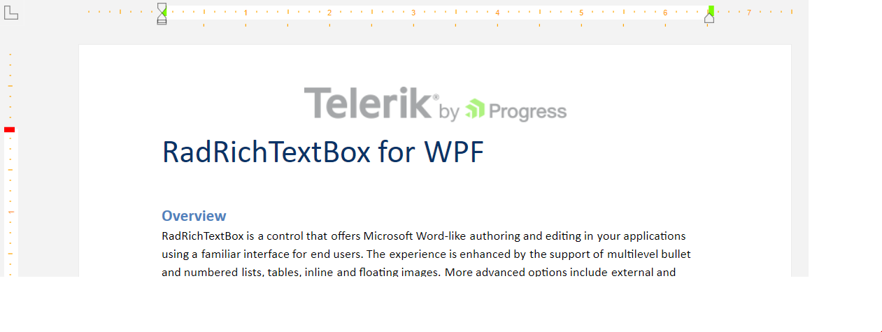
ThumbBackgroundStyle—This property provides the functionality to set aStylefor the background thumbs.VerticalThumbStyle—Gets or sets aStylethe vertical thumb.HorizontalThumbStyle—Gets or sets aStylefor the horizontal thumb.MarkersBrush—Allows you to specify a value of the type ofBrushfor the markers of the vertical and horizontal rulers.MeasurementUnit—Allows you to specify the unit used for measurement. The property is of the type ofUnitTypesand provides the following options:DIPPointPicaInchMmCmTwip
SectionColumnThumbStyle—This property provides the functionality to specify a style for the section column thumb.TableColumnThumbStyle—This property allows you to specify a style for the table column thumb.DefaultRulerThumbType—This property provides you with the ability to set a style for the default ruler thumb.
Customizing the Appearance of the Document Ruler
    <telerik:DocumentRuler MarkersBrush="Orange">
        <telerik:DocumentRuler.VerticalThumbStyle>
            <Style TargetType="Thumb">
                <Setter Property="Template">
                    <Setter.Value>
                        <ControlTemplate TargetType="Thumb">
                            <Rectangle Fill="Red" Width="12" Height="6"/>
                        </ControlTemplate>
                    </Setter.Value>
                </Setter>
            </Style>
        </telerik:DocumentRuler.VerticalThumbStyle>
        <telerik:DocumentRuler.HorizontalThumbStyle>
            <Style TargetType="Thumb">
                <Setter Property="Template">
                    <Setter.Value>
                        <ControlTemplate TargetType="Thumb">
                            <Rectangle Fill="LawnGreen" Width="6" Height="12"/>
                        </ControlTemplate>
                    </Setter.Value>
                </Setter>
            </Style>
        </telerik:DocumentRuler.HorizontalThumbStyle>
        <telerik:RadRichTextBox Name="radRichTextBox" IsSpellCheckingEnabled="False"/>
    </telerik:DocumentRuler>
Customized appearance of the DocumentRuler element
Hiding Vertical/Horizontal Ruler of the Document Ruler
You can change the visibility of the vertical/horizontal ruler of the DocumentRuler control. To do so, you can utilize its CreateHorizontalRuler and CreateVerticalRuler properties. These properties will be taken into account if the DocumentRuler instance has been loaded.
Hiding the vertical ruler of the DocumentRuler
    private void DocumentRuler_Loaded(object sender, RoutedEventArgs e)
    {
        this.documentRuler.CreateVerticalRuler = false;
    }
DocumentRuler with hidden vertical ruler
Read-Only Support
The DocumentRuler control exposes the IsReadOnly property. You can use it to prevent/allow the user to make changes to the document via the vertical and horizontal rulers. This property will be taken into account if the DocumentRuler control has been loaded.
Setting the IsReadOnly property
    private void DocumentRuler_Loaded(object sender, RoutedEventArgs e)
    {
        this.documentRuler.IsReadOnly = true;
    }
Customizing the Behavior of the DocumentRuler
You can customize the DocumentRuler's behavior by providing a custom implementation for the IDocumentRulerController interface to the Controller property. You can either create your own implementation of this interface or extend the default RadRichTextBoxRulerController class.