New to Telerik UI for WPF? Start a free 30-day trial
Customize the Application Menu Button
Updated on Sep 15, 2025
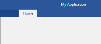
The default look of the application menu button is an empty rectangle as shown in Figure 1.
Figure 1: RadRibbonView Application Button in the Office2016 theme
Set the ApplicationButtonImageSource
In order to add an image as the application button's content, you can use the ApplicationButtonImageSource property.
Example 1: Setting the ApplicationButtonImageSource
XAML
	<telerik:RadRibbonView ApplicationButtonImageSource="Images/test.png">
		<telerik:RadRibbonView.Items>
            <telerik:RadRibbonTab Header="Home" />
        </telerik:RadRibbonView.Items>
	</telerik:RadRibbonView>
Figure 2: RadRibbonView Application Button with an image in the Office2016 theme

Add custom Content to the Application Button
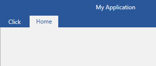
You can add custom Content to the Application Button via the ApplicationButtonContent property.
Example 2: Setting the ApplicationButtonContent
XAML
	<Grid>
        <Grid.Resources>
            <TextBlock x:Key="clickTextBlock" Text="Click" />
        </Grid.Resources>
        <telerik:RadRibbonView ApplicationButtonContent="{StaticResource clickTextBlock}">
            <telerik:RadRibbonView.Items>
                <telerik:RadRibbonTab Header="Home" />
            </telerik:RadRibbonView.Items>
        </telerik:RadRibbonView>
    </Grid>
Figure 3: RadRibbonView Application Button with custom content
Disabling the ApplicationButton
In order to disable the application button, you can set the IsApplicationButtonEnabled property to False.
Example 3: Disabling the Application Button
XAML
<telerik:RadRibbonView IsApplicationButtonEnabled="False" />Hide the Application Button
In order to hide the application button, you can set the ApplicationButtonVisibility property to Collapsed.
Example 4: Setting the ApplicationButtonVisibility
XAML
<telerik:RadRibbonView ApplicationButtonVisibility="Collapsed" />