ToolTip
The RadHeatMap control provides a tooltip behavior which can be used to visualize arbitrary information related to a data point. The ToolTip functionality is disable by default. To enable it, you need to set ShowToolTips property of the RadHeatMap to true.
Example 1: Enabling the ToolTip behavior of the RadHeatMap
<telerik:RadHeatMap ShowToolTips="True" />Customizing the Tooltip
To customize the apperance of the tooltip you can use the HeatMapToolTipSettings propertyo of RadHeatMap. For demonstration purposes we will use a simple class that will represent one cell of the RadHeatMap control. This class will expose three properties:
- Row: А string property which gets or sets the row name of the corresponding cell.
- Column: А string property which gets or sets the column name of the corresponding cell.
- Value: Аn integer property which gets or sets the value of the corresponding cell.
Example 2: Creating the model
	public class TempInfo
    {
        public int Year { get; set; }
        public string Month { get; set; }
        public double Temperature { get; set; }
}To fill the RadHeatMap with sample data we can create a list of TempInfo objects and set it as DataContext of the control.
Example 3: Populating the RadHeatMap control
	public partial class MainWindow : Window
    {
        public MainWindow()
        {
            this.InitializeComponent();
			this.PrepareData();
        }

		private void PrepareData()
		{
			int year = 2018;
			string[] months = new string[6] { "Jan", "Feb", "Mar", "Apr", "May", "Jun" };
			var randomNumberGenerator = new Random();

			var source = new ObservableCollection<TempInfo>();
			for (int i = 0; i < months.Length; i++)
			{
				for (int k = 0; k < 6; k++)
				{
					var info = new TempInfo() { Year = year + k, Month = months[i], Temperature = randomNumberGenerator.Next(10, 300) };
					source.Add(info);
				}
			}

			this.DataContext = source;
		}
} After having the sample data ready, we can go in the XAML code and define the RadHeatMap and the ToolTipSettings.
Example 4: Customizing the ToolTip
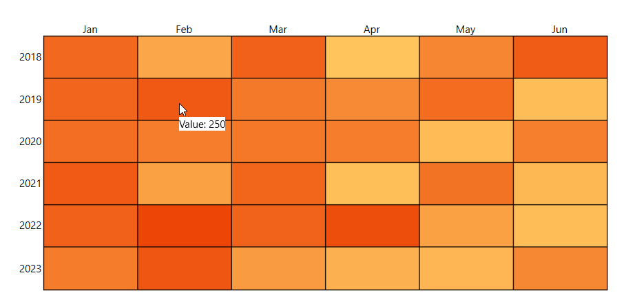
	<telerik:RadHeatMap ShowToolTips="True" CellBorderColor="Black" CellBorderThickness="1" >
		<telerik:RadHeatMap.ToolTipSettings>
			<telerik:HeatMapToolTipSettings>
				<telerik:HeatMapToolTipSettings.ToolTipTemplate>
					<DataTemplate>
						<StackPanel Orientation="Horizontal" Background="White">
							<TextBlock Text="Value: " FontSize="12"/>
							<TextBlock Text="{Binding Value}" FontSize="12"/>
						</StackPanel>
					</DataTemplate>
				</telerik:HeatMapToolTipSettings.ToolTipTemplate>
			</telerik:HeatMapToolTipSettings>
		</telerik:RadHeatMap.ToolTipSettings>
		<telerik:RadHeatMap.Definition>
			<telerik:CategoricalDefinition x:Name="categoricalDefinition" ItemsSource="{Binding}"
									RowGroupMemberPath="Year"
									ColumnGroupMemberPath="Month"
									ValuePath="Temperature" />
		</telerik:RadHeatMap.Definition>
	</telerik:RadHeatMap>
Figure 1: RadHeatMap with customized ToolTip