Styling Indent Cells
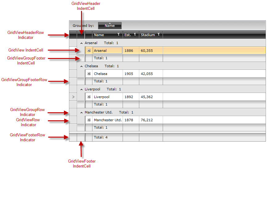
RadGridView exposes different indent cells and indicator presenters depending on its current state - being grouped, in a hierarchy, or displaying the corresponding footers. Figure 1 outlines the visual structure of those elements for a grouped RadGridView with the ShowColumnFooters and ShowGroupFooters properties set to True.
Figure 1: RadGridView Indent Cells and Indicator Presenters

Indent Cells
RadGridView exposes four different indent cell types:
-
GridViewIndentCell: It is part of the GridViewRow.
-
GridViewHeaderIndentCell: It is part of the GridViewHeaderRow.
-
GridViewFooterIndentCell: It is part of the GridViewFooterRow.
-
GridViewGroupFooterIndentCell: It is part of the GridViewGroupFooterRow.
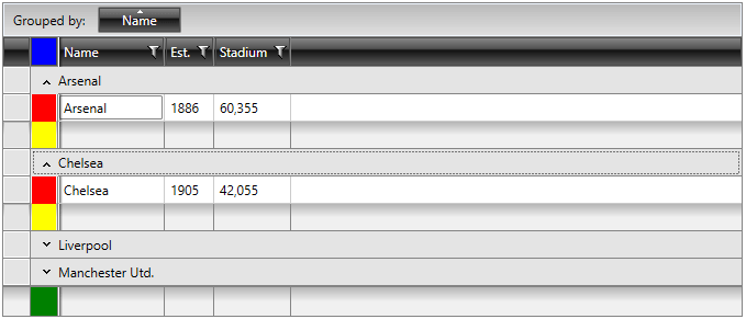
Similarly to other RadGridView elements, you may alter their appearance by modifying their default styles or by directly editing their control templates. Example 1 demonstrates how to create styles that target those elements.
Example 1: Styling Indent Cells
	<Application.Resources>
        <Style TargetType="telerik:GridViewIndentCell">
            <Setter Property="Background" Value="Red" />
        </Style>

        <Style TargetType="telerik:GridViewHeaderIndentCell">
            <Setter Property="Background" Value="Blue" />
        </Style>

        <Style TargetType="telerik:GridViewFooterIndentCell">
            <Setter Property="Background" Value="Green" />
        </Style>

        <Style TargetType="telerik:GridViewGroupFooterIndentCell">
            <Setter Property="Background" Value="Yellow" />
        </Style>
    </Application.Resources>
Figure 2: A grouped RadGridView with styled indent cells

Indicator Presenters
RadGridView exposes five indicator presenters, each of them belonging to the corresponding row:
-
GridViewRow
-
GridViewHeaderRow
-
GridViewGroupRow
-
GridViewGroupFooterRow
-
GridViewFooterRow
You may customize each of them by editing the control template of the respective row and modifying the Border element named PART_IndicatorPresenter.
Figure 3 shows a RadGridView with styled indent cells and indicator presenters.
Figure 3: RadGridView with styled indent cells and indicator presenters
