New to Telerik UI for WPF? Start a free 30-day trial
How To Change the Action Trigering an Expand
Updated on Sep 15, 2025
This article describes how to control the mouse action that triggers an expand.
The RadExpander control exposes a ClickMode property to allow you to determine when the content of the control should be expanded. The property is an enumeration of type ClickMode that exposes the following members:
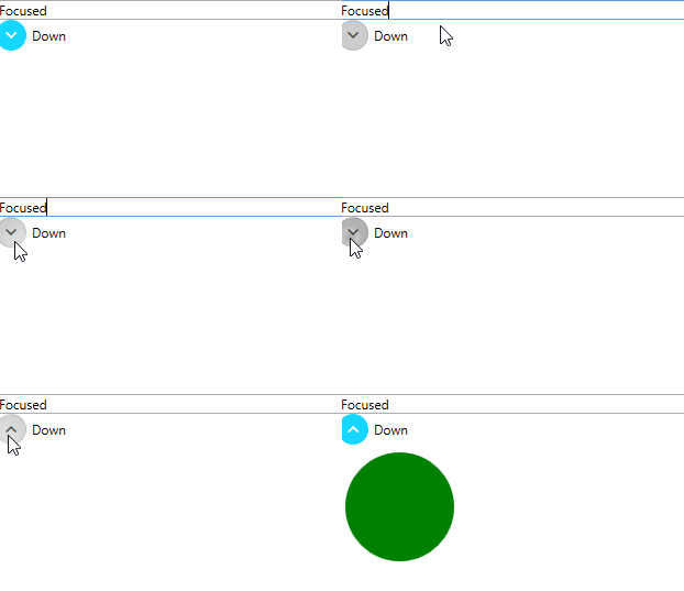
- Release: Specifies that the content should be expanded when the left mouse button is pressed and released on top of the RadExpander.Header. If you are using the keyboard, this setting specifies that the content should be expanded when the RadExpander.Header is focused and the SPACEBAR or ENTER key is pressed and released.
Example 1: Setting ClickMode to Release
XAML
	<StackPanel>
        <TextBox Text="Focused" />
        <telerik:RadExpander ClickMode="Release"
                         ExpandDirection="Down"
                         Header="Down">
            <StackPanel Orientation="Horizontal">
                <Ellipse Width="99"
                     Height="99"
                     Margin="5"
                     Fill="Green" />
            </StackPanel>
        </telerik:RadExpander>
    </StackPanel>
Figure 1: Release ClickMode

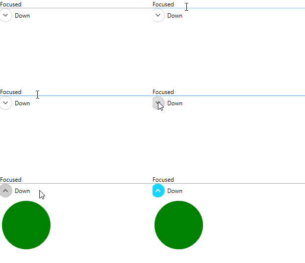
- Press: Specifies that the content should be expanded when the left mouse button is pressed on top of the RadExpander.Header. If you are using the keyboard, this setting specifies that the content should be expanded when the RadExpander.Header is focused and the SPACEBAR or ENTER key is pressed.
Example 2: Setting ClickMode to Press
XAML
	<StackPanel>
        <TextBox Text="Focused" />
        <telerik:RadExpander ClickMode="Press"
                         ExpandDirection="Down"
                         Header="Down">
            <StackPanel Orientation="Horizontal">
                <Ellipse Width="99"
                     Height="99"
                     Margin="5"
                     Fill="Green" />
            </StackPanel>
        </telerik:RadExpander>
    </StackPanel>
Figure 2: Press ClickMode

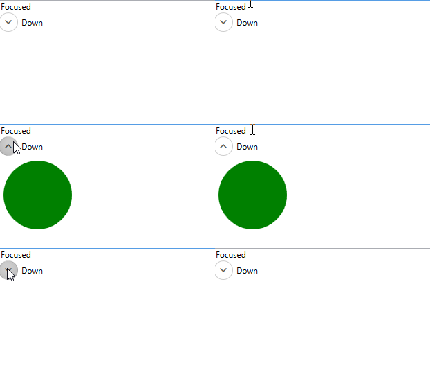
- Hover: Specifies that the content should be expanded when the mouse pointer hovers over the RadExpander.Header.
Example 3: Setting ClickMode to Hover
XAML
	<StackPanel>
        <TextBox Text="Focused" />
        <telerik:RadExpander ClickMode="Hover"
                         ExpandDirection="Down"
                         Header="Down">
            <StackPanel Orientation="Horizontal">
                <Ellipse Width="99"
                     Height="99"
                     Margin="5"
                     Fill="Green" />
            </StackPanel>
        </telerik:RadExpander>
    </StackPanel>
Figure 3: Hover ClickMode

The default value of the ClickMode property is Release which means that by default the RadExpander control is expanded when the left mouse button is released after a click on the header or when the Enter or Space keys are released while focusing the header.